- Design
- Naming
- Strategy
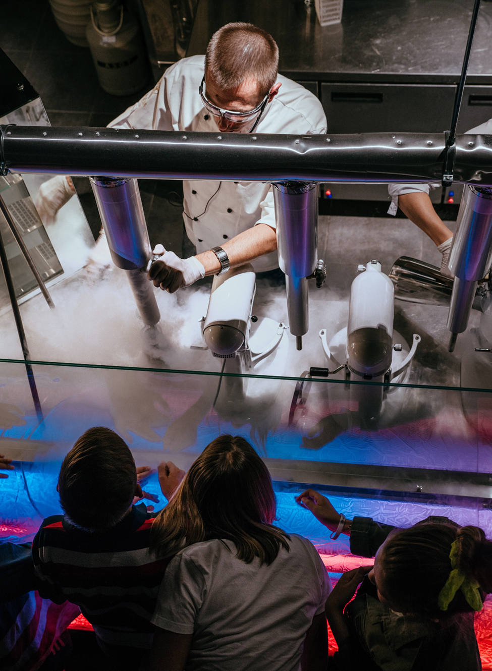
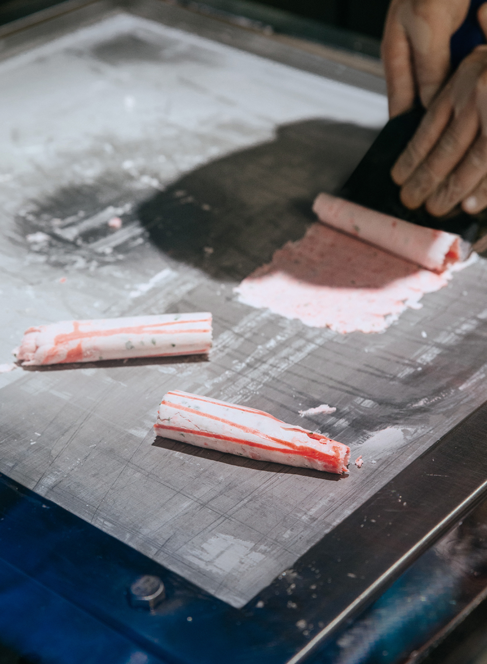
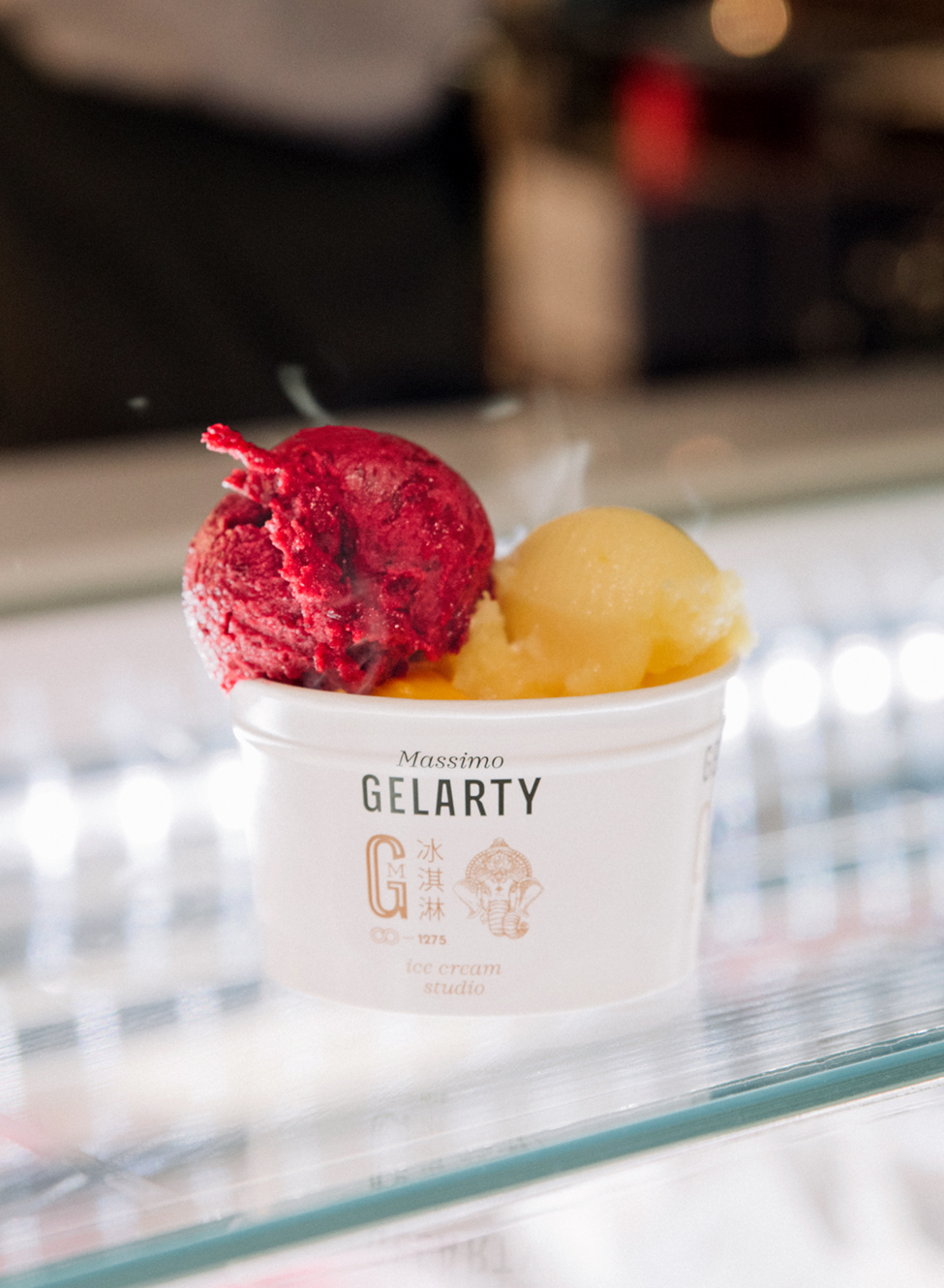
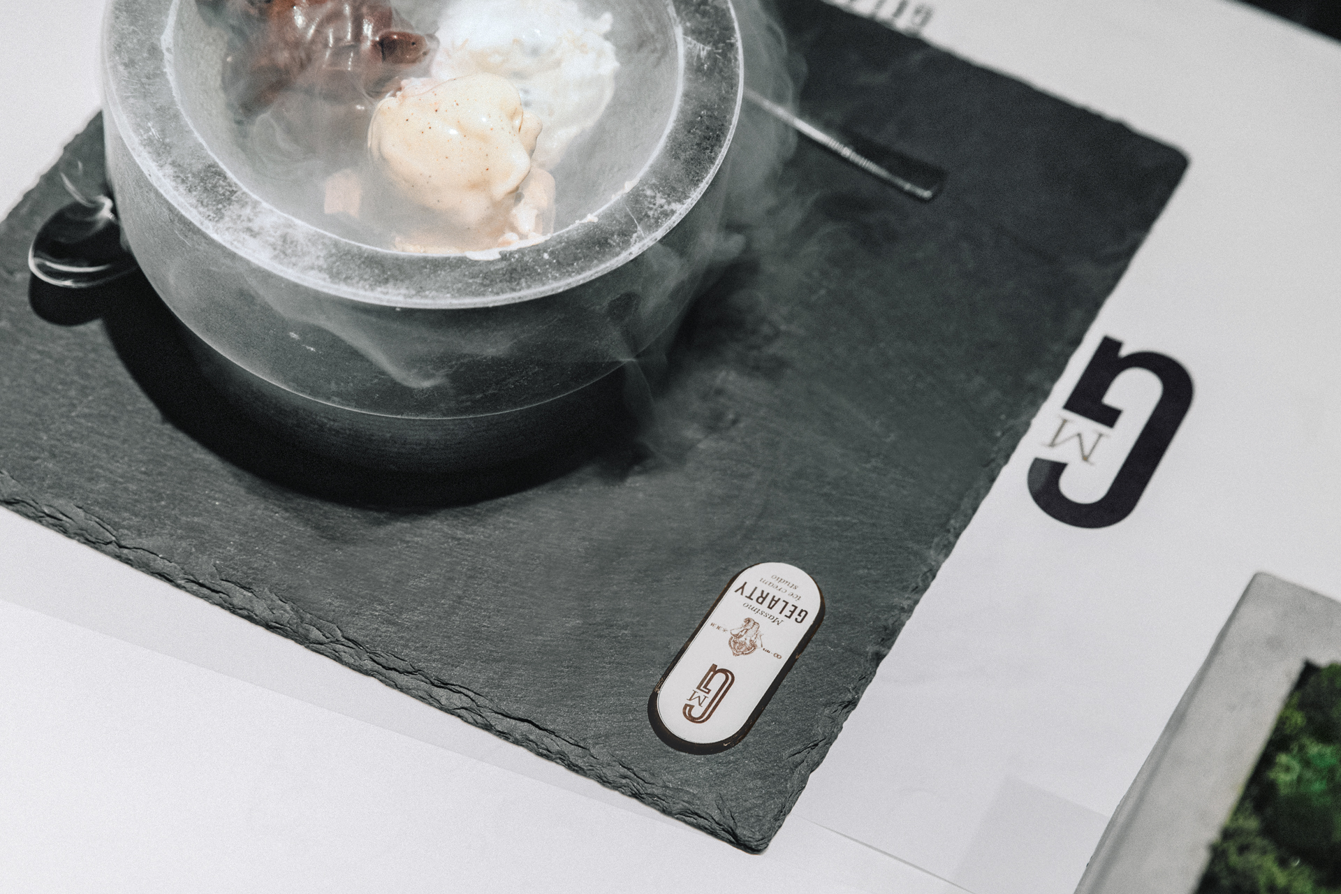
Six months ago, a man came to us and claimed that the ice cream we ate was all wrong. It was originally invented for short moments of pleasure, thus the ice cream that can be stored in the refrigerator for months is not a genuine one. He said that industrial production had almost buried traditional technologies. The market is 95 percent filled with surrogates from concentrates, food colorants, emulsifiers and flavor enhancers. The founder Maksym had a dream: to reintroduce the most authentic ice cream, to bring it back to people. He has reinvented the old culinary techniques with the modern methods. An ancient Chinese recipe for mixing ingredients on the ice was improved by a shaker and liquid nitrogen, and the Sinhalese cold stone for ice cream was replaced by an Italian ice cream table.
Challenge
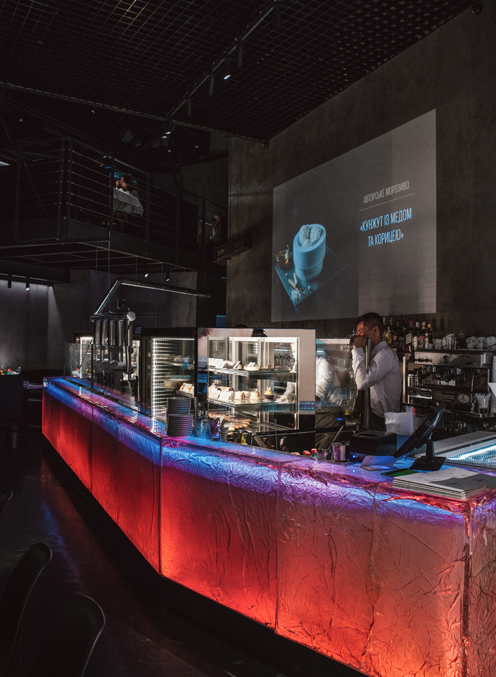
When we tasted the ice cream made by Maksym, we realized this is something special, not only for Kyiv but even for London or New York. We had to create a brand that would be at least equal to that product, ready to enter the international market without any changes. And also to present to an average Ukrainian a new molecular ice cream.
Solution
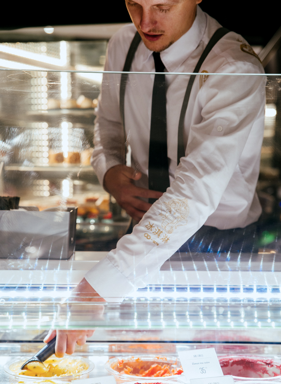
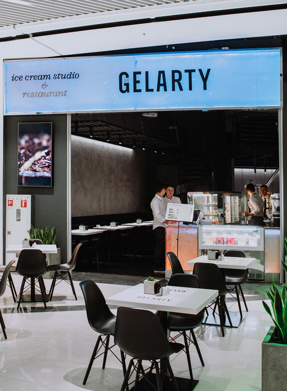
The preparation of ice cream with the help of liquid nitrogen or on an ice table looks like a real magic, which should not be concealed. We developed a retail concept of a studio and gave it a one-word name: the show. The chefs have to make the ice cream in an open kitchen, so visitors can see nitrogen at −196 °C forming a foggy mist and presenting the real ice cream to the world. It appeals to everyone: children, parents, grandmothers, gourmets, skeptics, bloggers and those who were just passing by.
Naming
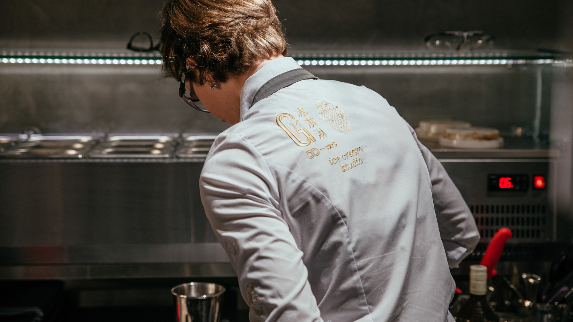
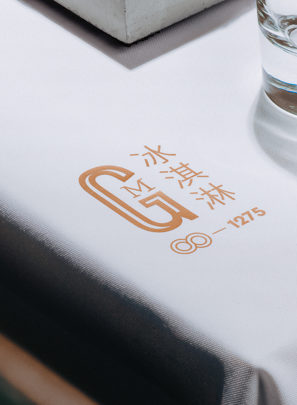
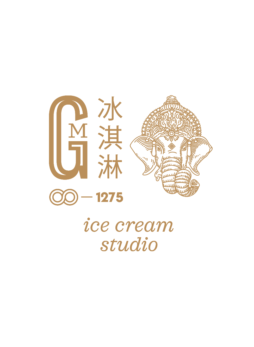
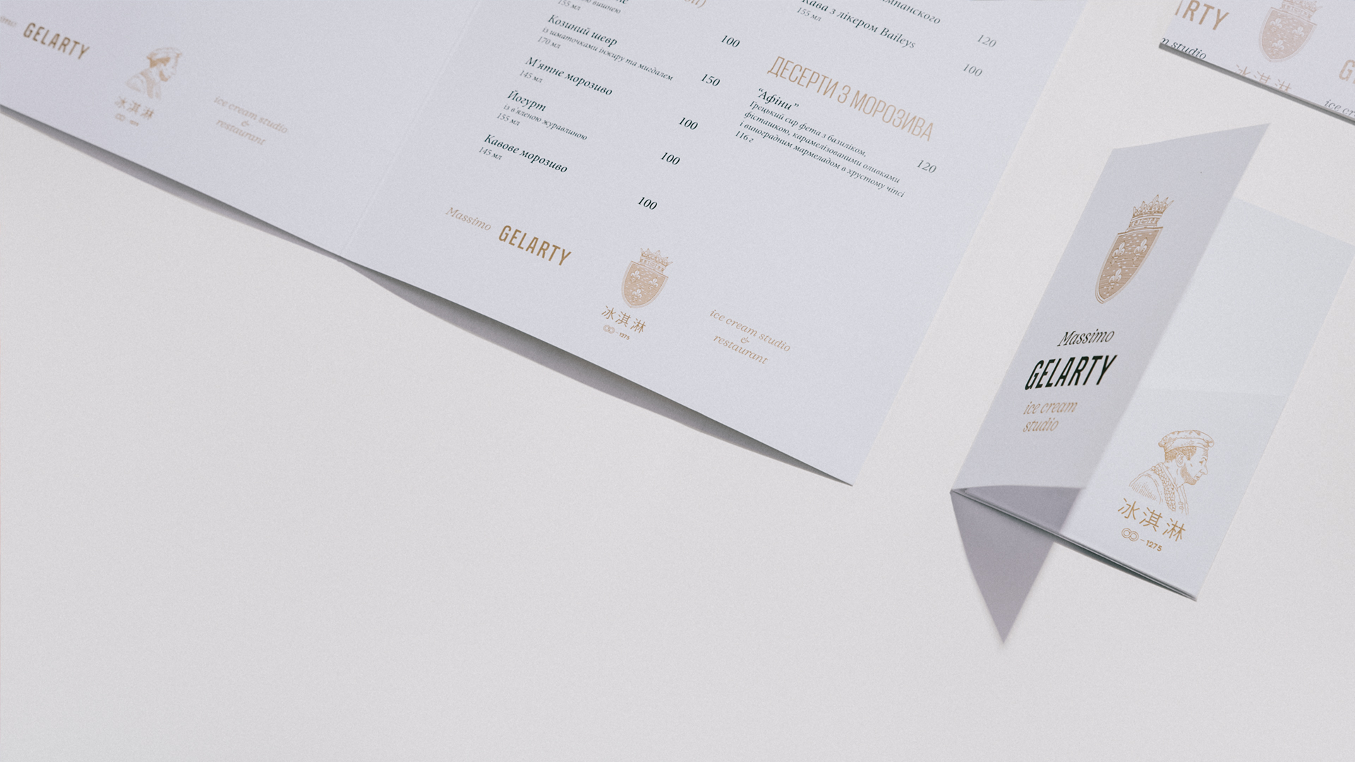
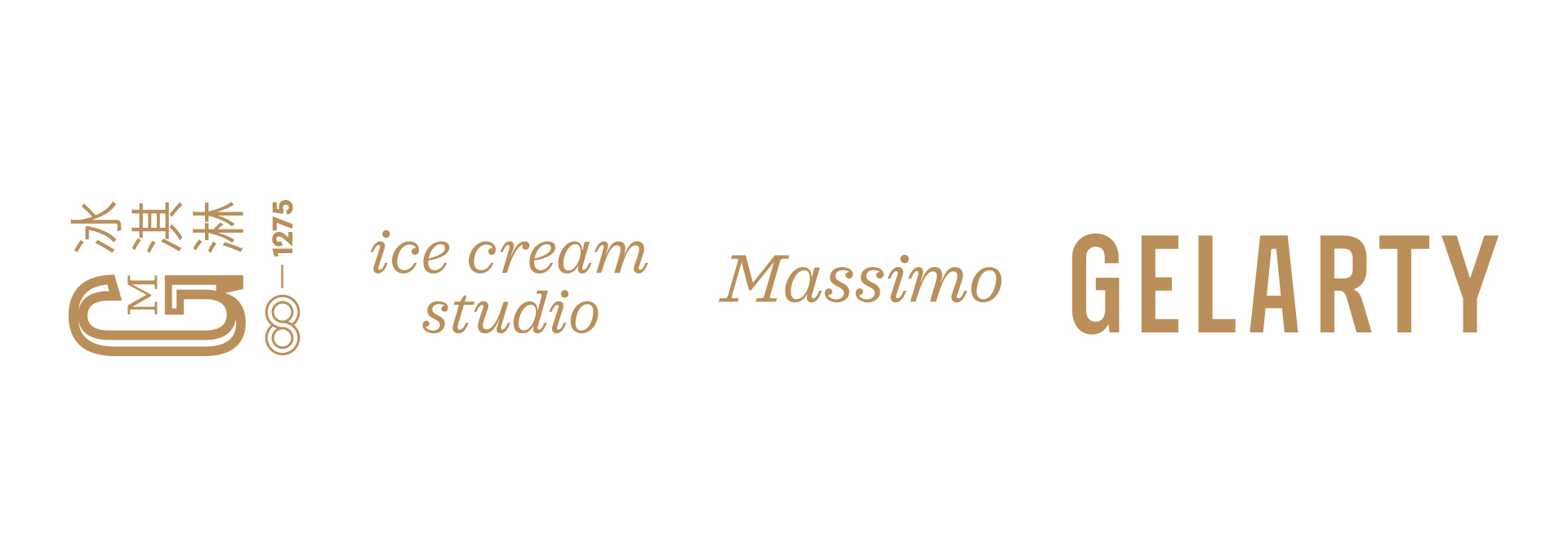
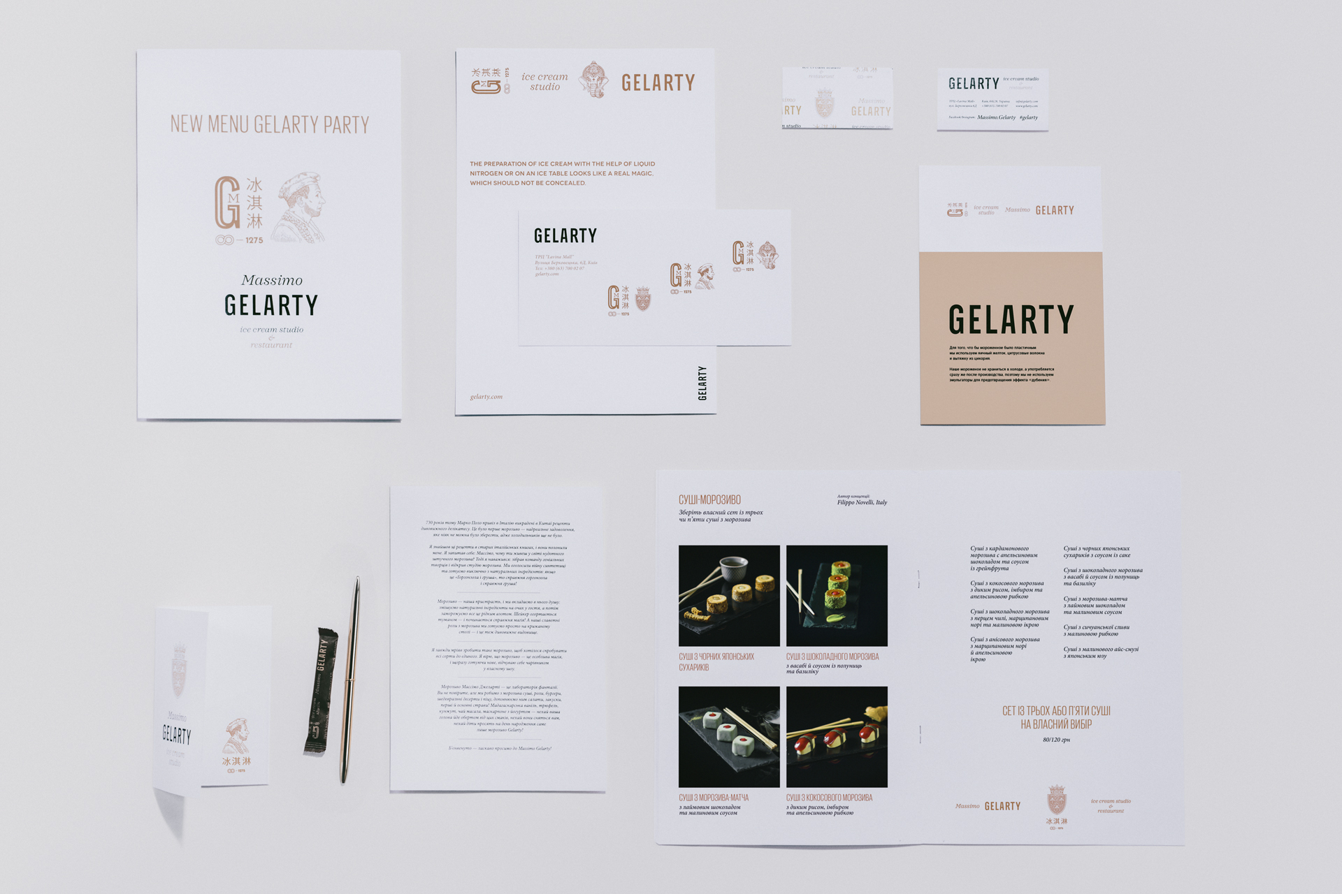
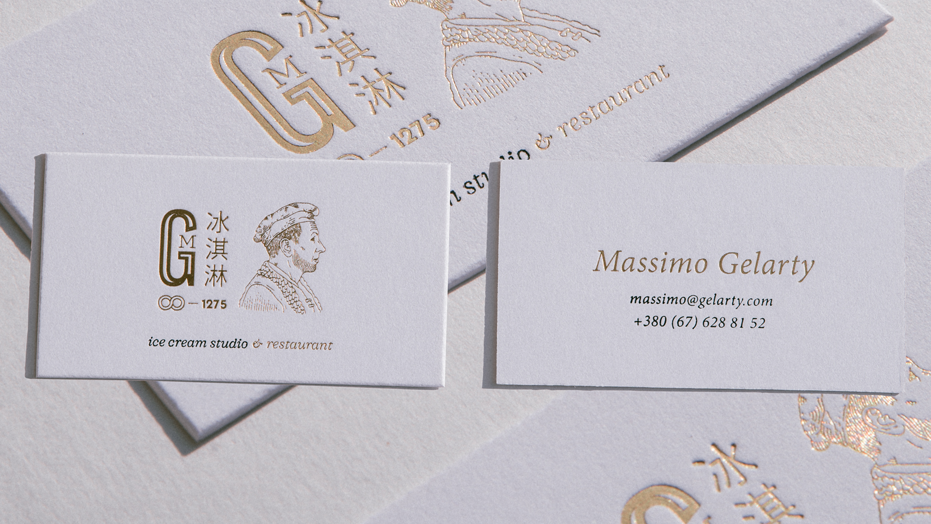
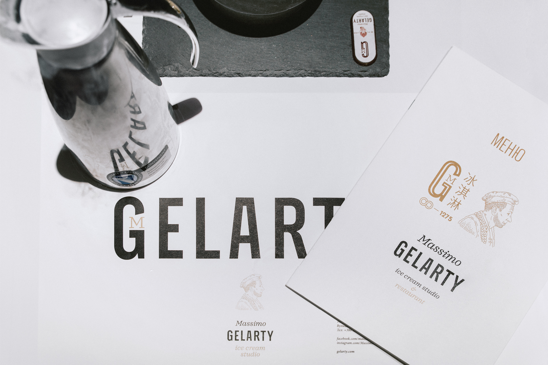
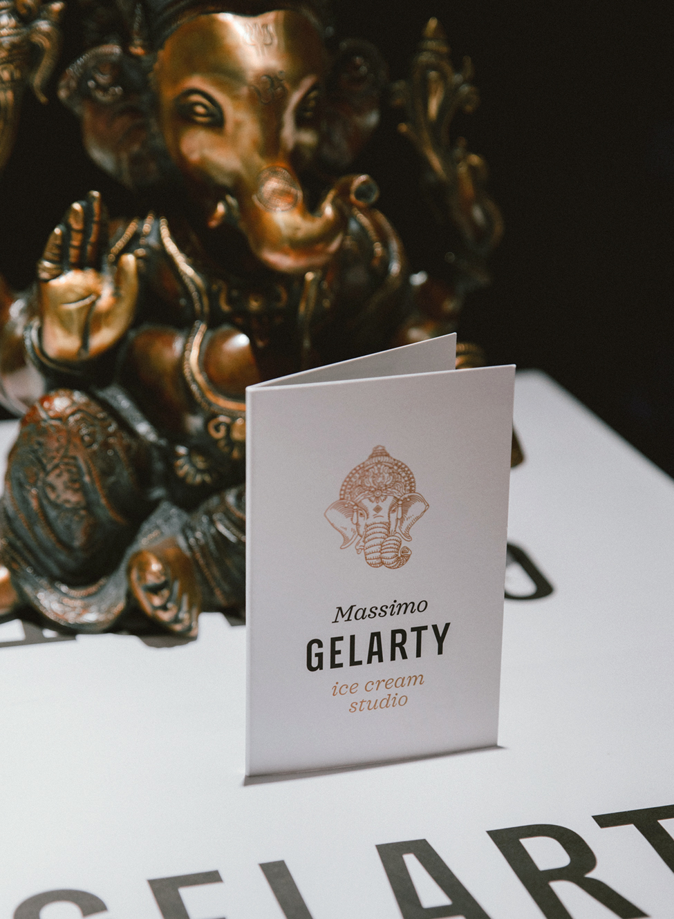
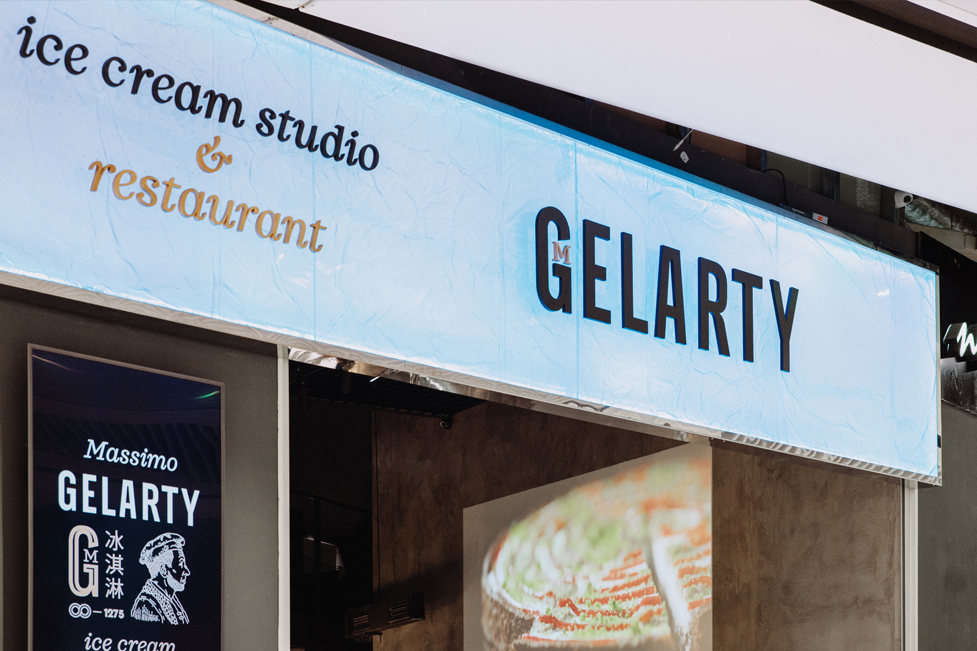
In the process of naming, we realized that if you compress the whole idea into two notions, those will be ice cream and art. The Italian gelato and arte became the basis for the name Gelarty, which we supplemented with the ice cream studio description. And Maksym, who is fanatically in love with his business and conducts a show every day himself, took the creative pseudonym Massimo Gelarty.
Design
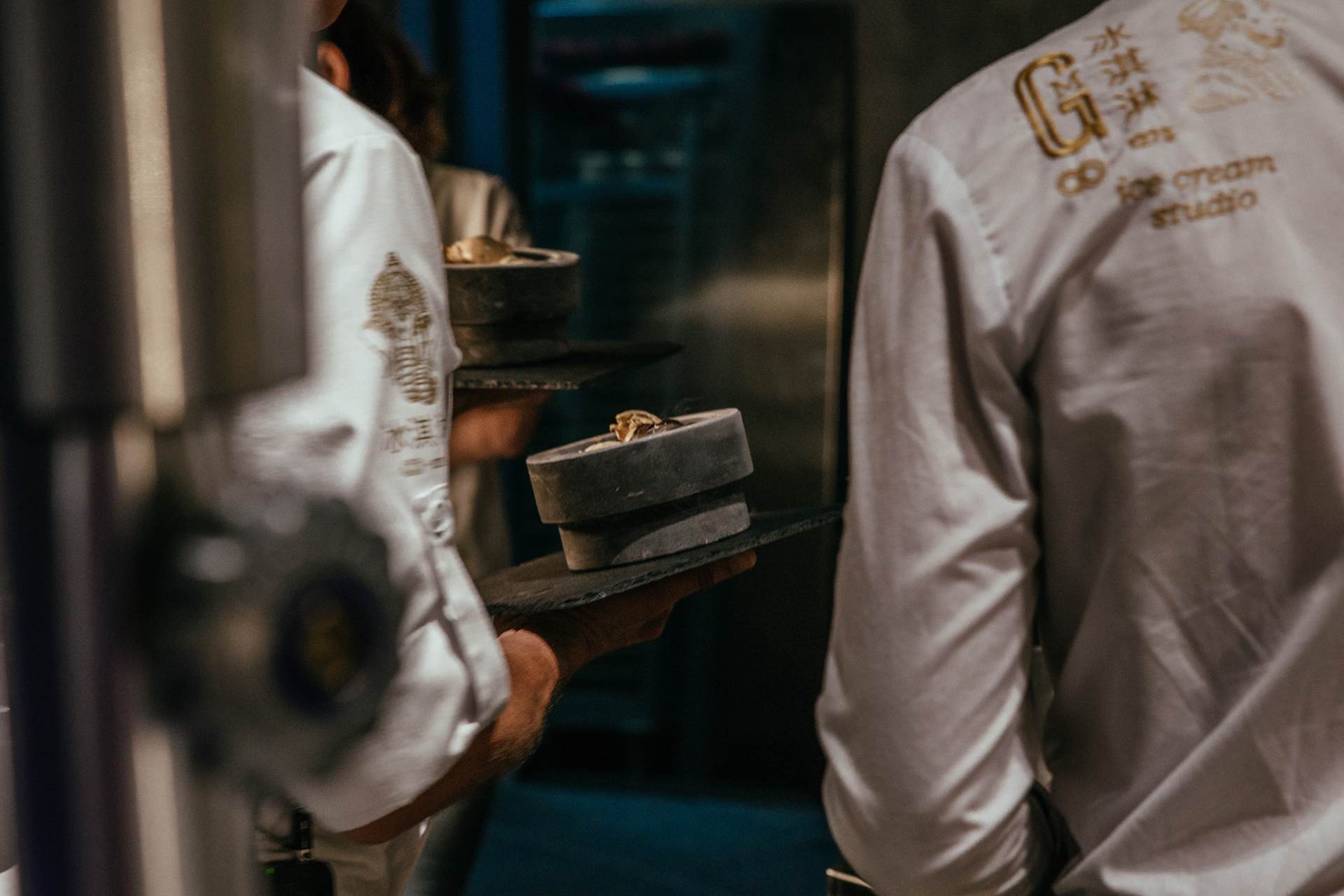
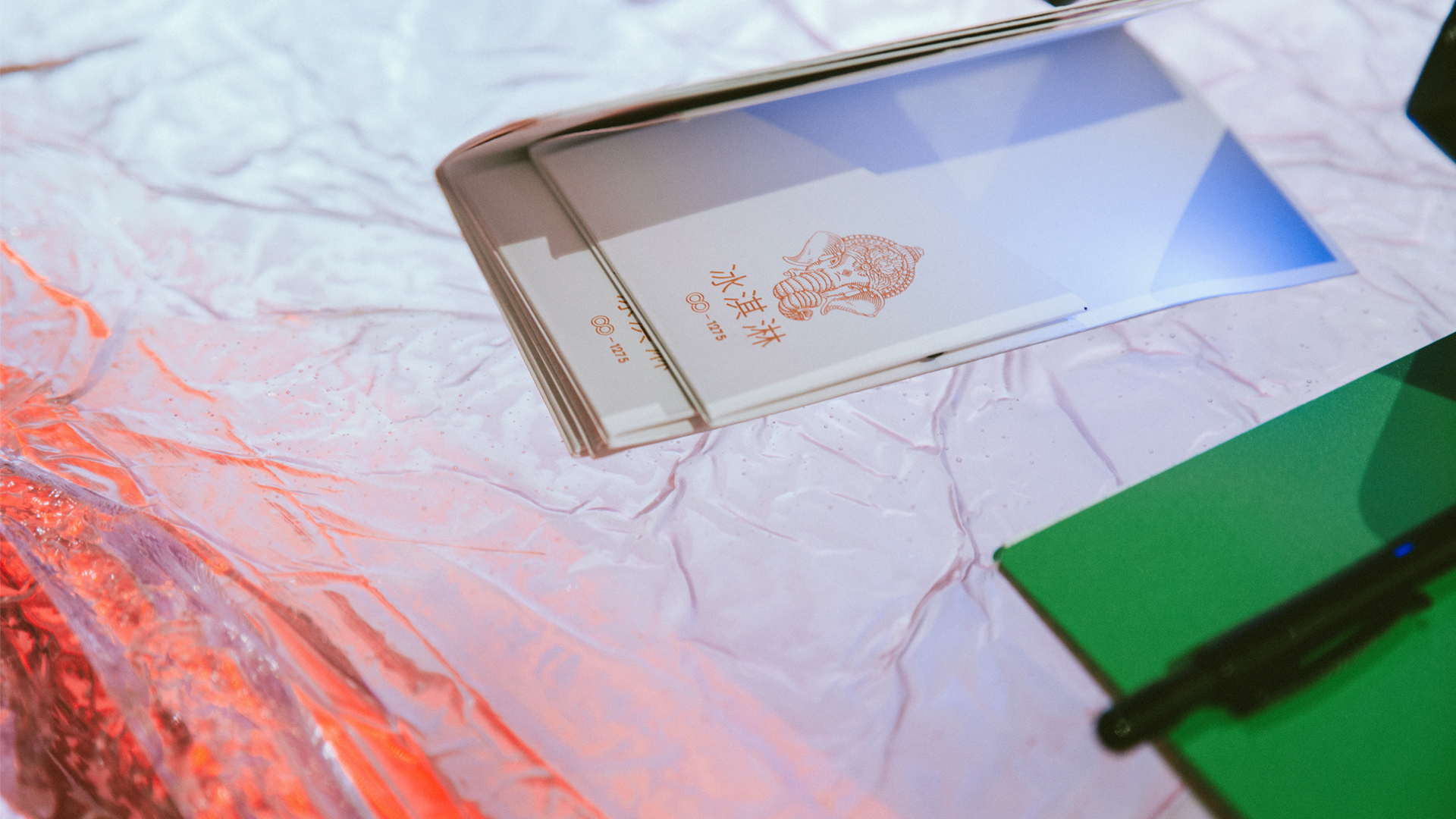
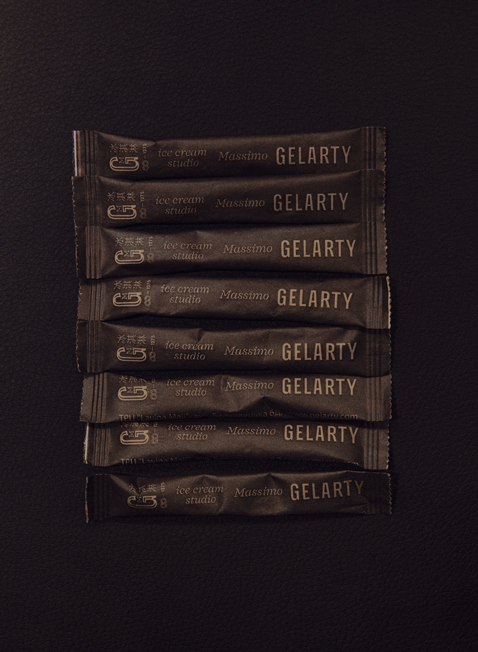
In Gelarty's visual identity system, we used the traditional graphic elements of three cultures: Chinese, Sinhalese, and Italian. In the contour of the logo, we combined the shape of an ancient coat of arms and a mixer bowl. We applied variative identity with the graphic elements to all attributes: from the menu to the compliment sweets.