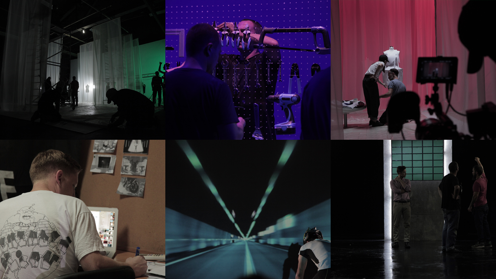
Infinitely Forward

LENOVO
  • Communication
  • Design
  • Strategy

Lenovo is the largest manufacturer of personal computers and other electronics with a 20% share of the global market. But despite the leadership position in the Ukrainian market, consumers had stereotypes that it was “cheap” and “Chinese” in a bad sense of the word.
The trail of this reputation did not allow consumers to notice the main thing: Lenovo is a progressive brand that creates truly innovative products. A tablet with a built-in projector, a transformer with a removable keyboard, and a graphic tablet—this is how a revolutionary thinks, not an imitator. Based on that, we began to build a new communication campaign.

Solution

In the race where everyone tries to copy a competitor, Lenovo dictates new rules. The innovator brand, the revolutionary brand, the dreamer brand—here is unknown from this side Lenovo, but the one it used to be forever.

It is not enough to do something distinctive once; you have to move forward every single day.

The move starts with the questions “And why not?”, “What if?”, “Who said that it was impossible?”. New views. Fresh ideas. The task is not to make a one more home button, but to create an entirely new experience for its customers.

Lenovo does not imitate. Lenovo sets new rules. Herein the new communication platform of the new Lenovo has been created—“Infinitely forward.”

Communication Design

The second, but no less important step after the communication strategy was to create a design system. We faced the fact that all Lenovo materials were of a different nature and were not the same. The system was needed.

The new brand mood should have been felt through business cards, through leaflets, on the website, in handouts, and even on social media. The task was to create a whole visual world for the new Lenovo communication. And we created that world.

The new classic typeface with four different styles.

Text blocks are arranged in a way to create the feeling of constant movement. Infinitely forward.

Letter L is the core of identity system. It defines the position of all design elements.

The main color is red. We combined it with other colors to get complementary tones.

Lenovo products are the key elements of a communication design. They are the focus of any visual, defining the color.

With a new communication design, Lenovo has become more serious, stronger in messages, and bold in the visual style.

Absolutely everything related to Lenovo now reveals and complements each other. Two key brand statements permeate through all communication: innovations and the constant progress.