WOMAN INSIGHT
  • Communication
  • Design
  • Naming
  • Strategy

In 2008 Svitlana Kerimova founded the first center of family sex education. It was called Love Is, and Svitlana developed and conducted each course there personally. Gradually, the center team has grown to 25 teachers; branches were opened in Moscow and Odesa. By 2016, it became clear that the existing business model no longer provided growth.

Svitlana dreamed of opening a center branch in all civilized countries. We needed to turn a small local chain into an international brand understandable to women all over the world.

Solution

Women’s communities are a delicate area. We appealed to those who had already been trained at the center. It turned out that, apart from the knowledge for which they came, one of the best impressions was the atmosphere. This was the place where the woman was given due attention, supported and helped to find herself. So we came up with the idea of a new brand model, the women’s development club. We developed the club’s rules, where the most important message was “Don’t be afraid to open up.” The club is a place for women and about women, where the coaches are primarily friends, and they are always on your side. Each participant became a member of the global community and could find like-minded women in any country in the world: it was enough to come to the club’s local branch.


Naming

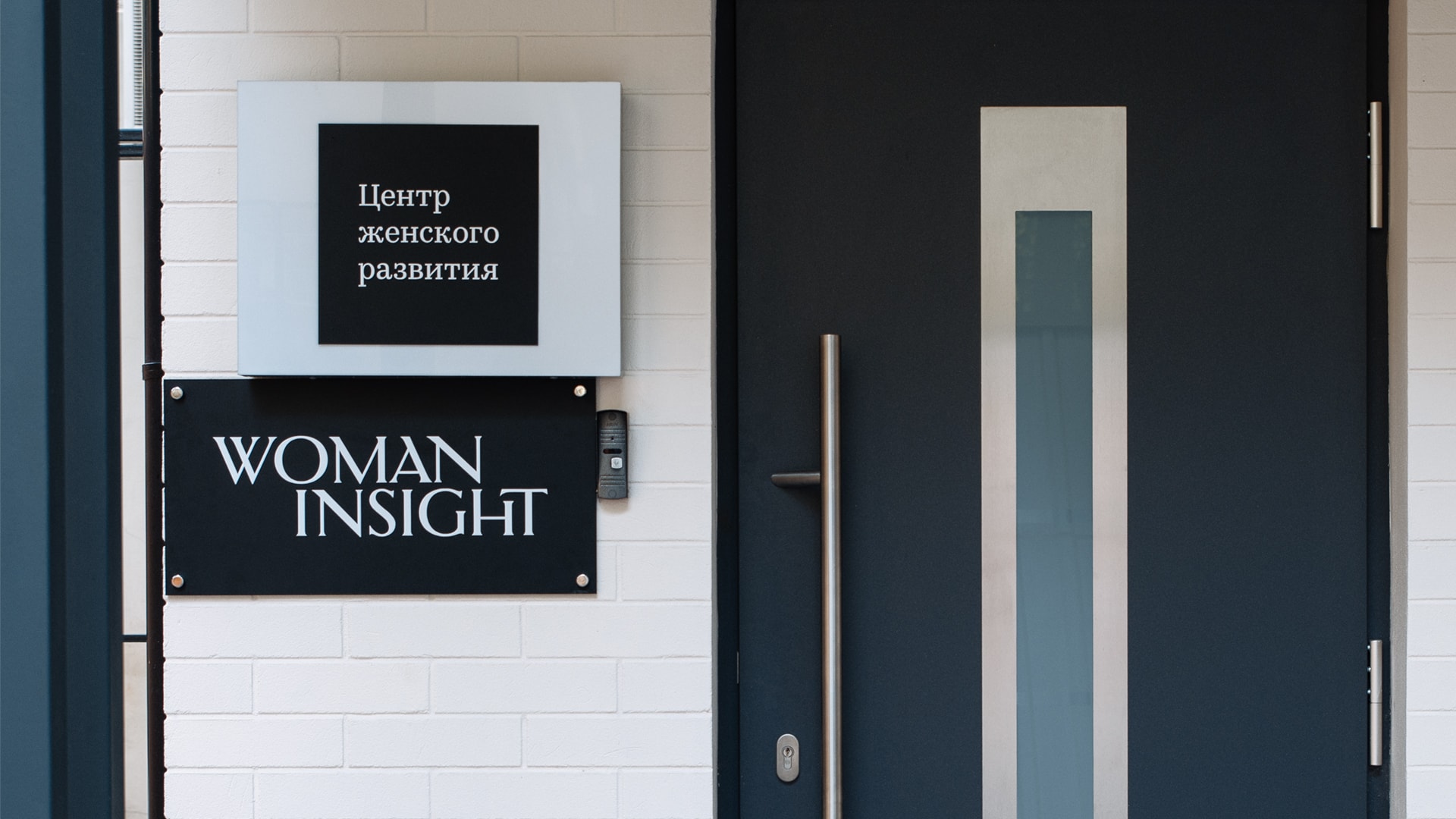
The logical first step in rebranding was to change the name. The annoying connection with chewing gum did not contribute to the ambitious goal of the founder. So we were looking for a simple but powerful solution. Woman Insight turned out to be just that name—so accurate that it seemed as if it had always been.

Design

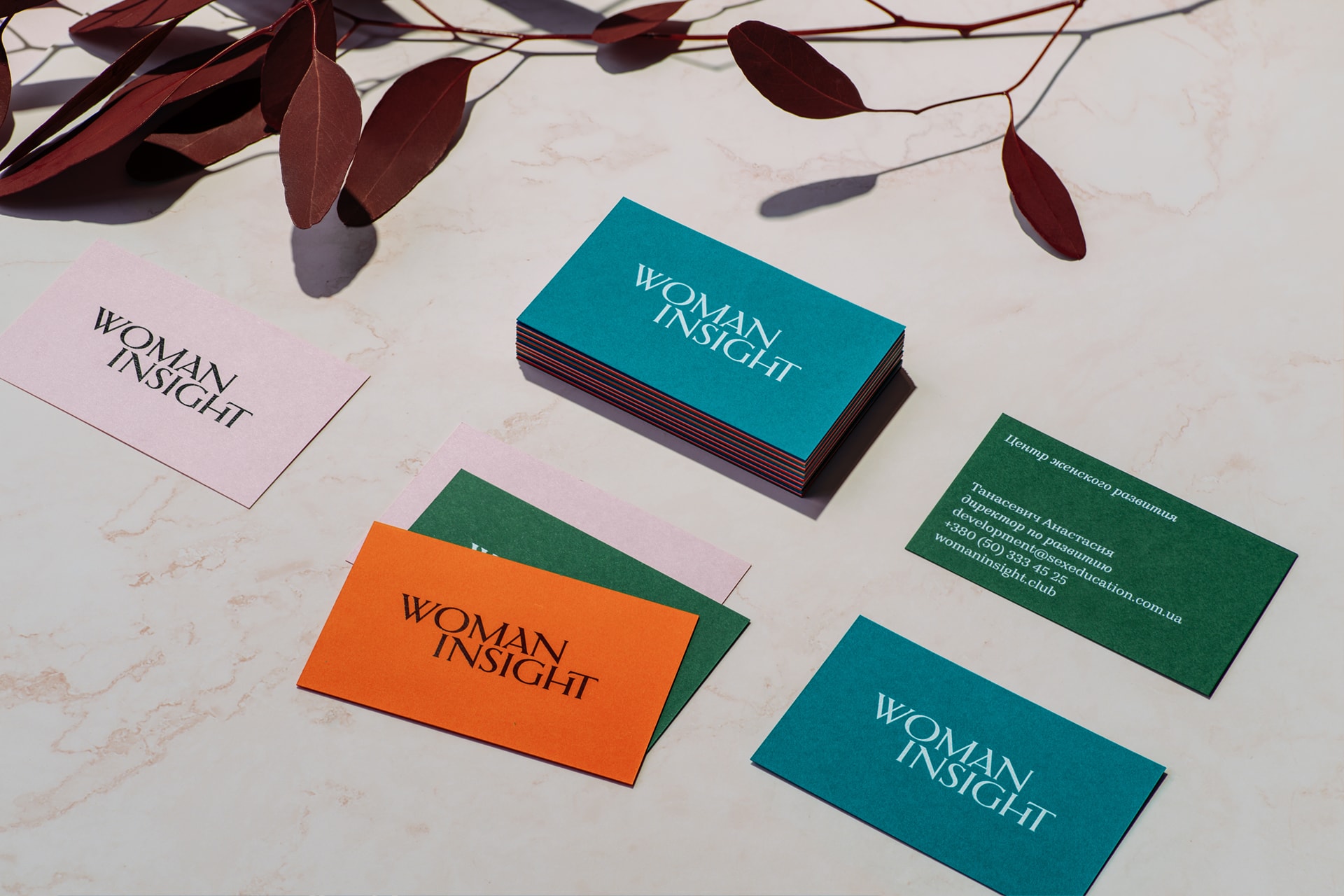
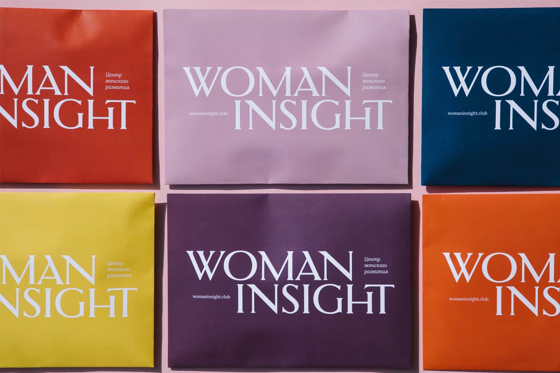
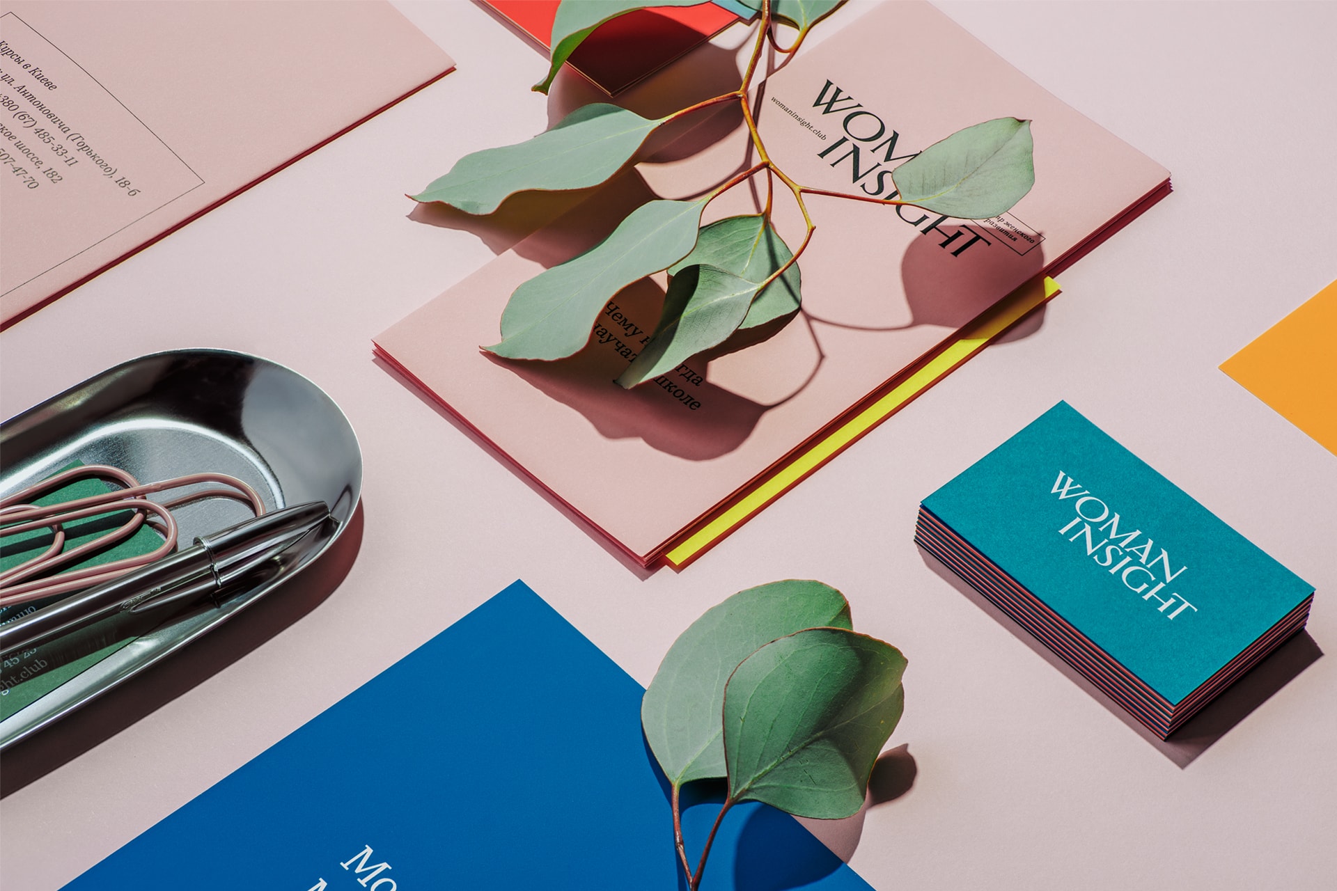
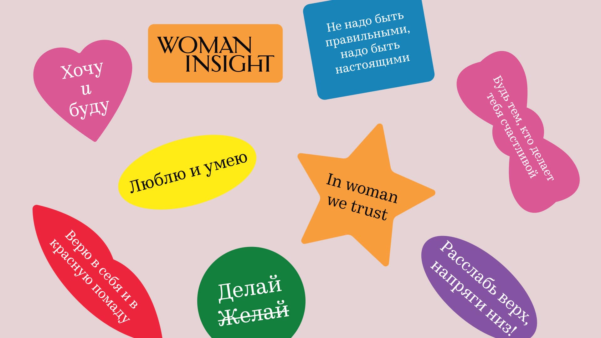
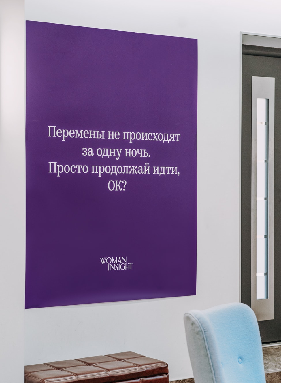
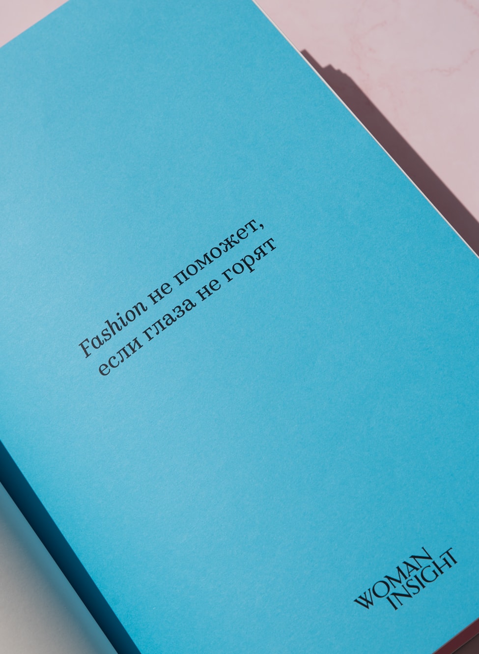
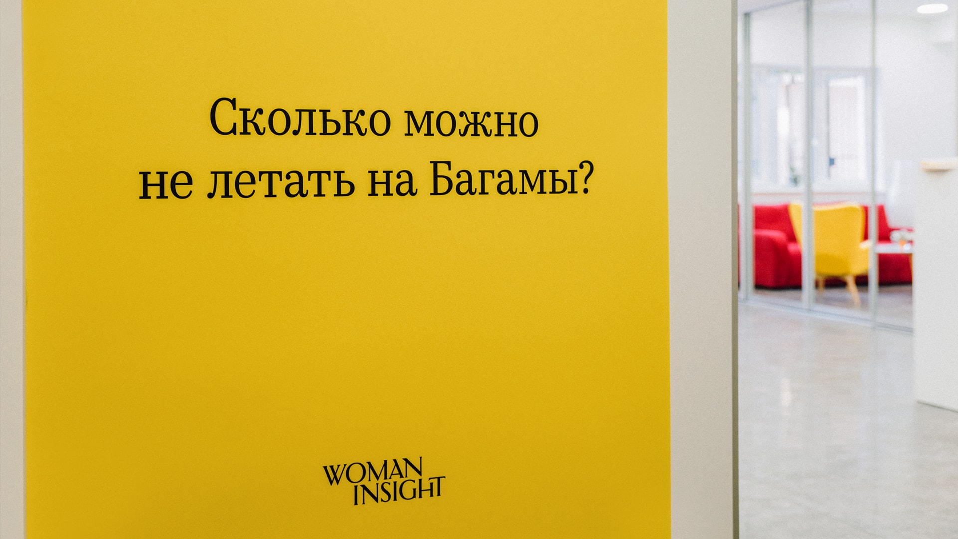
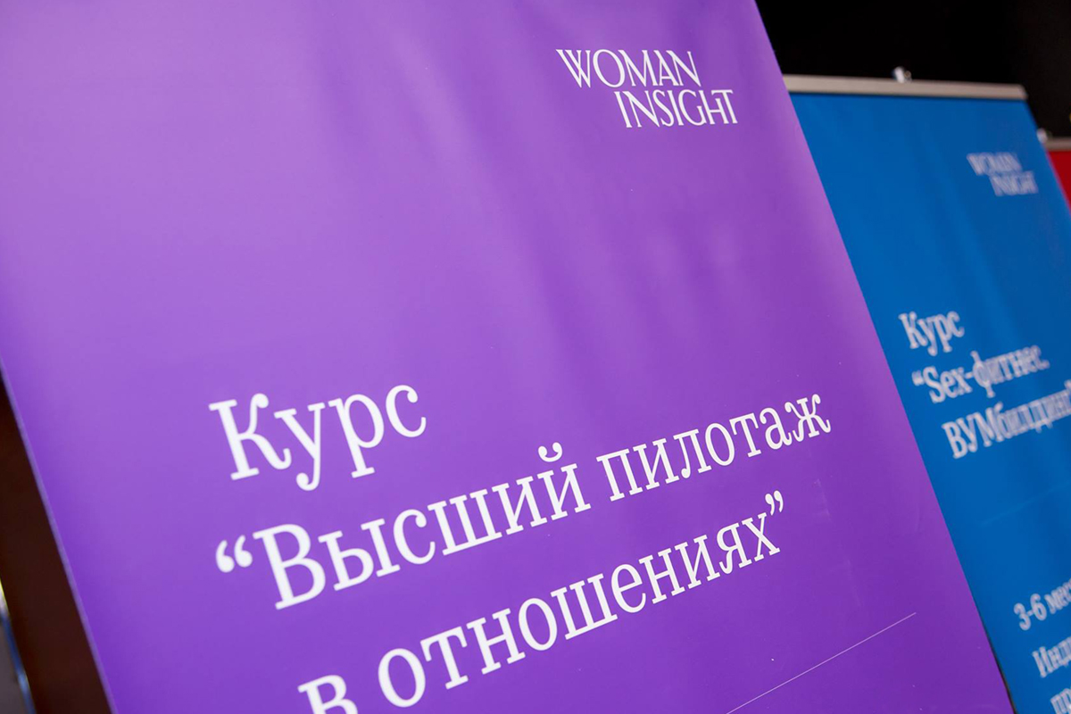
Inspired by an expensive women’s gloss, we developed a vivid visual system. The style is based on the image from the cover of a magazine—openness, beauty, self-confidence. The logo was made strict and universal, and the most viable in different media due to the simplicity and flexibility of working with font blocks. We studied the methodology of the centers and picked up seven strong colors, so as not to become attached to one color, and to give more freedom. We obtained a visually pleasing, aesthetic style, what is called “eye candy.” This style in itself dictates the mood, its task is to encourage, inspire, and instill confidence.

Launch

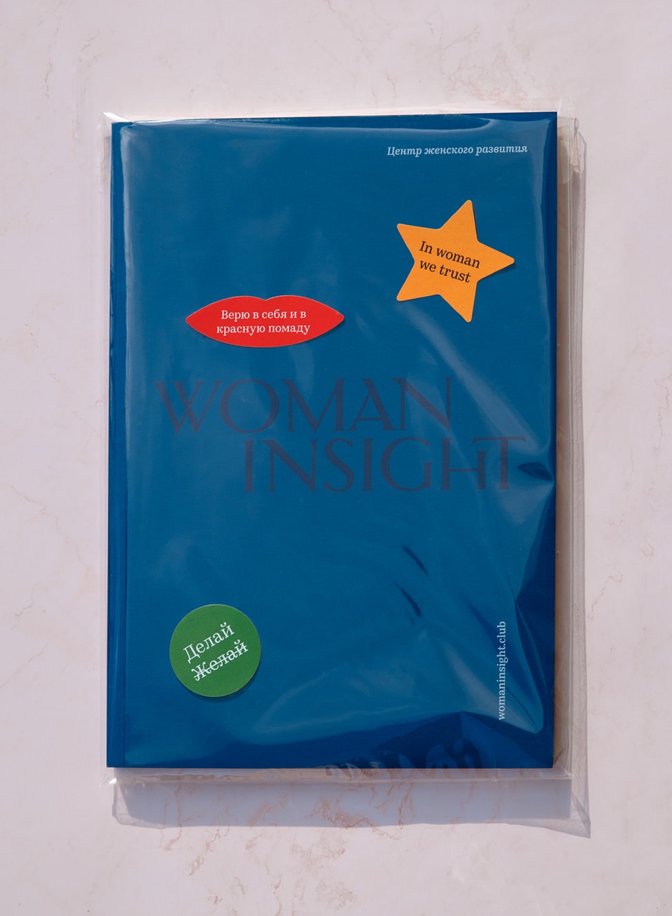
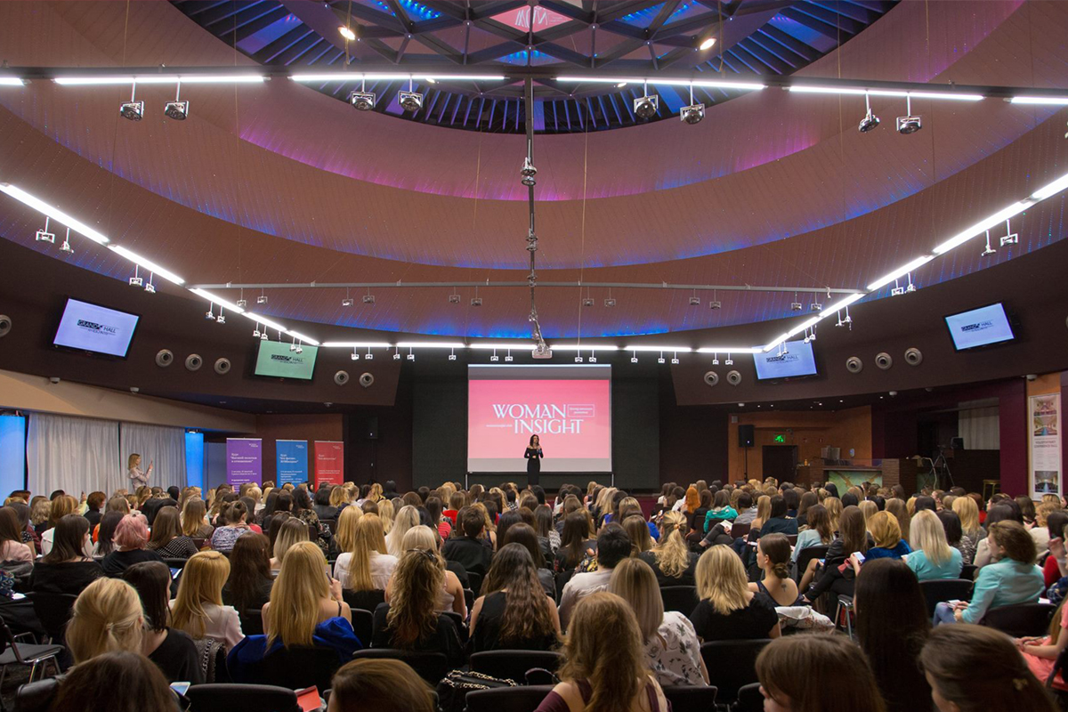
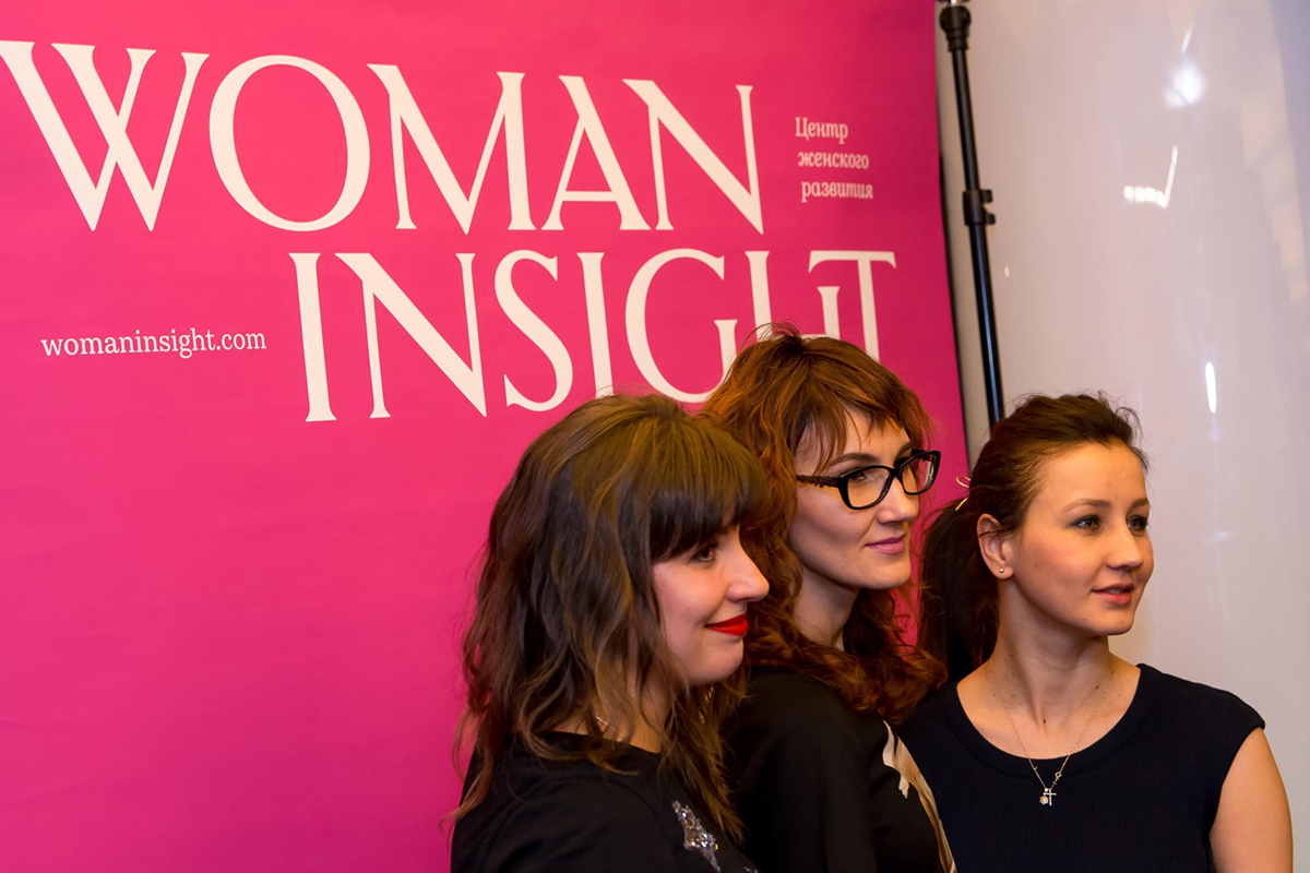
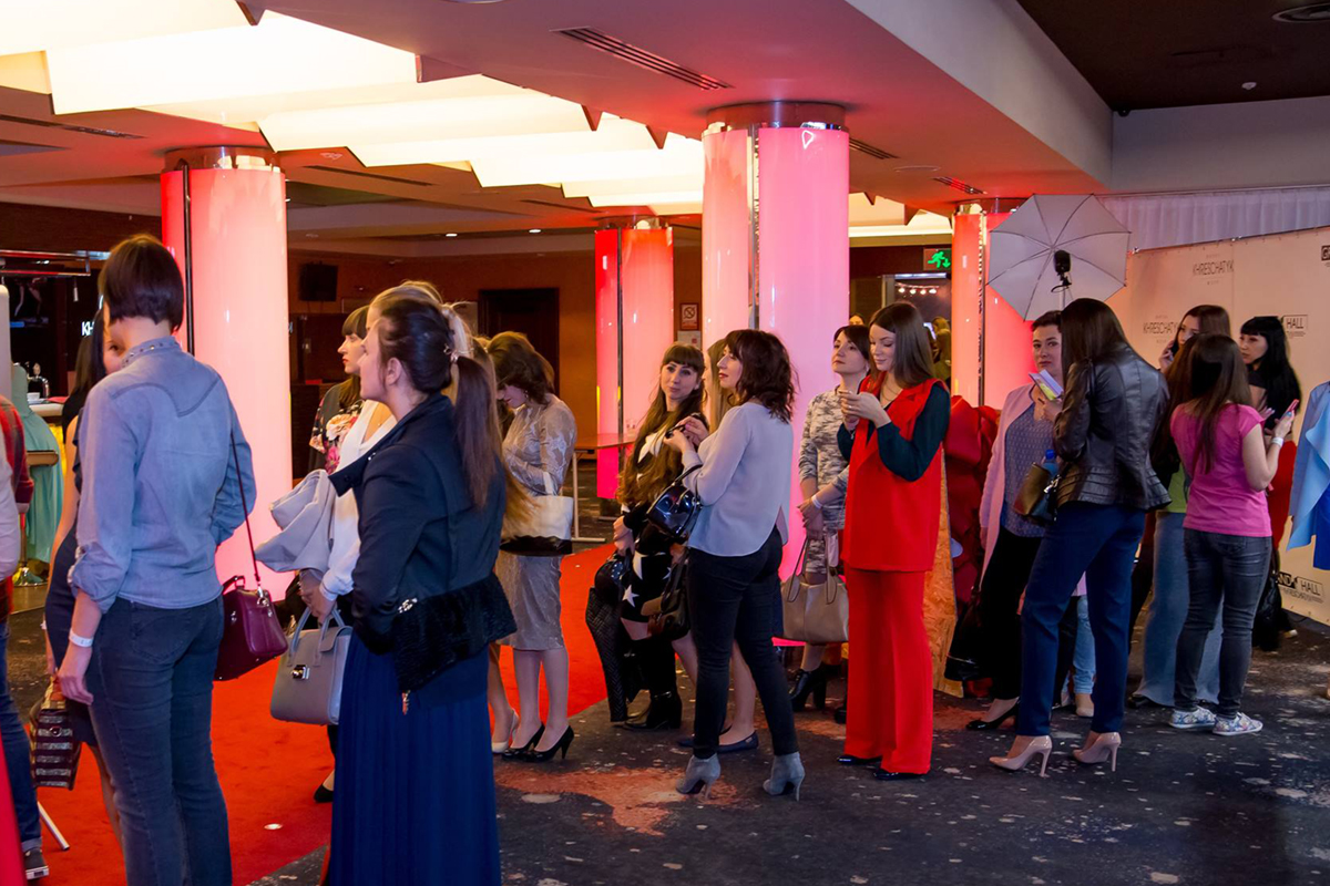
To attract attention to the rebranding of the centers, a big opening event was held at the Ukraina cinema. We shot a touching video manifesto, made a landing page for feedback, and developed a set of motivational materials, souvenirs, stickers, badges of the club members and the photo zone in the form of a cover of a glossy magazine, which instantly won the social media.