New avenues
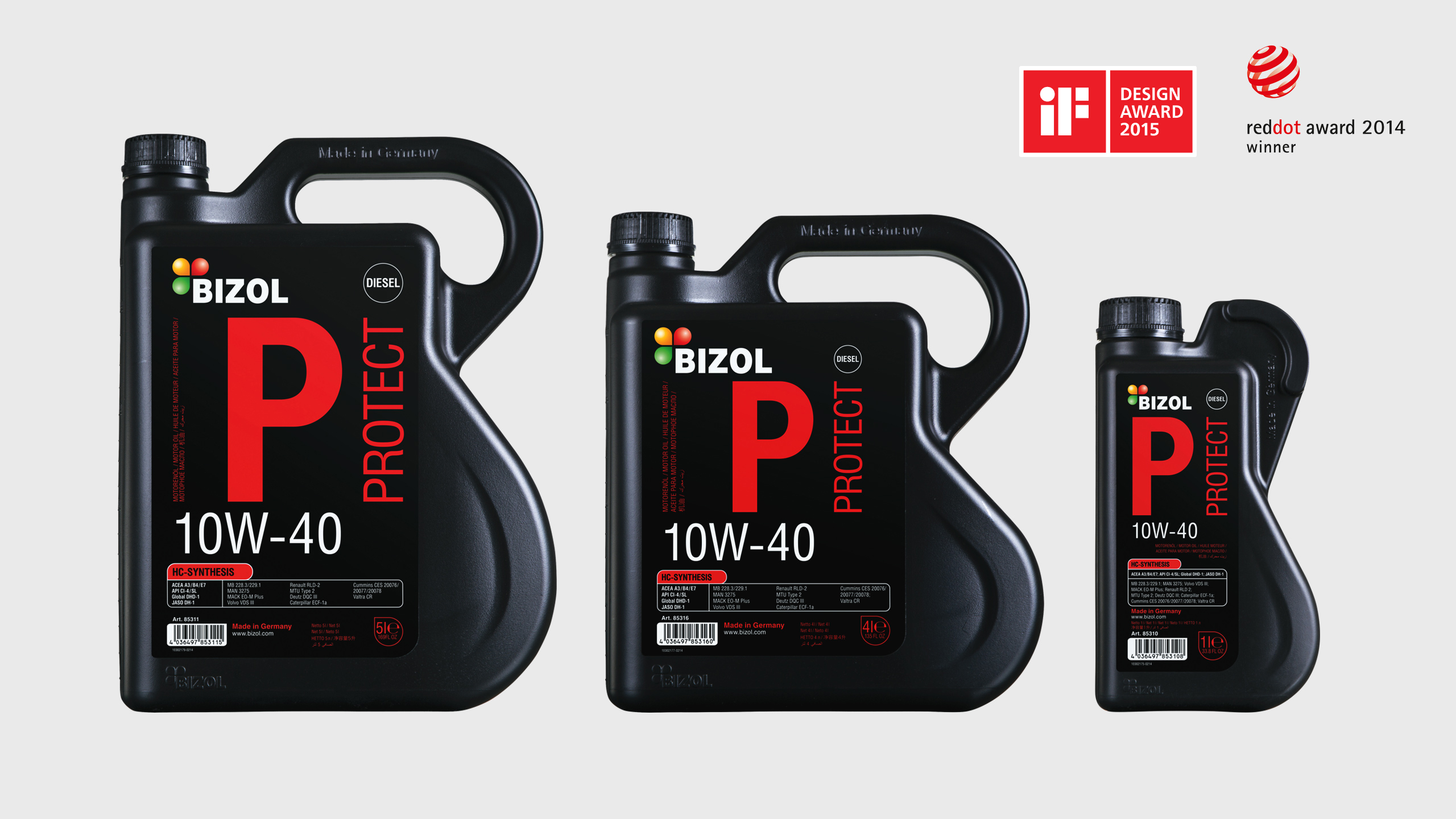
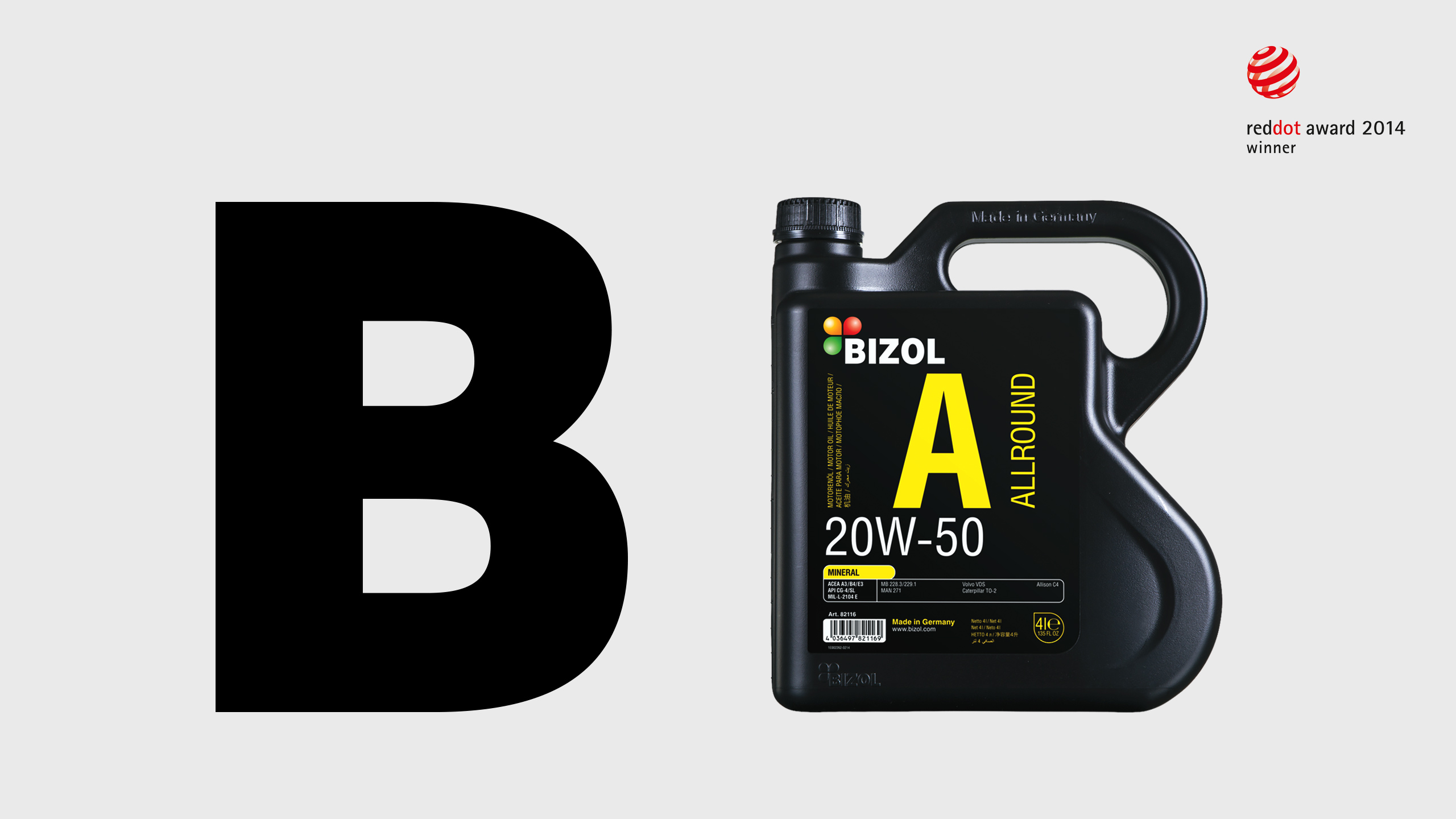
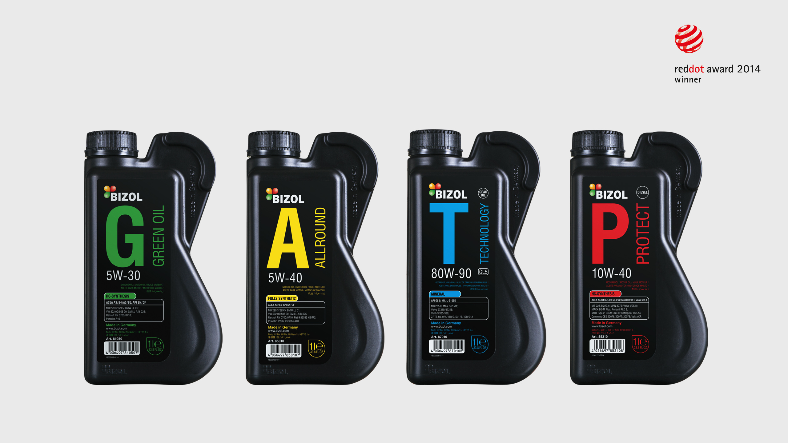
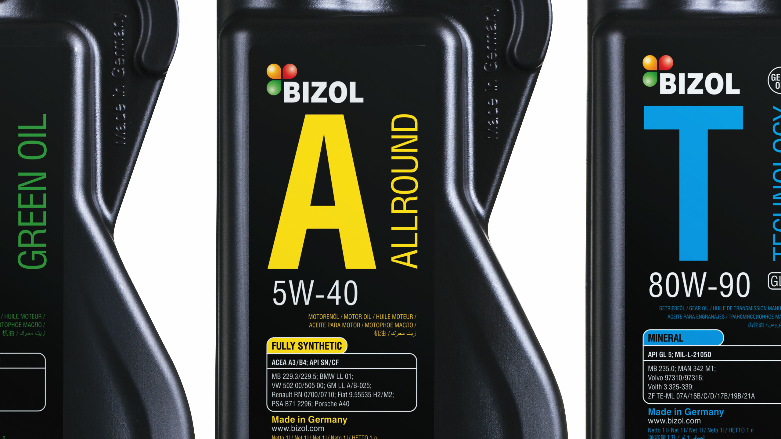
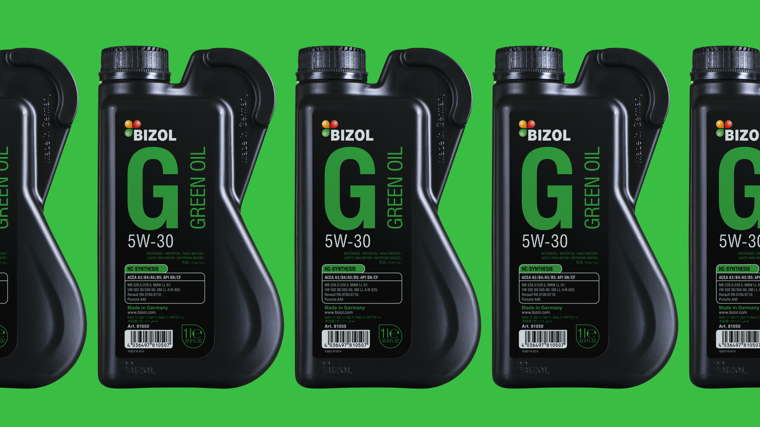
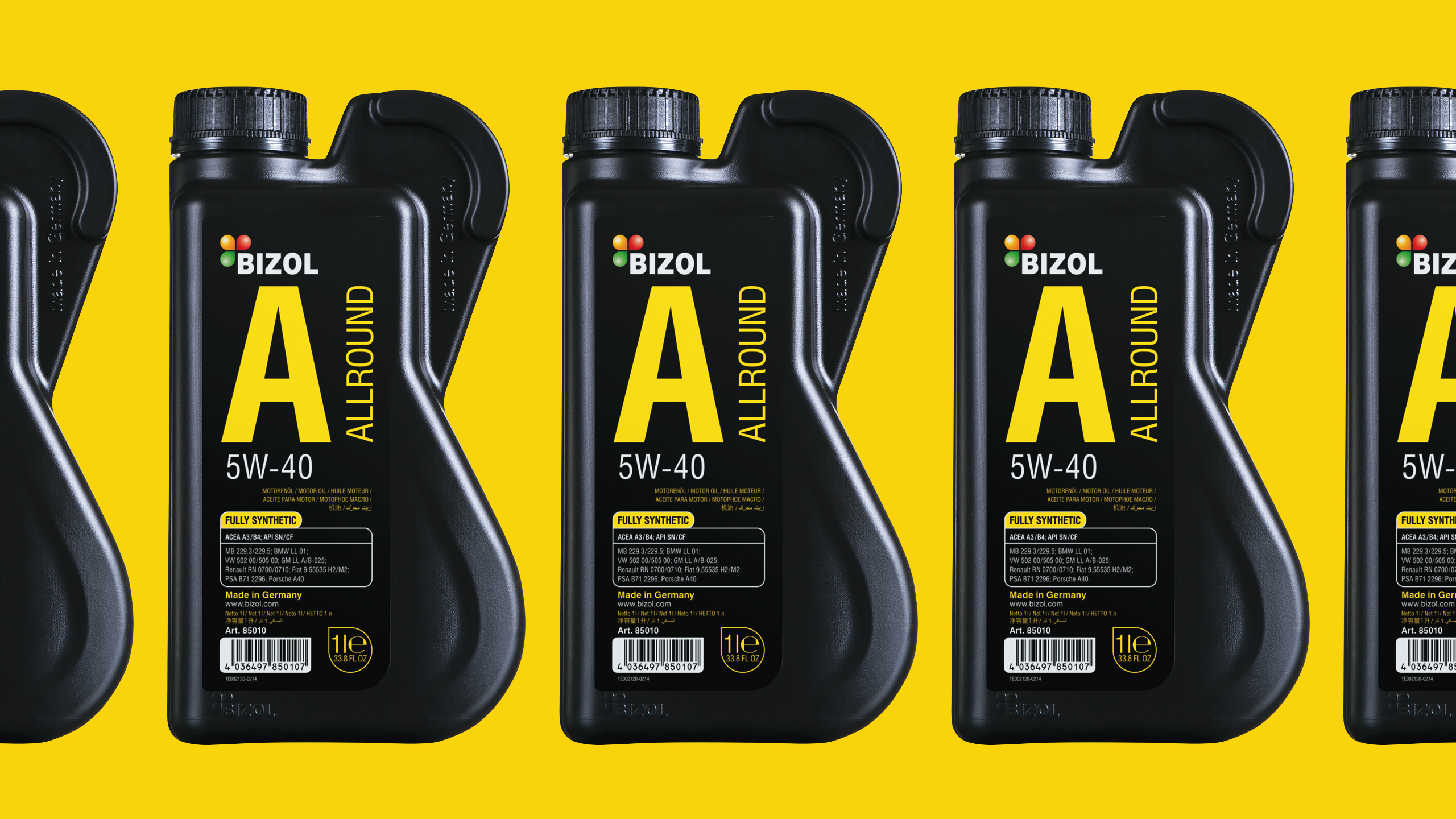
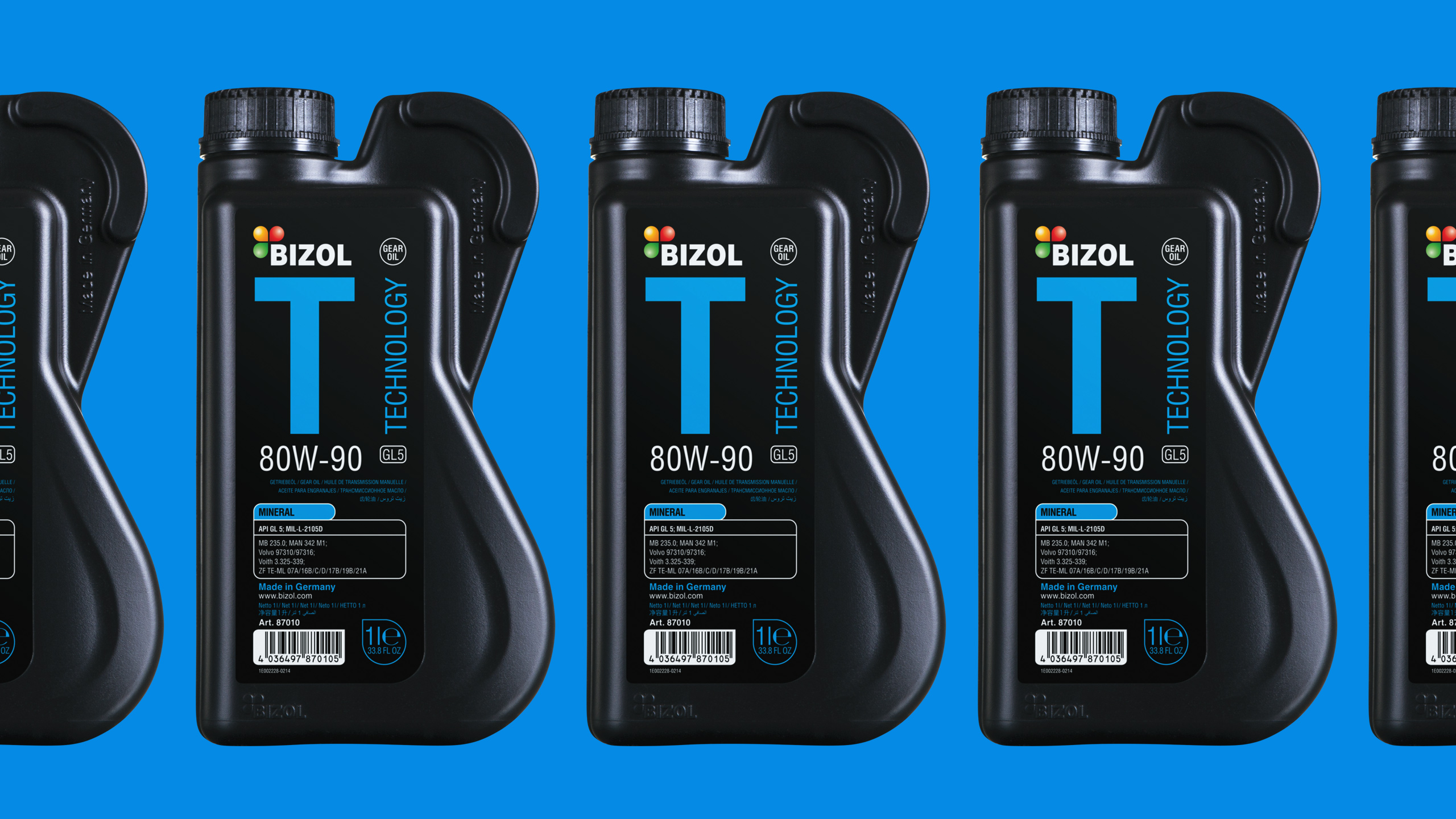
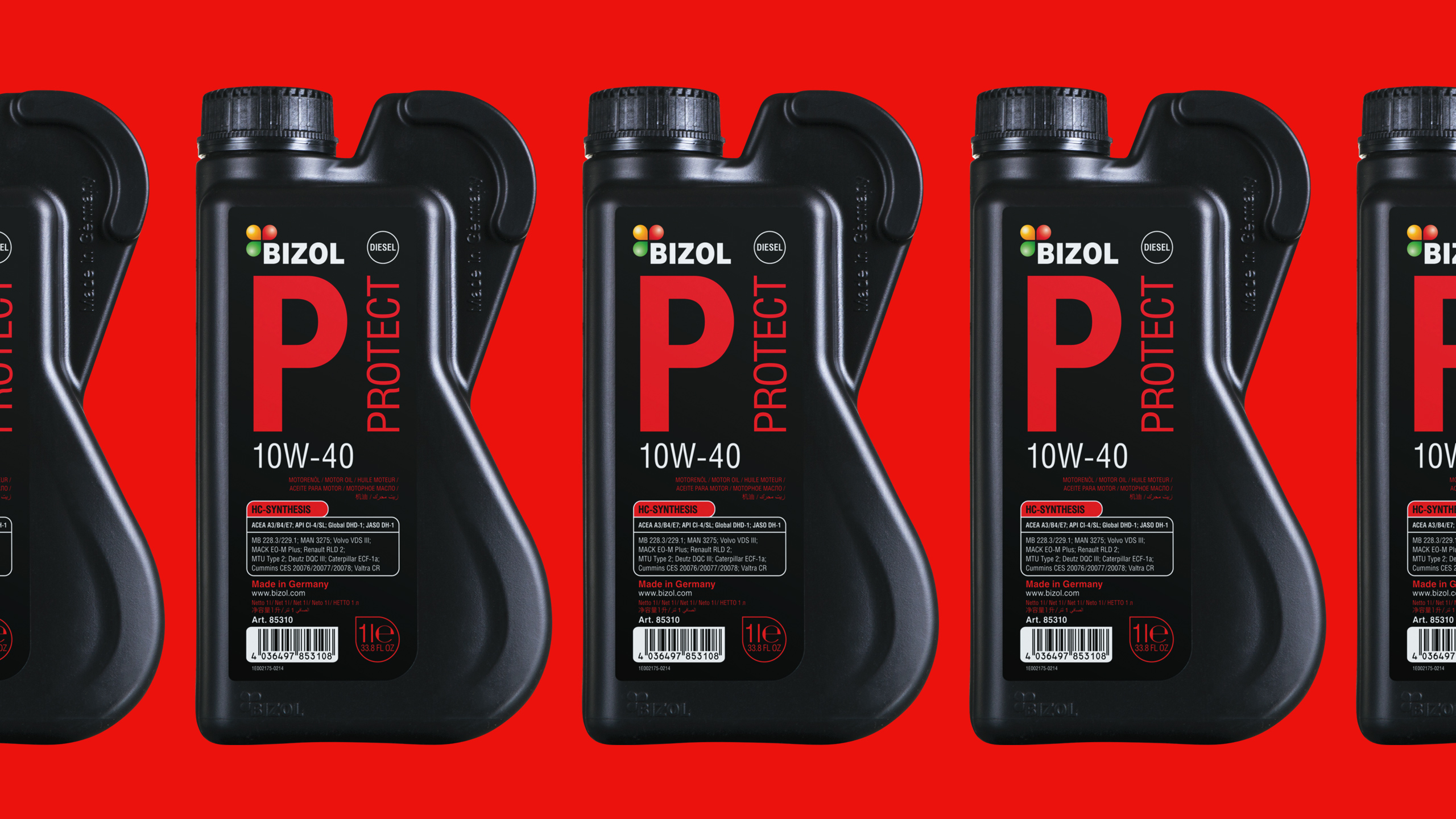
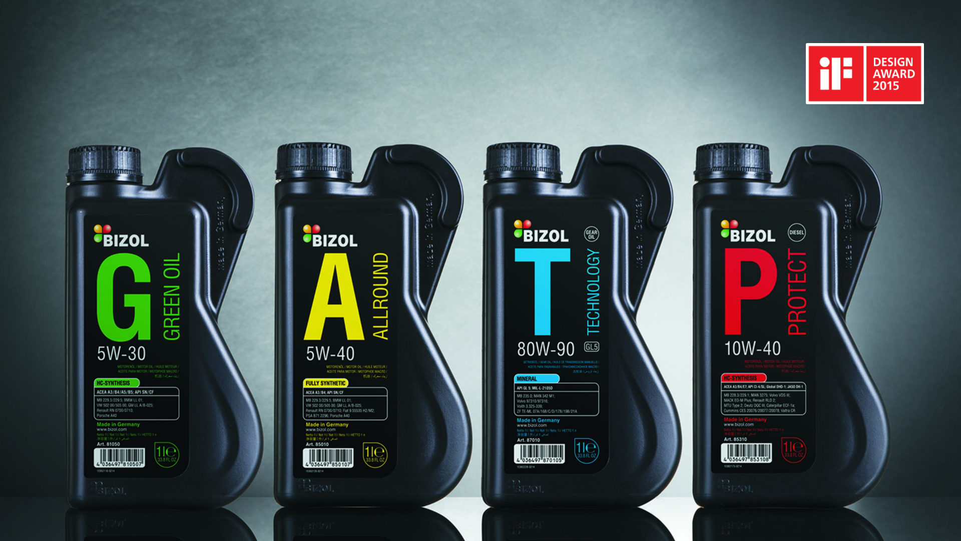
In 2008, we worked out Bizol logo, and in 2014, came up with the new packaging for the whole range of motor oils. Emphasizing brand integrity, the shape of the new can resembled letter B. What is more, that designing solution enabled to overcome spills and splashing. We adopted the same letter B concept for can labels, and by adding muted color marking, made it easy and instant to distinguish oils on store shelves. Obiter, the newly designed Bizol cans were prize-winning at Red Dot Design Award.
