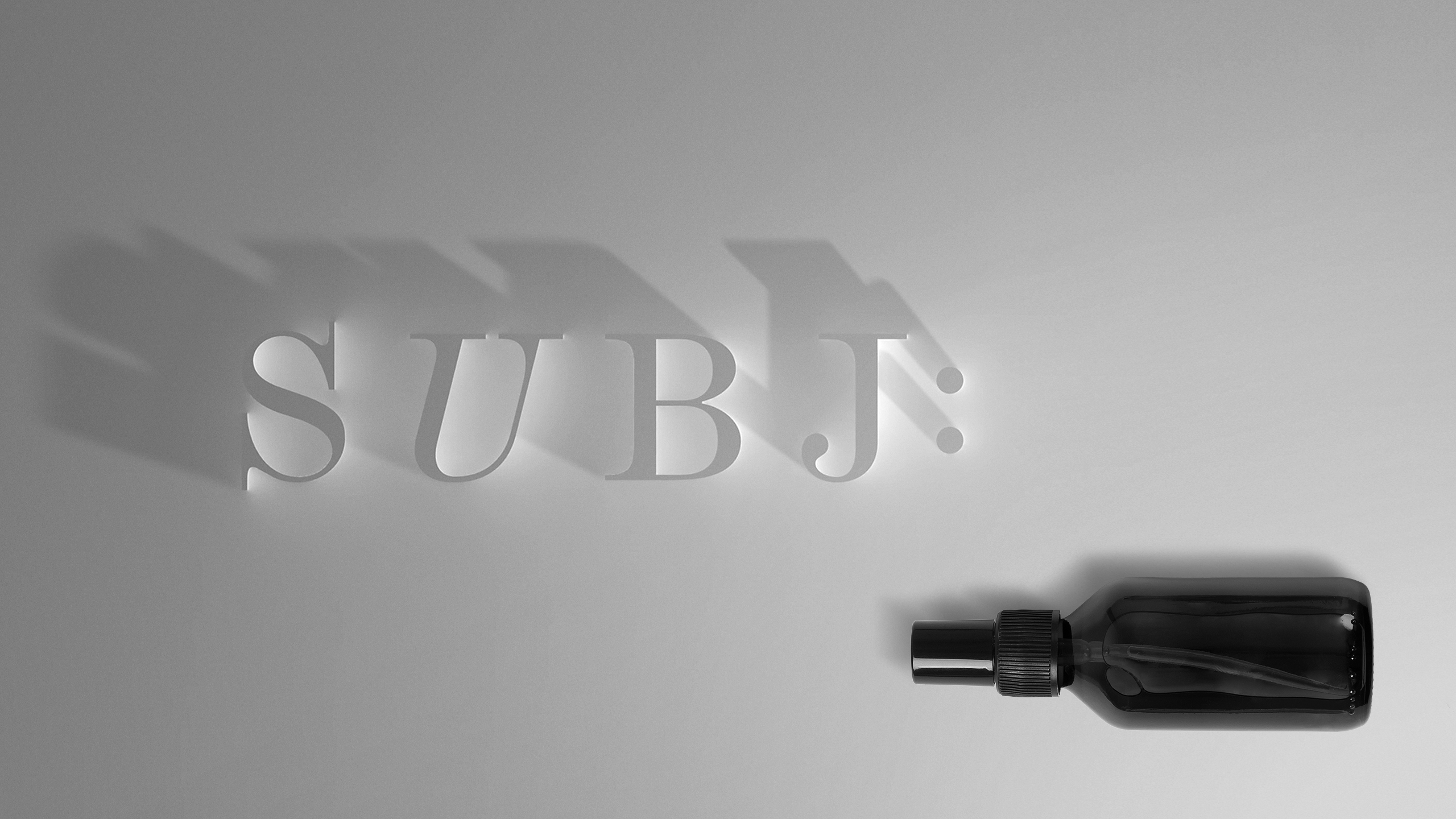
Subj:
- Design
- Naming
Top-Cosmetics, one of Ukraine’s leaders in the beauty industry, was going to roll out a new international project. It would be a network of limited-access supermarkets for beauty professionals only: personal cards for entry to sales outlets, personal accounts for online access, over 50 brands, about 17,000 professional products, education and workshops.
Challenge
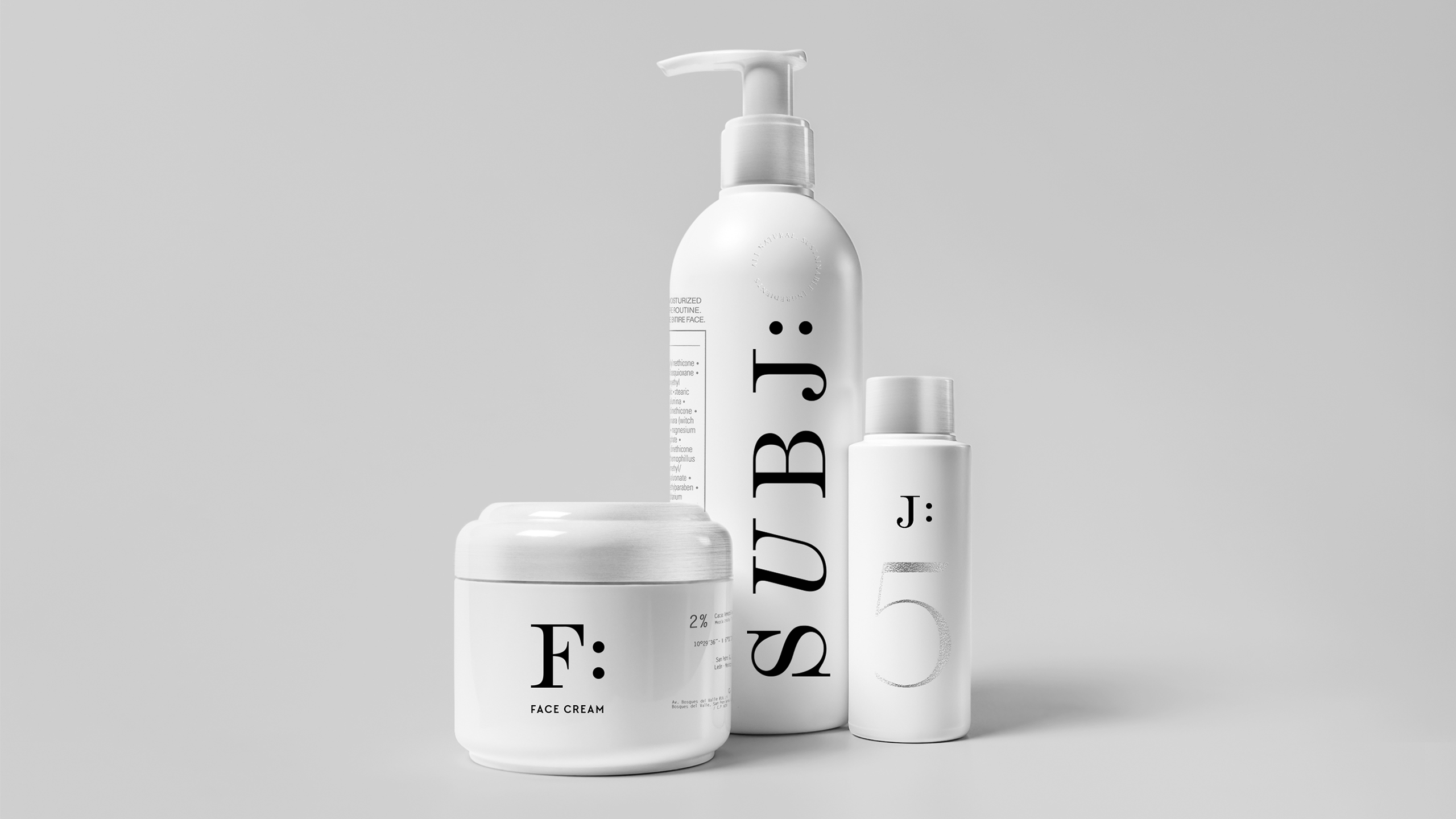
We had a task to develop the naming and visual identity for the project. The new store format and innovative services needed the functional solutions that would be off the beaten truck for a beauty industry company. The new brand was going to manufacture cosmetic products under the same trademark, so the identity should work just as well for packaging solutions.


Solution
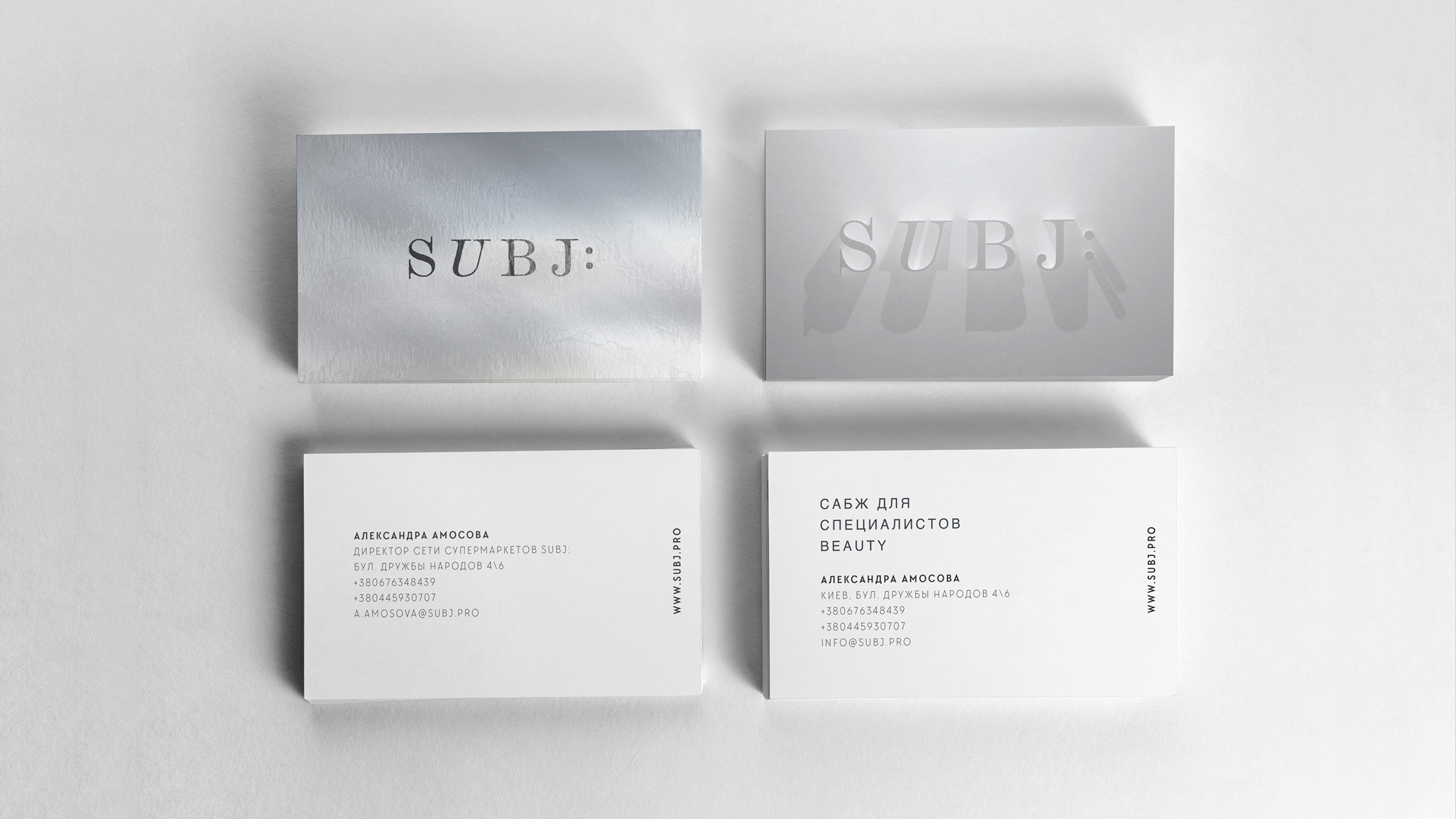
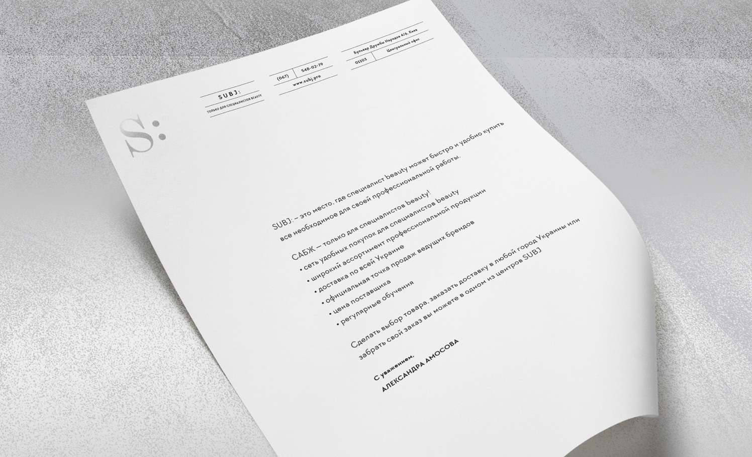
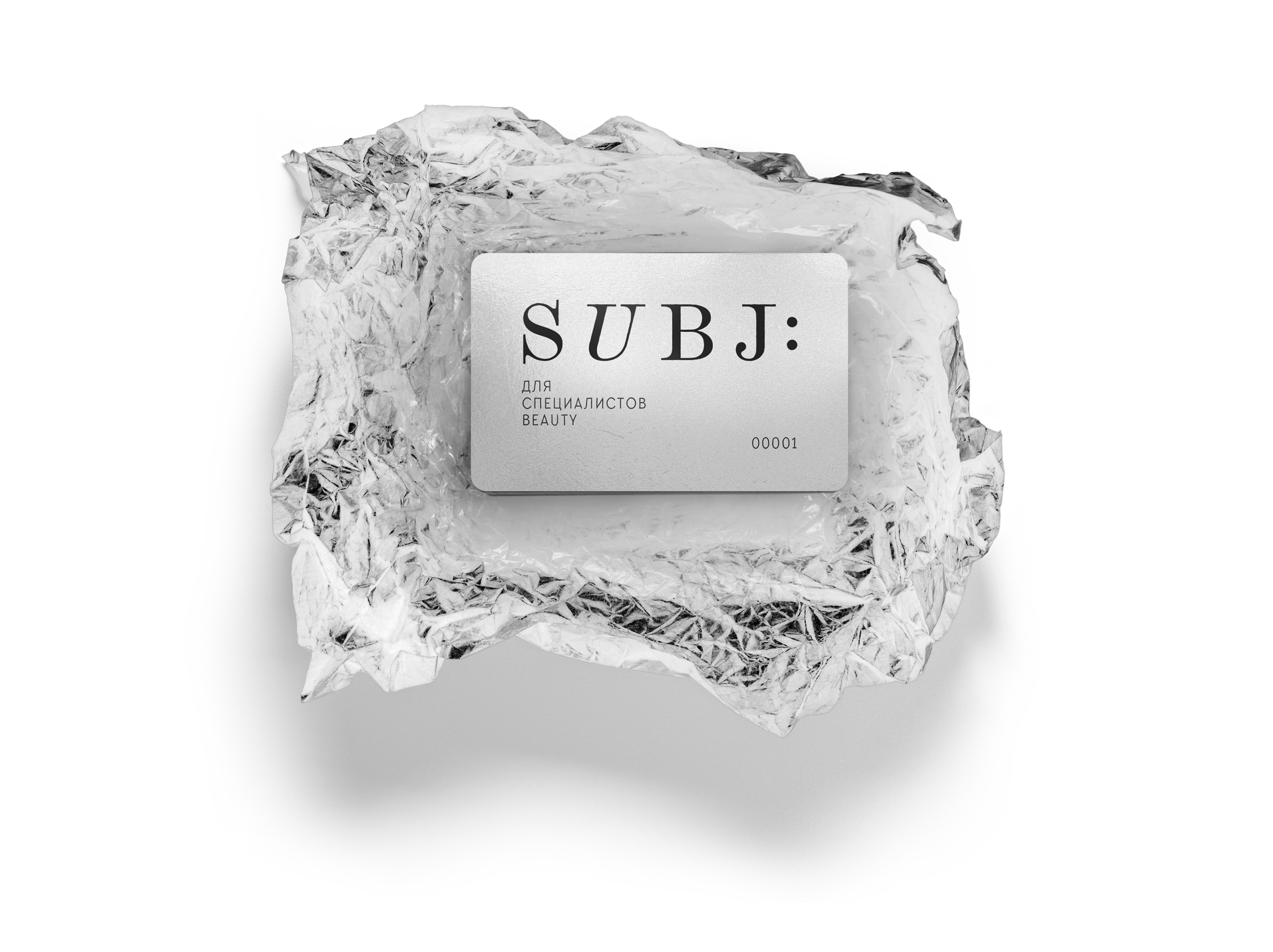
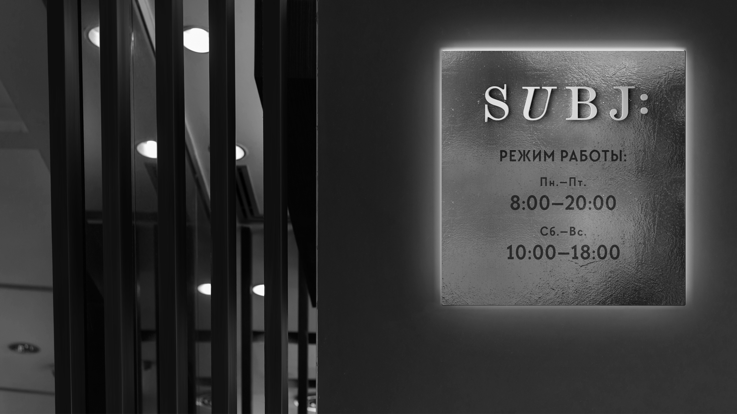
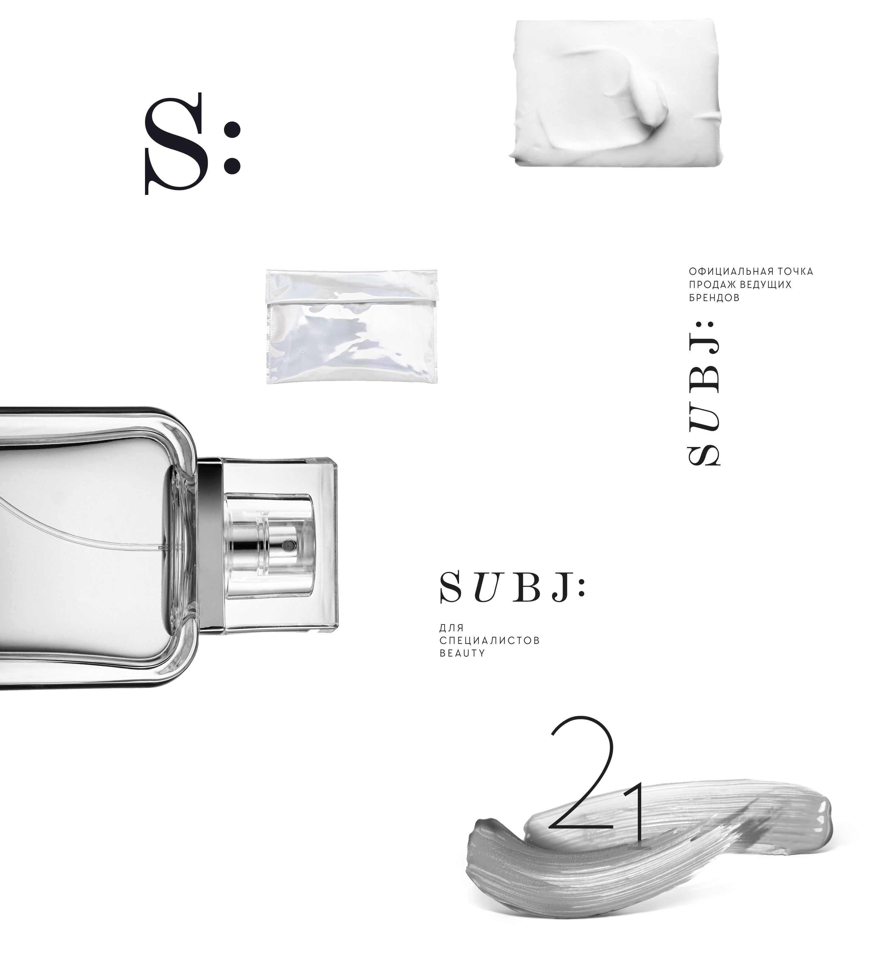
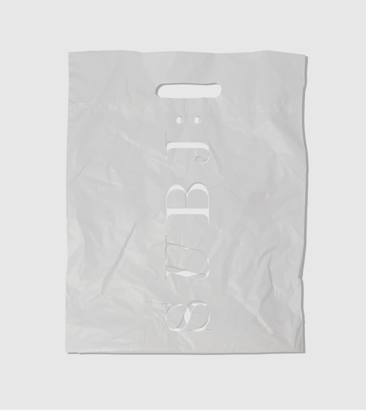
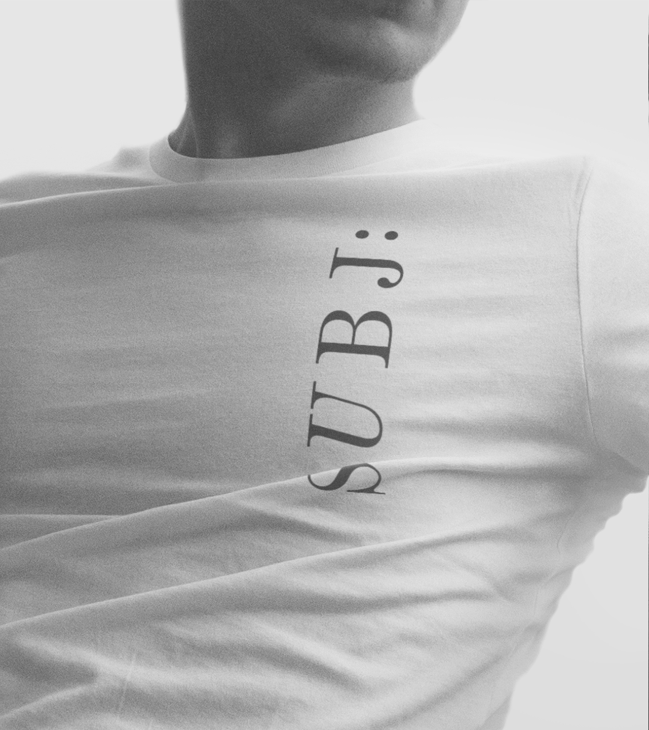
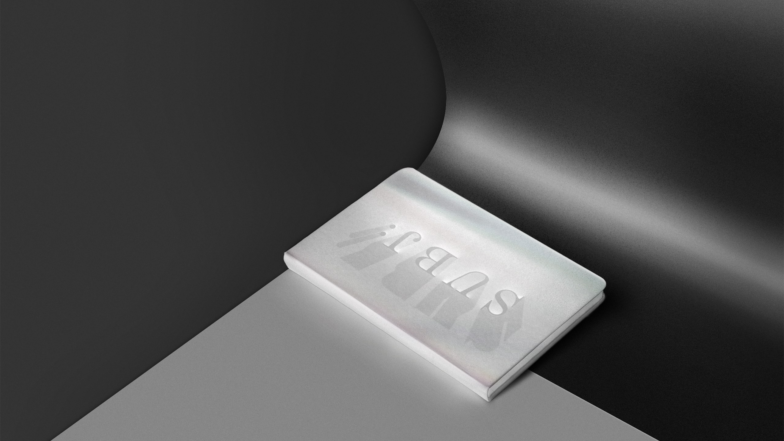
We completely turned away from standards in beauty naming. No connotations with beauty, femininity and charm, and no functional descriptions. We put the essence of the brand’s scope into its name and descriptor: Subj: for beauty experts. The underlying meaning of Subj: is «we are focused, we are always to the point, and We know the main thing — that is the essence». This is always leading-edge technologies and applicability. We put the idea of reflection into its identity. Like a mirror, Subj: reflects the brands it sells. Today, the brand explores and selects the world’s best professional products for beauty. So, the style is based on minimalist typography, white and black color combinations, and materials with metallic and reflective properties. The logo involves a restrained font solution with some specific traits of the grapheme that communicate softness and fluidity of cosmetics. We also applied a dynamic identity by using 3D letters in the logo that create a play of light and shadow. All of this produces a flow-of-time effect and softly underlines a wide selection at Subj: for beauty experts.