Solution
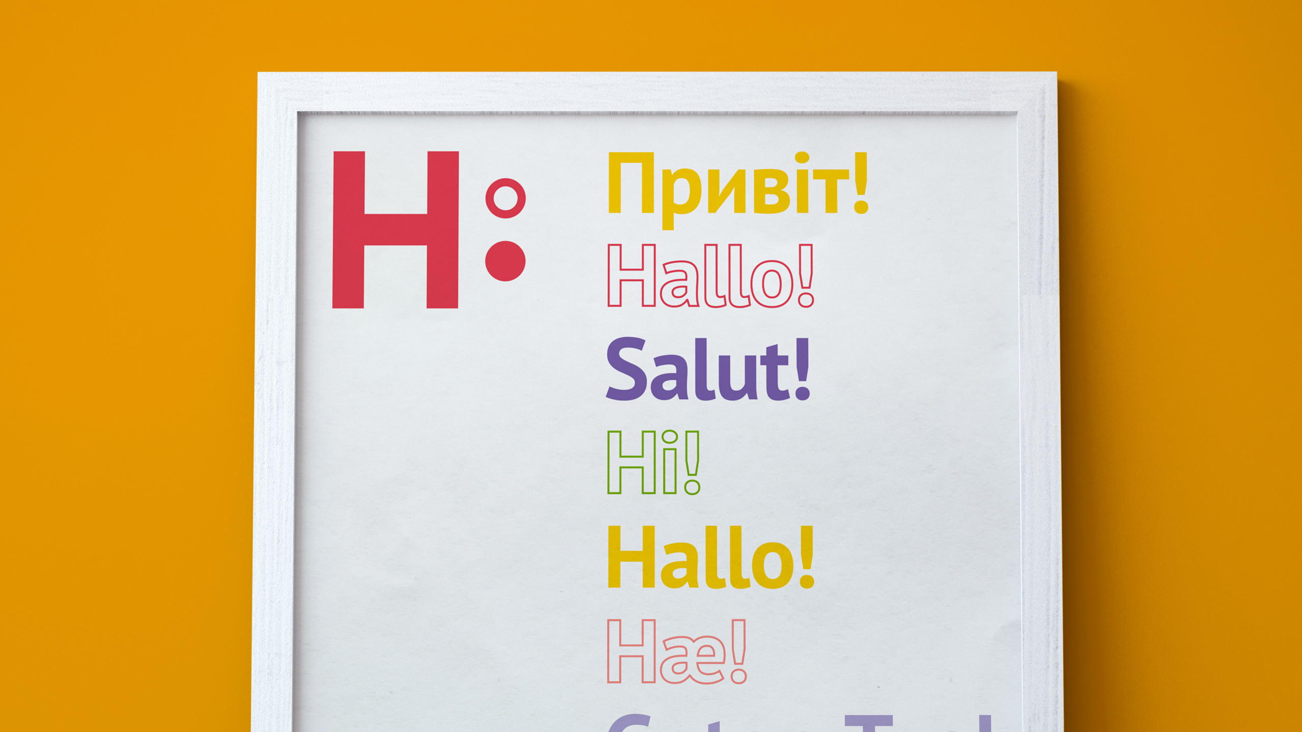
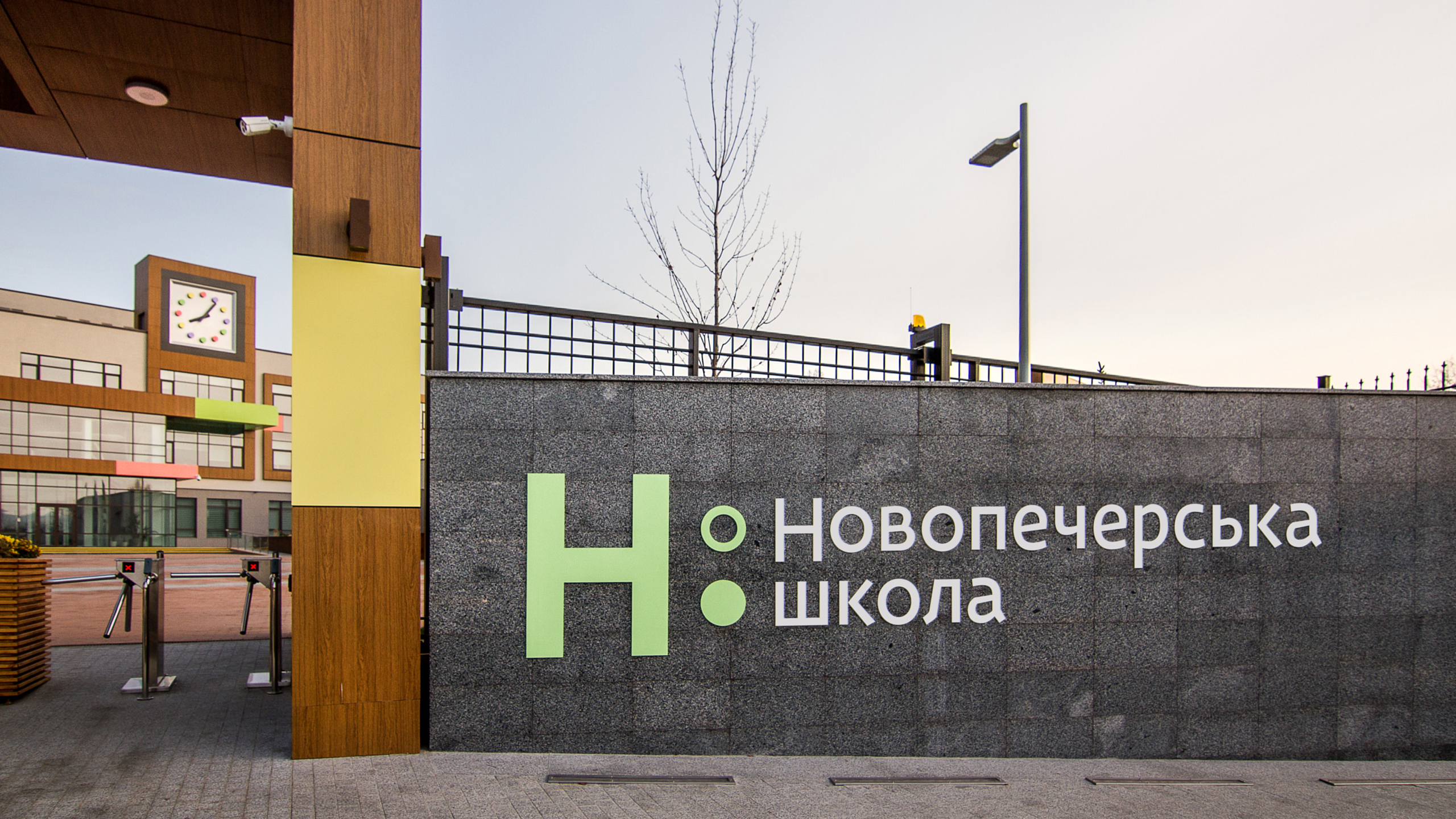
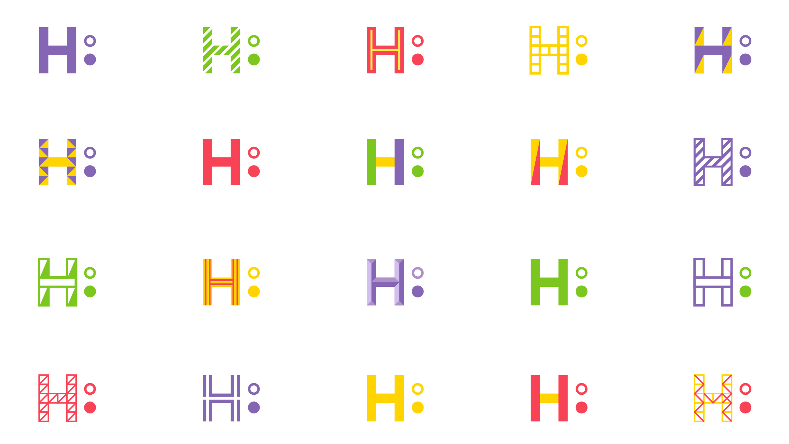
We realized that Novopechersk school is about an equal dialog between teachers and pupils. That is the idea we brought into the logo. The “N” followed by a colon stands for a dialog. Keeping in mind that dialog can have numerous edges and dimensions, we made the whole visual system flexible in color combinations and graphic elements. At that, a solid dot here symbolizes self-sufficiency and independence, and an unshaded one stands for openness.