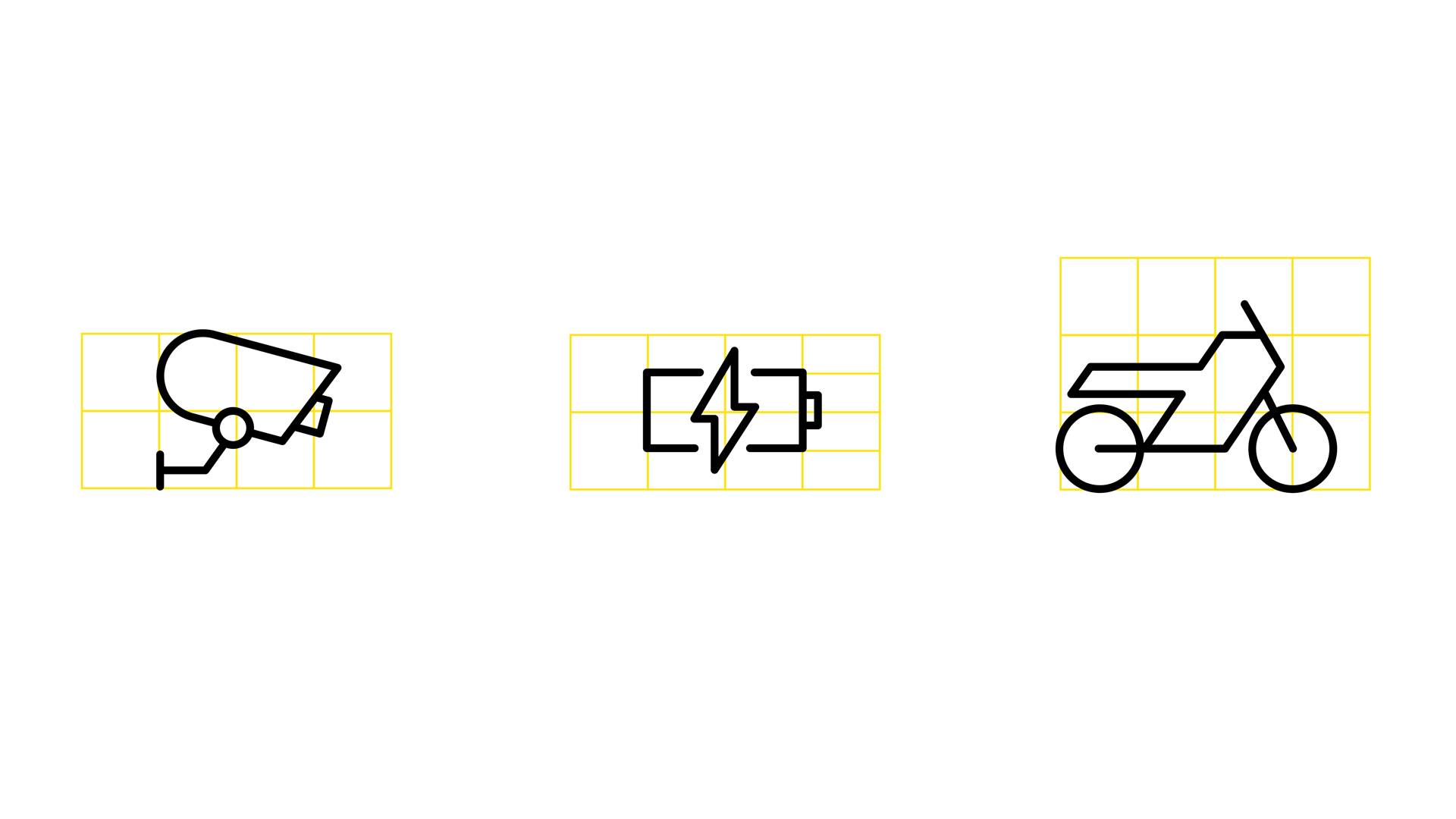
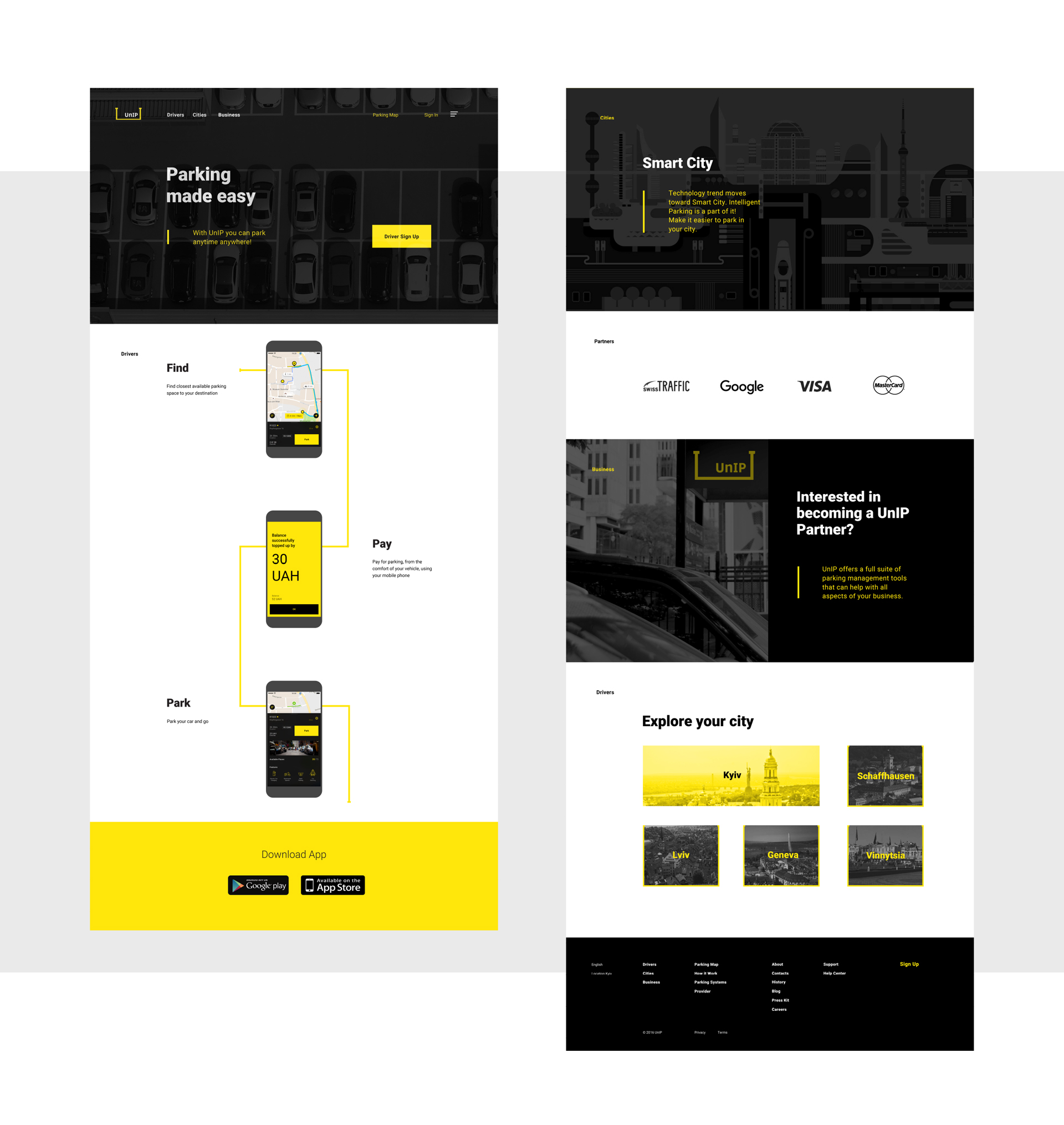
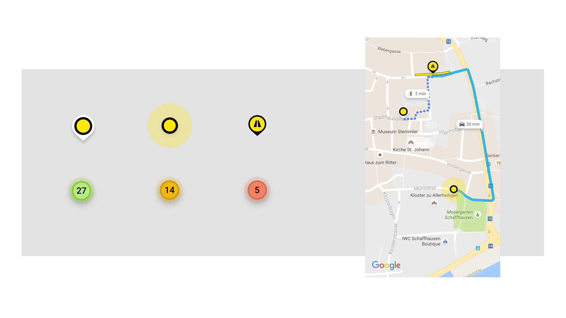
Enjoy Parking

UNIP
  • Design

UnIP is an online platform for city parking; it allows drivers to find vacant parking slots and pay for them right via the phone. The system simplifies the work of the municipalities, helps toll parkings and saves drivers’ time.

Challenge

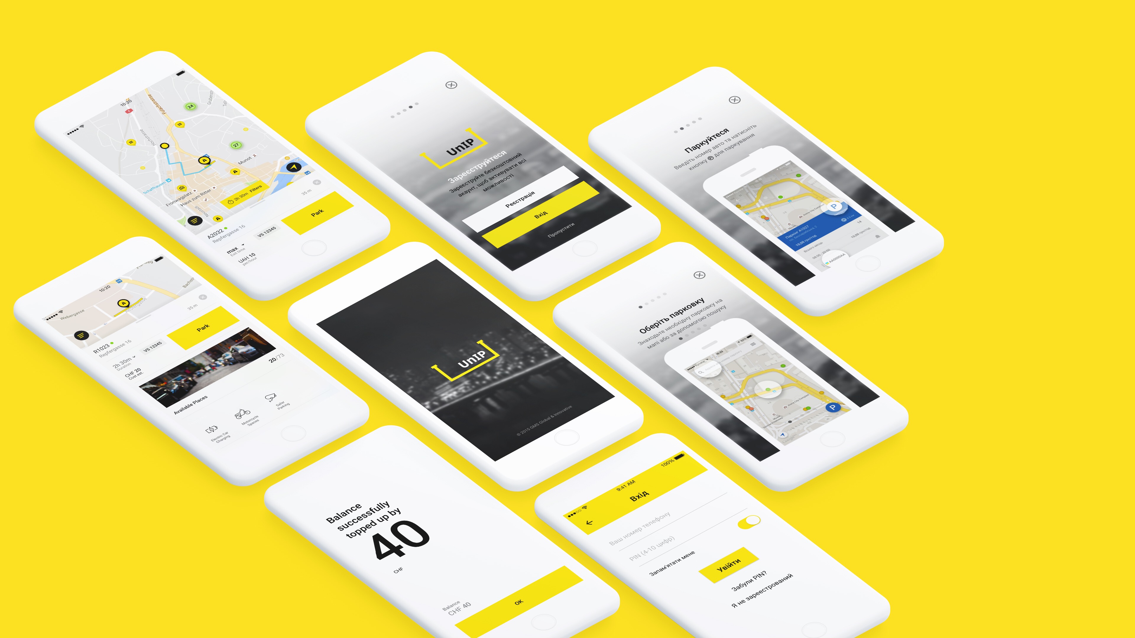
Overpopulated cities with a lack of parking space and constant traffic jams are the main UnIP field. The platform audience lives at a pace of constant haste. So all the identity and all its elements must be as simple as possible. They should not distract drivers and be easy to read both on screens of devices and in the urban environment. The client wanted minimalism.

Solution

“U,” the first letter of the brand’s name, has become the sign and the main graphic element. We have stylized it as a the parking space marking. We’ve purposefully made it wider, to symbolize that there is enough space for all platform users. Placed against a black background our element has also become an icon for a mobile app.

The whole UnIP graphics system is consolidated with a yellow underline. It is in communication materials, where our “U” highlights the most important words and expressions, in co-branding and in information stands at our partner’s parking areas. It’s everywhere. We’ve combined it all with this simple and dynamic identity element.