
Solution
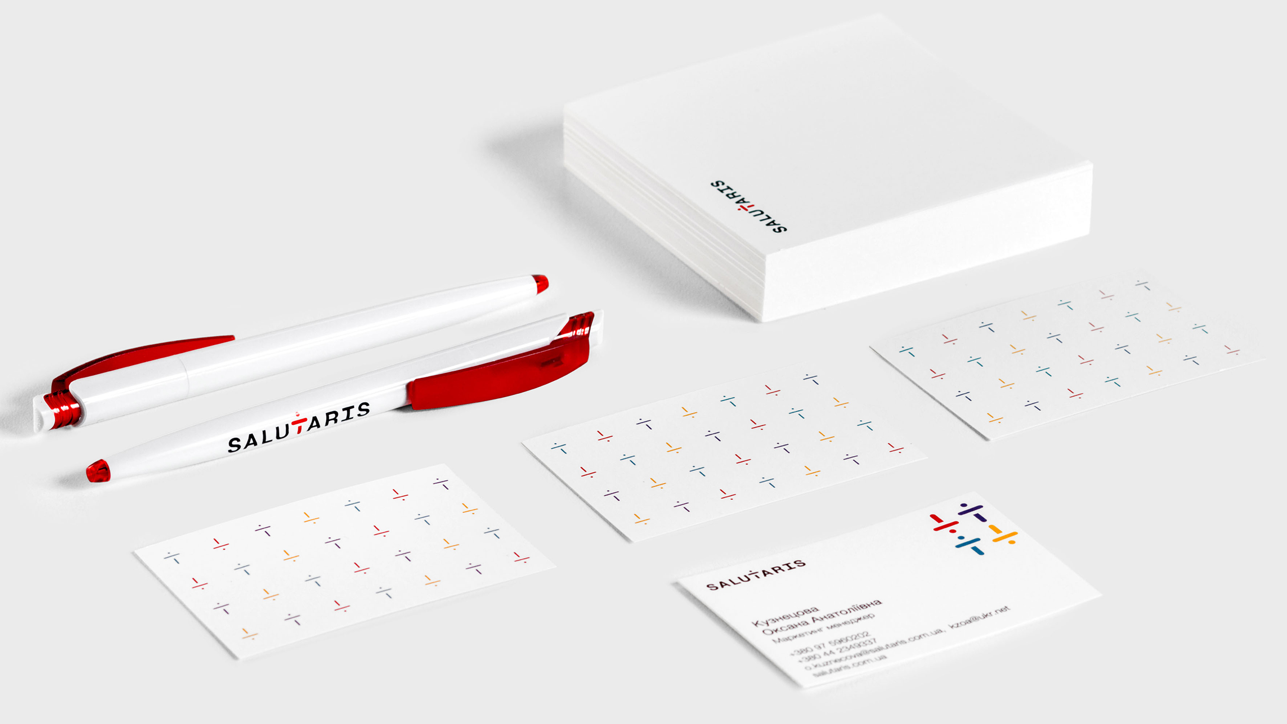
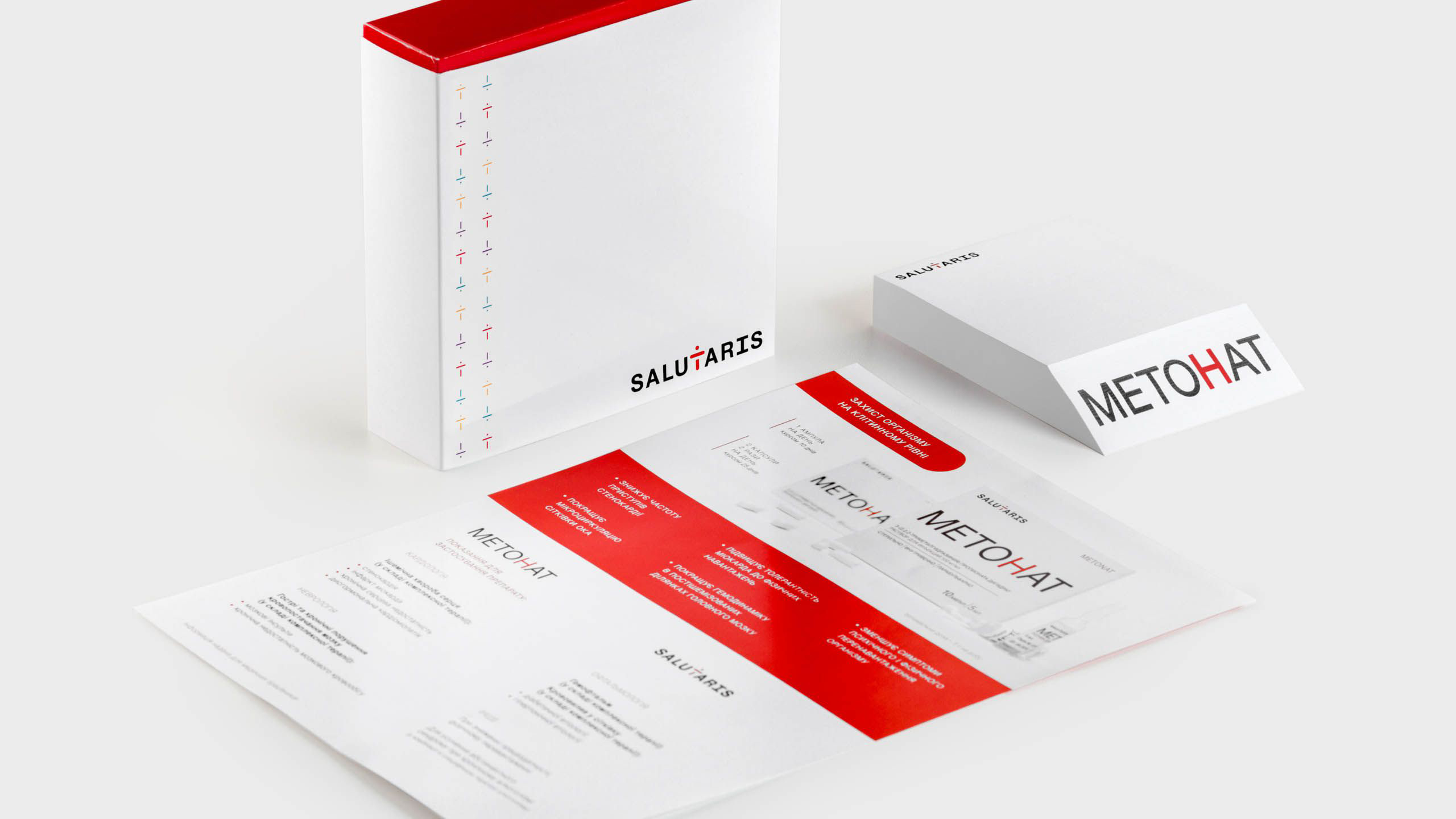
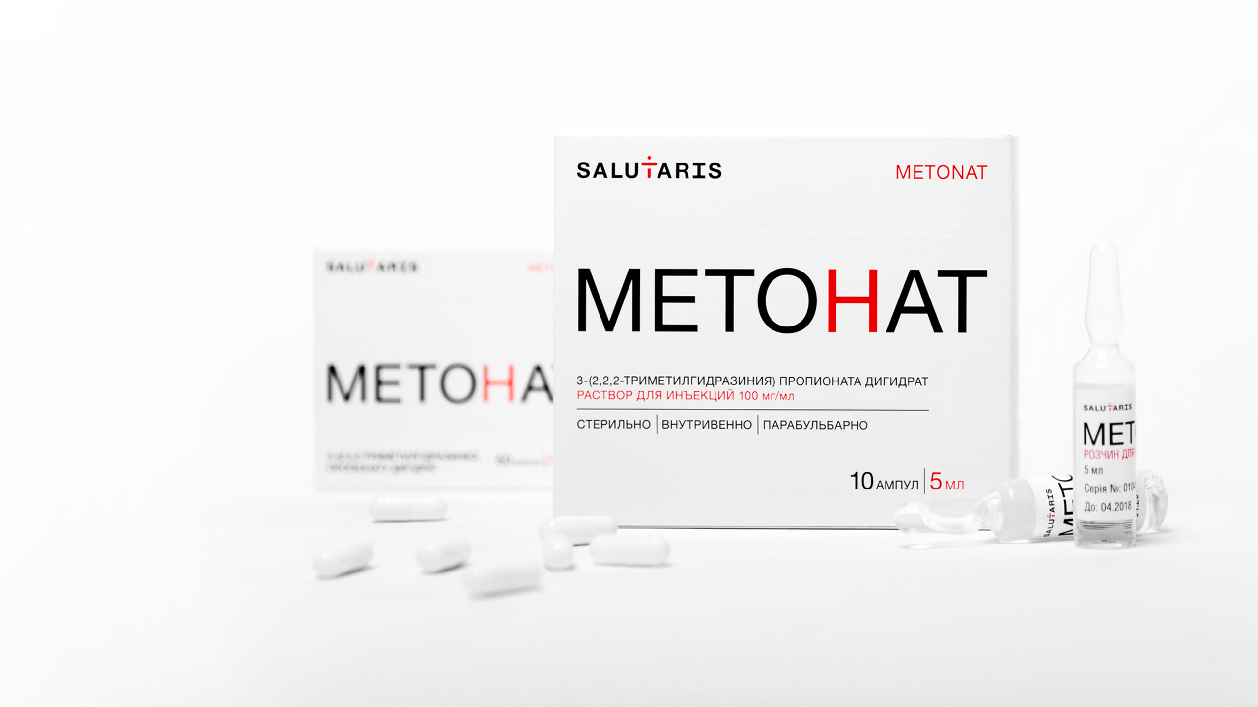
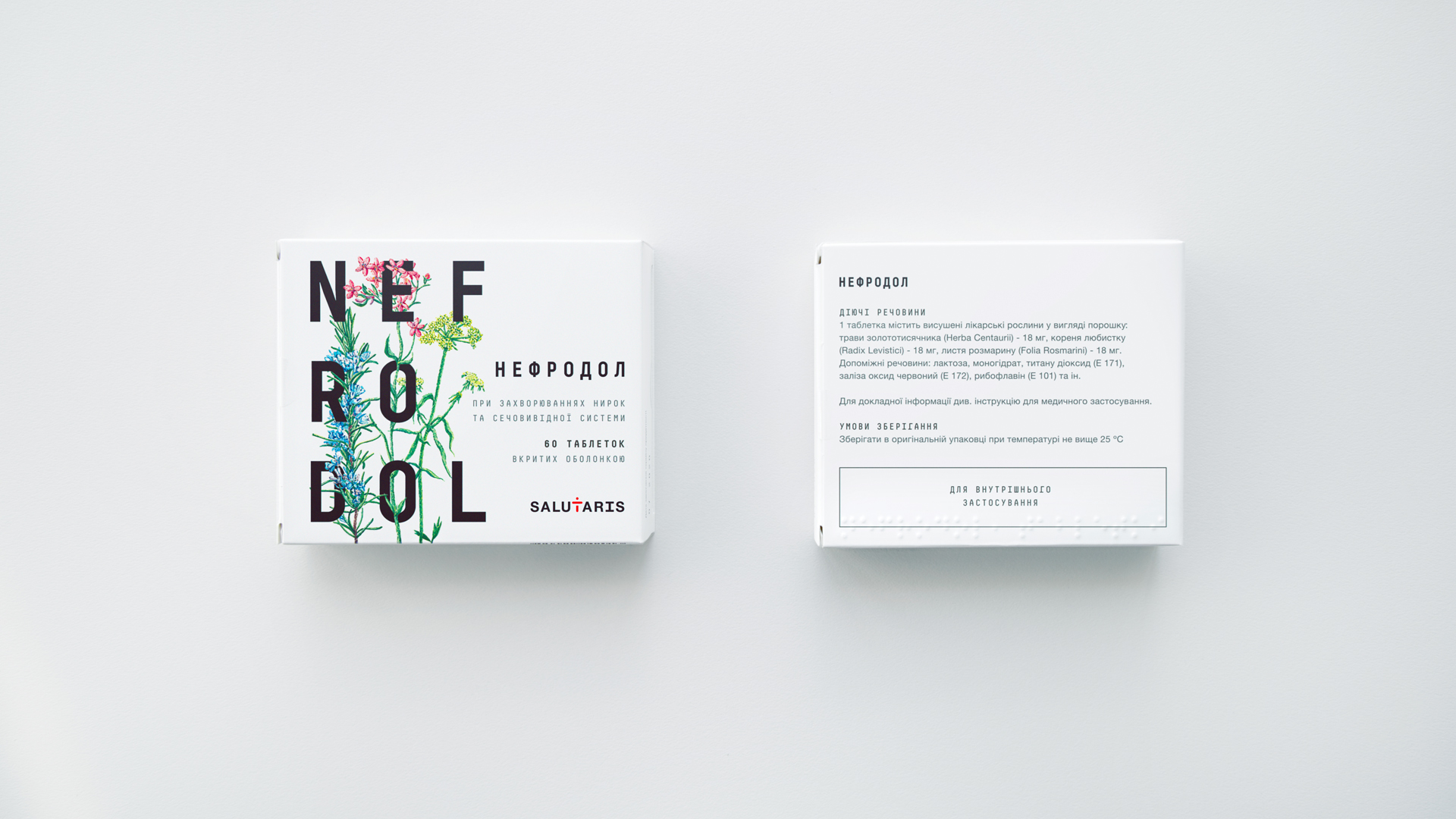
We developed the name and Salutaris line titles for individual products. In addition, we have established a complete system of visual identity — both for the brand as a whole and for each drug.

Heart of business of Ukrainian pharmaceutical company Salutaris is laboratory which specializing in the development of new drugs and components. Her latest developments has great demand on the corporate pharmaceutical market. The company has always worked as a quality supplier of innovative solutions for other businesses and never developed its own brand. So, we had two problems. First, the rebranding of the company and its active positioning on B2B market as a partner for large pharmaceutical companies. Secondly, launching its own line of drugs with powerful emphasis on cardiovascular drugs.
We developed the name and Salutaris line titles for individual products. In addition, we have established a complete system of visual identity — both for the brand as a whole and for each drug.
When I worked in the Kyiv City State Administration, Fedoriv was developing the tourism logo for Kyiv. He offered not just picture but the whole philosophy. I understood that work with Andrey and his team would lead to success.
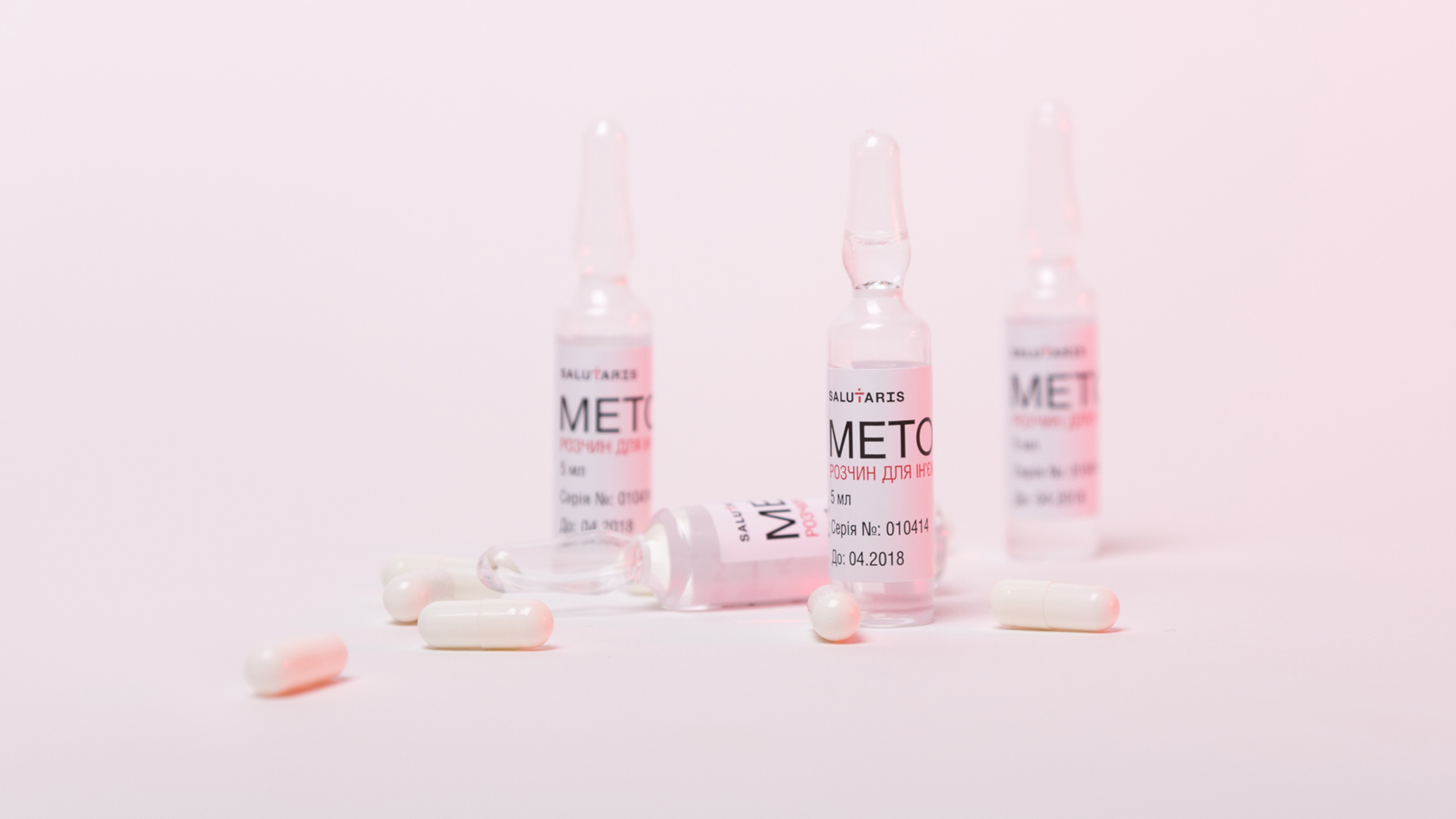
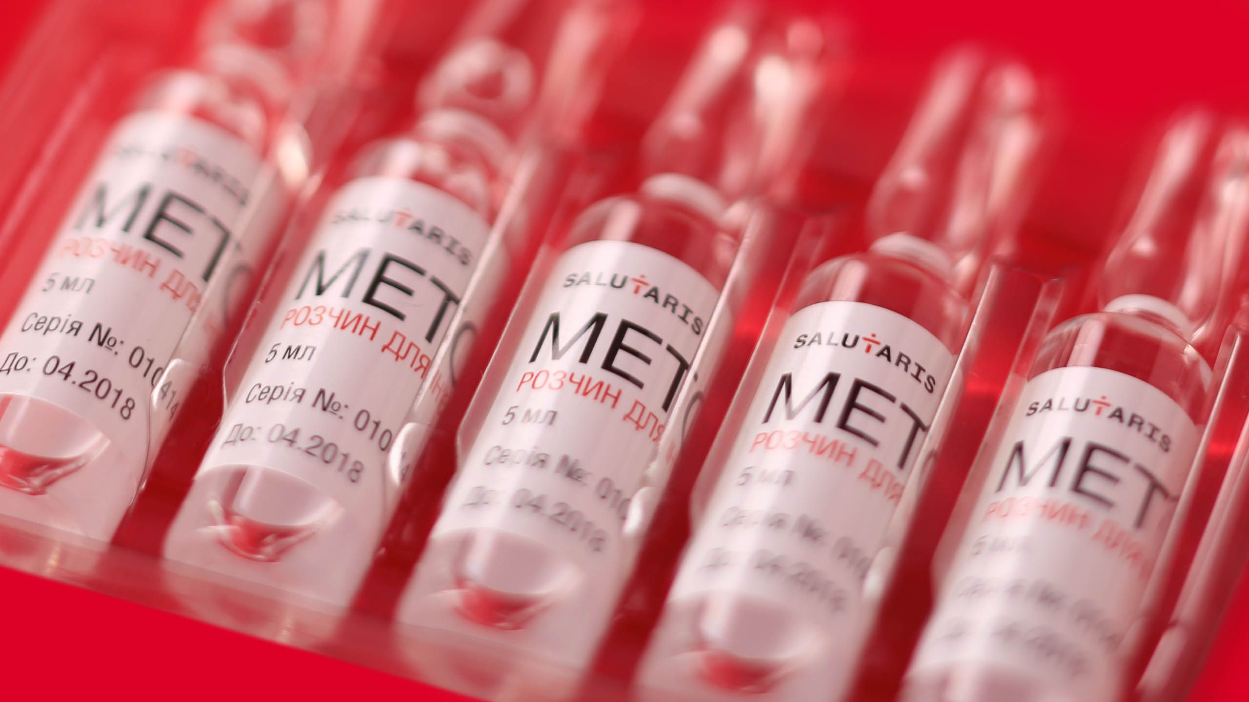
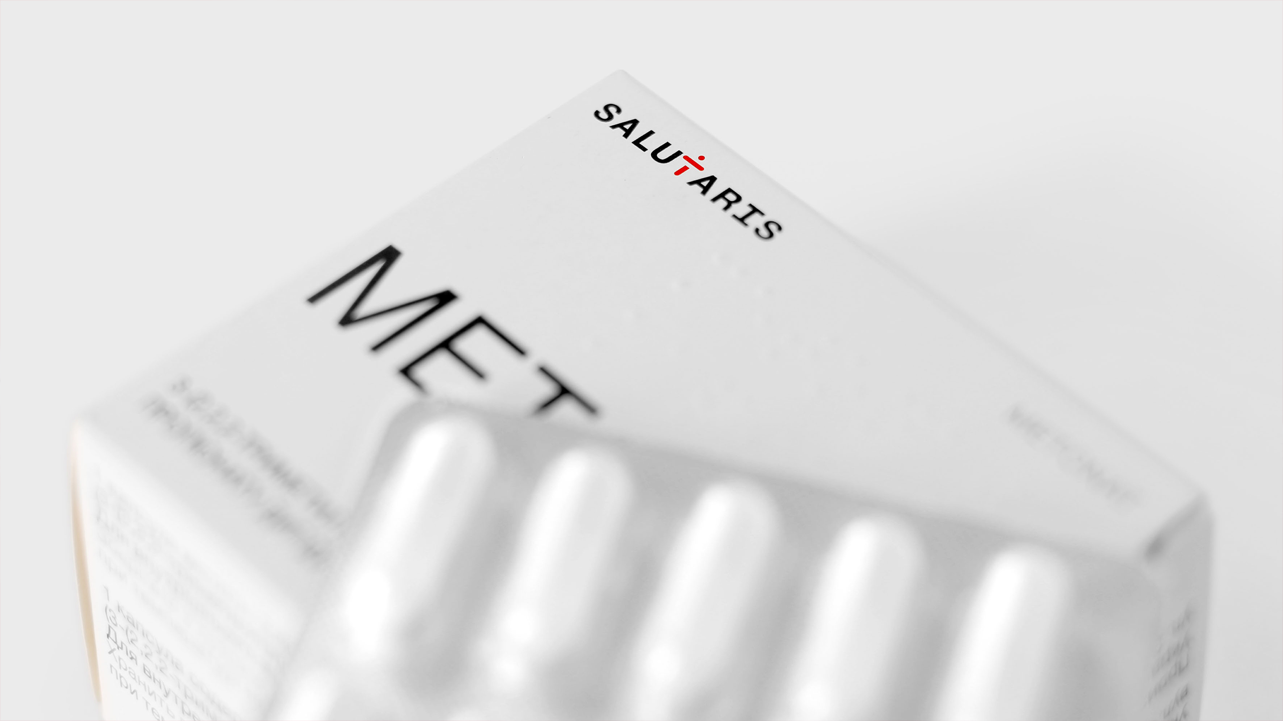
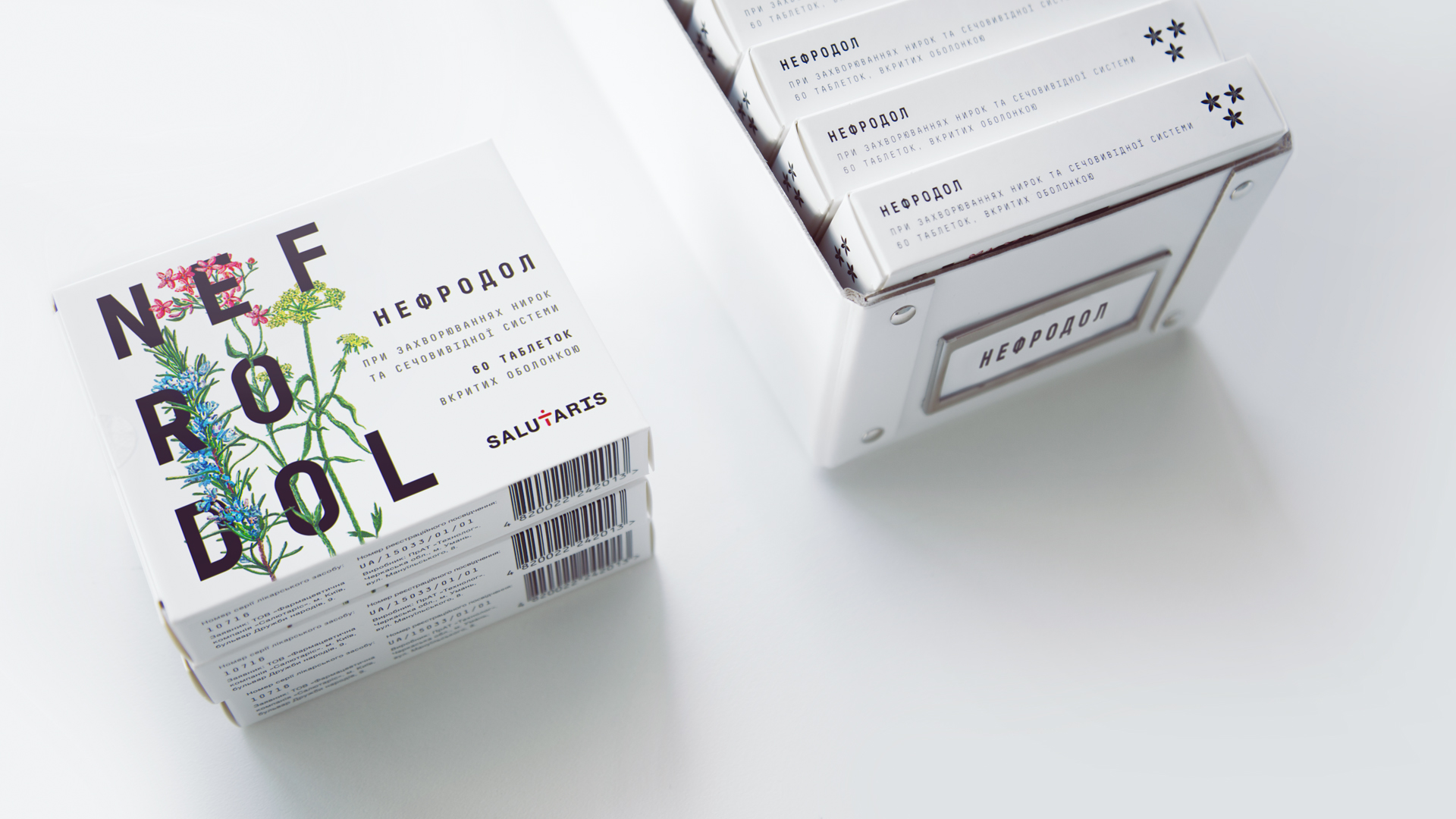
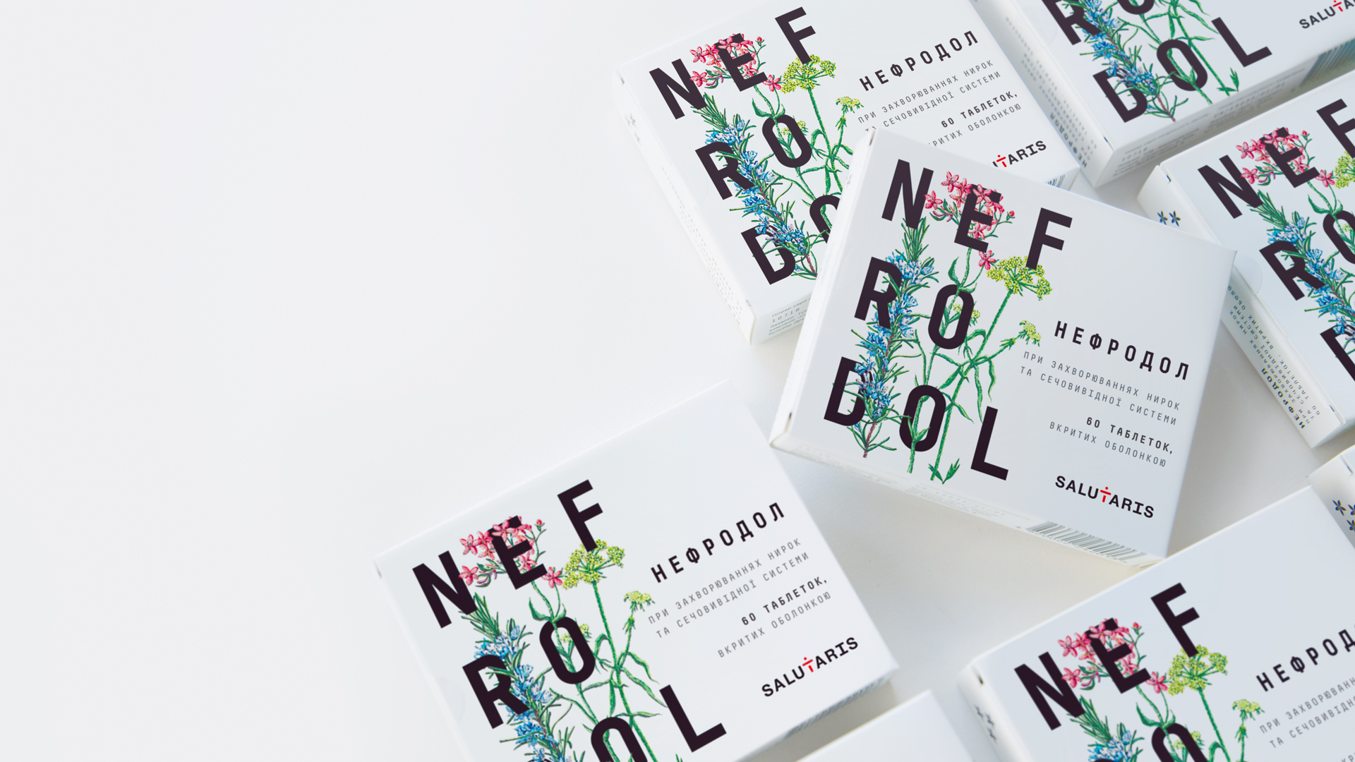
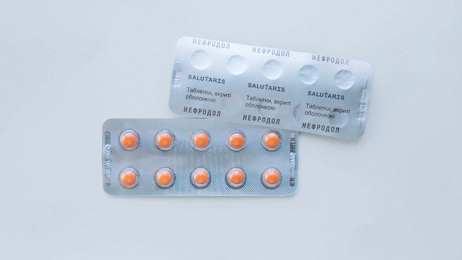
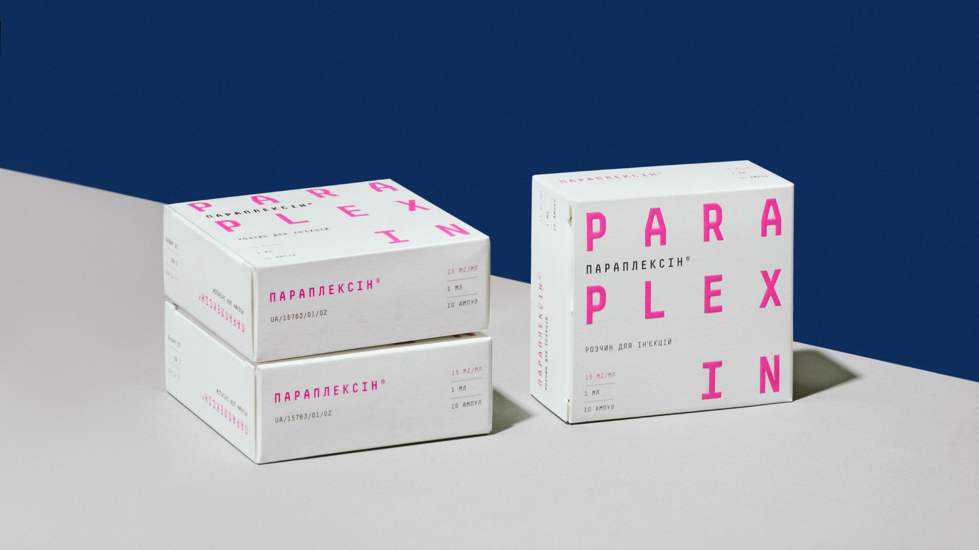
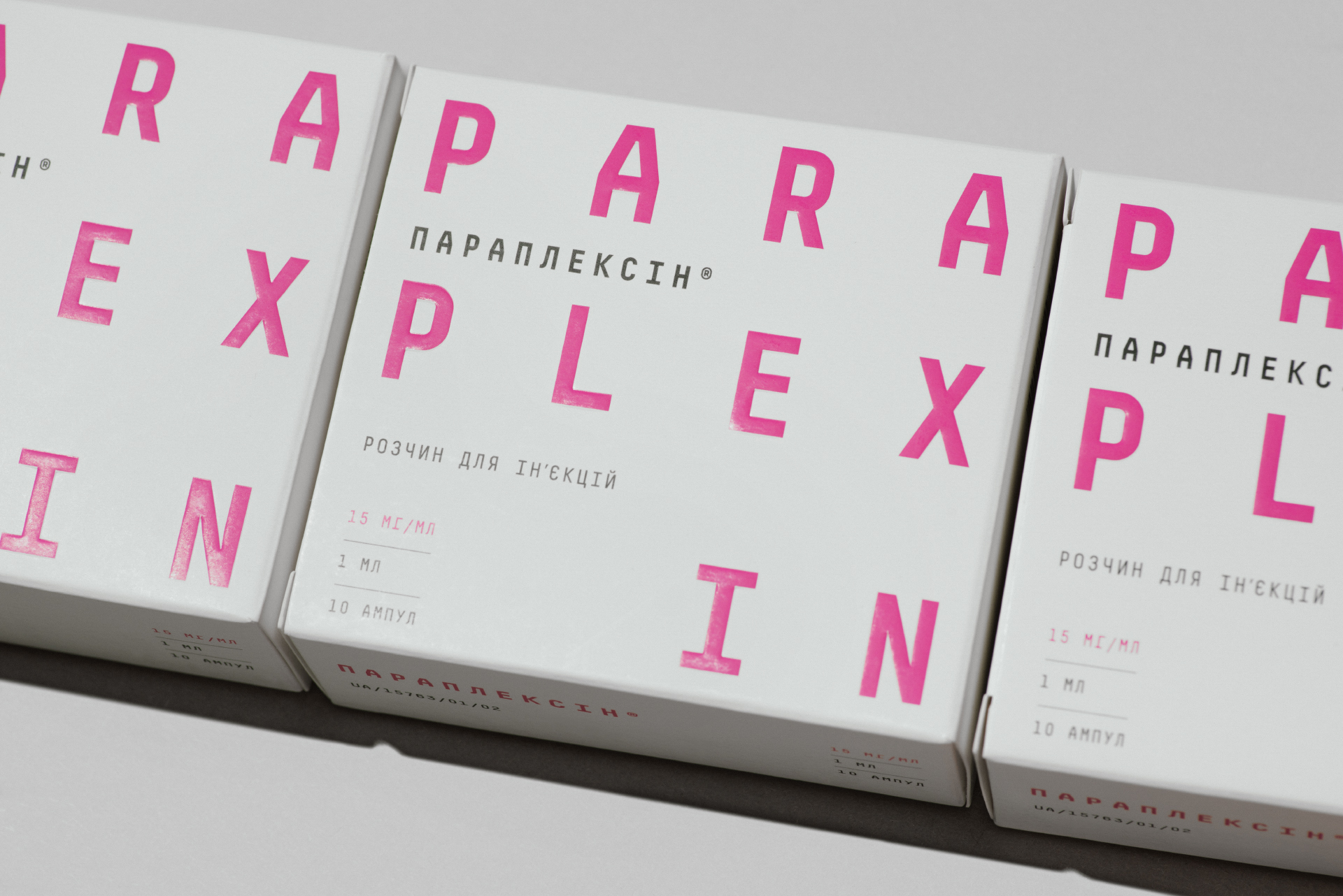
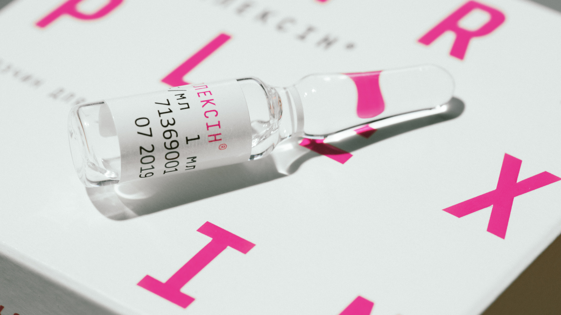
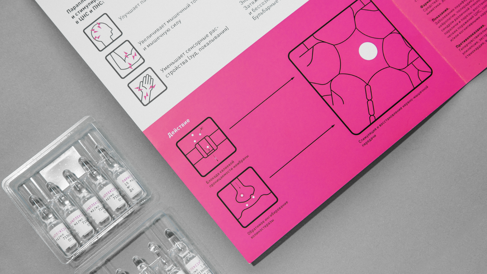
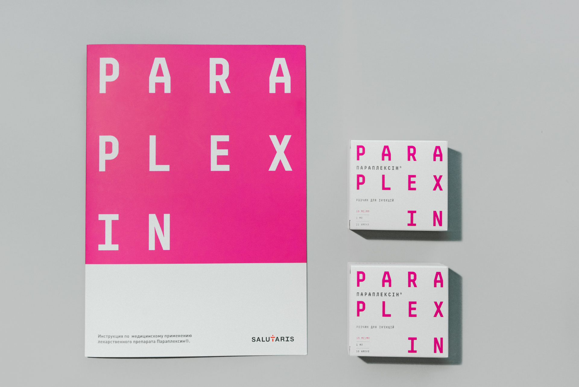
Paraplexin restores and stimulates the transmission of impulses along nerve fibers. Sounds complicated. Because the problems that the drug solves are also complicated. When creating packaging for Paraplexin, we decided to show the complicated in a simple way. It is minimalistic. White packaging. A lot of “air.” Base fonts. And a bright color for contrast. Paraplexin is a prescription drug. Most of the time, pharmacists and doctors are those who interact with the drug. Therefore, our packaging, whatever one may say, is easy to recognize: on the chemist’s shelf, in the warehouse, in the display case.