Solution
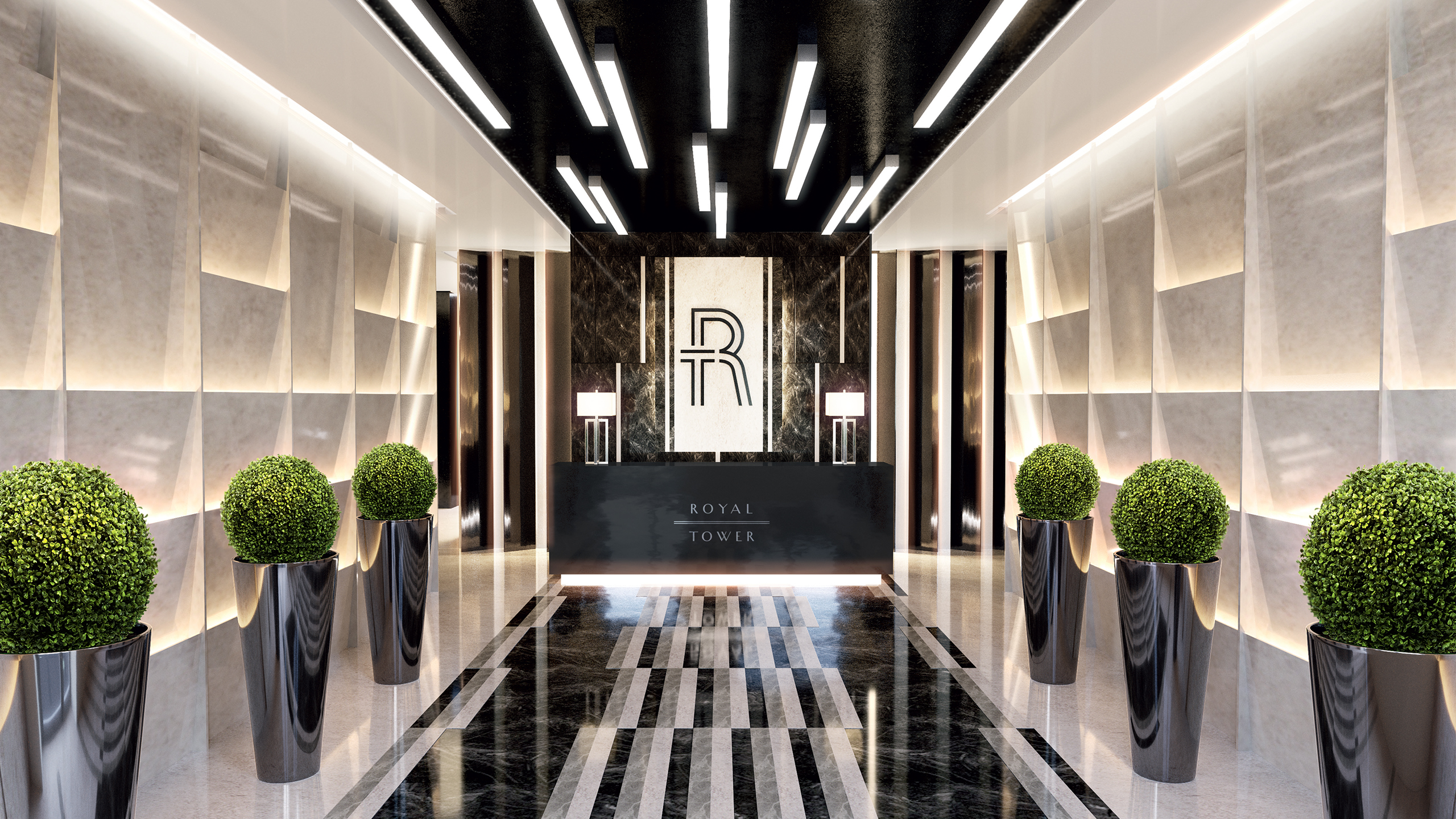
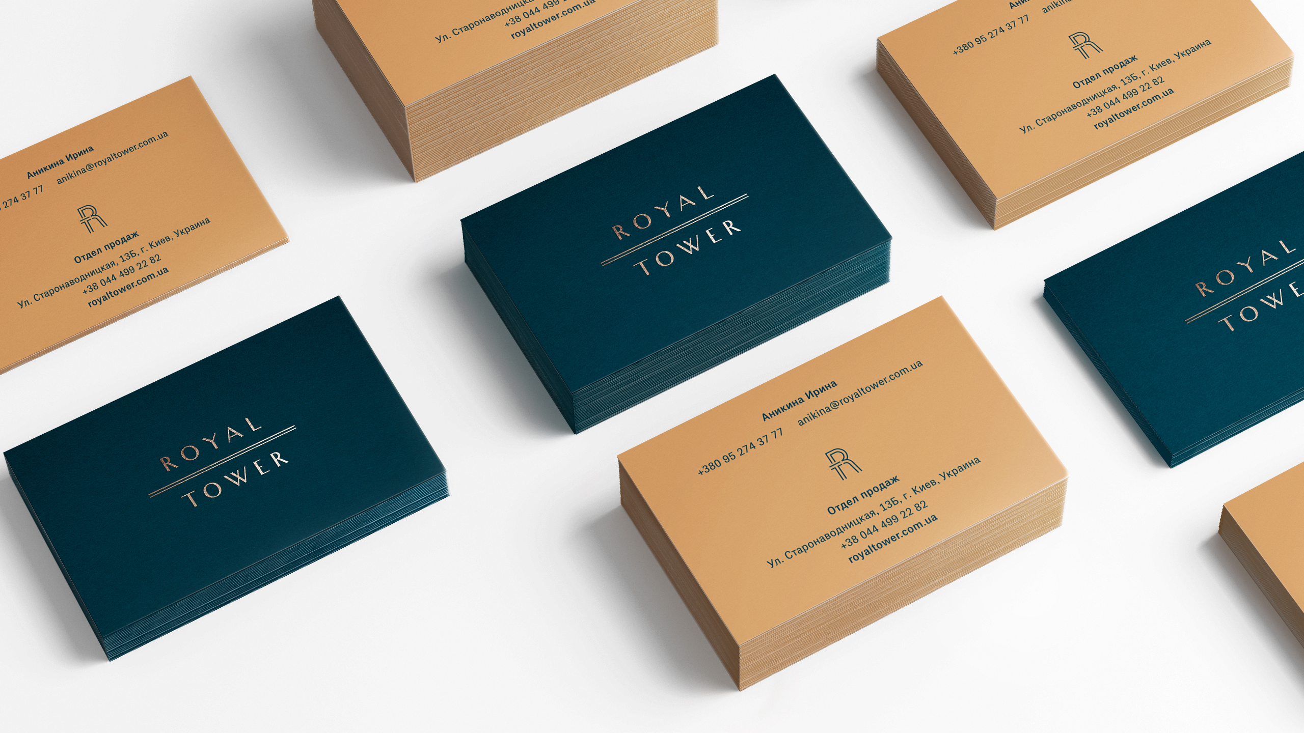
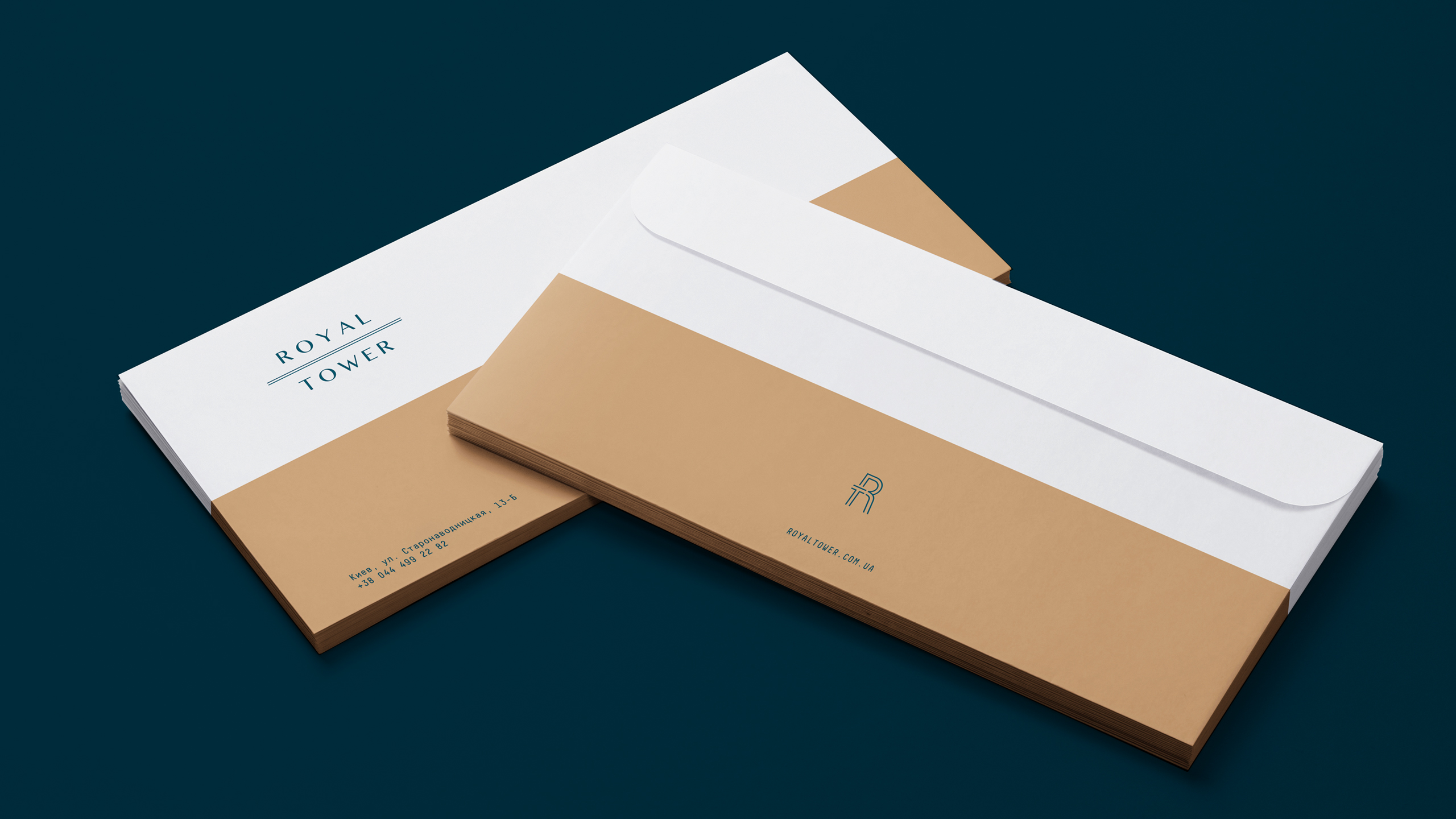
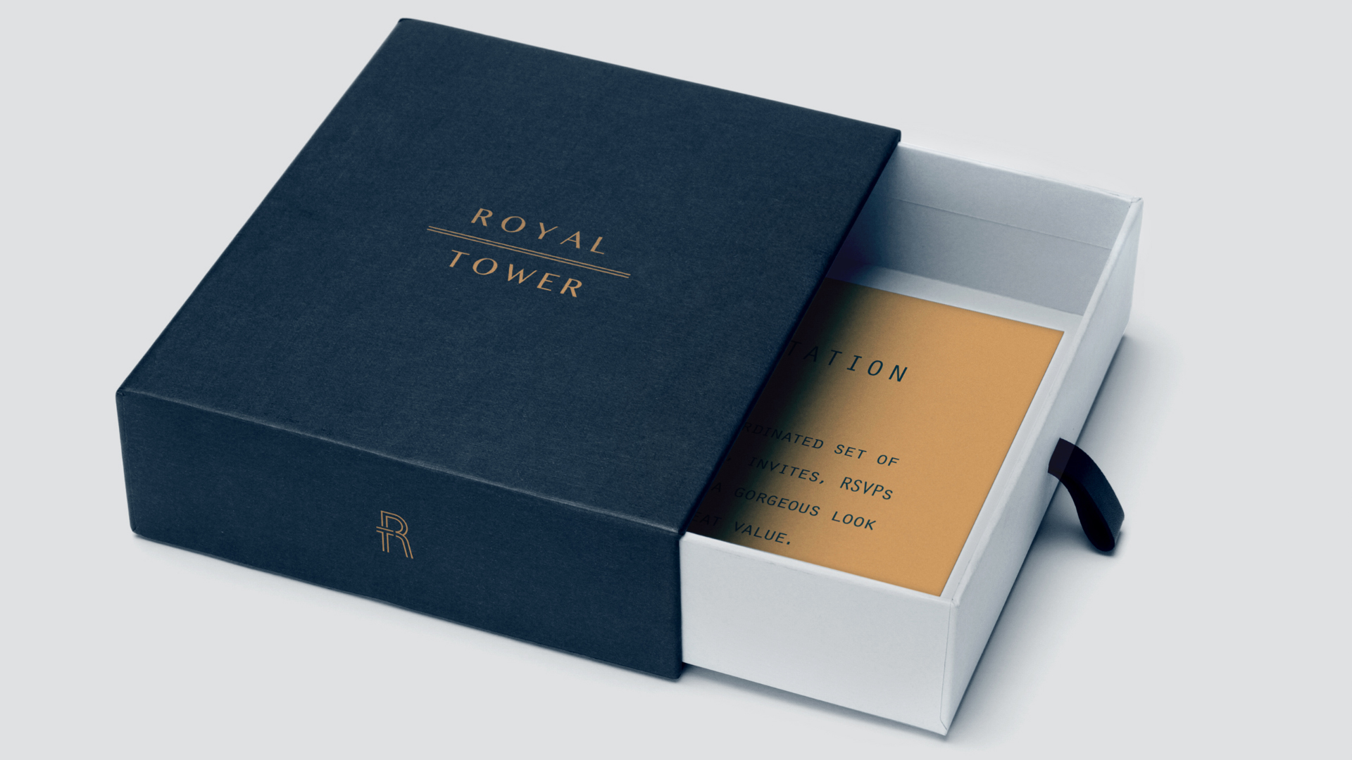
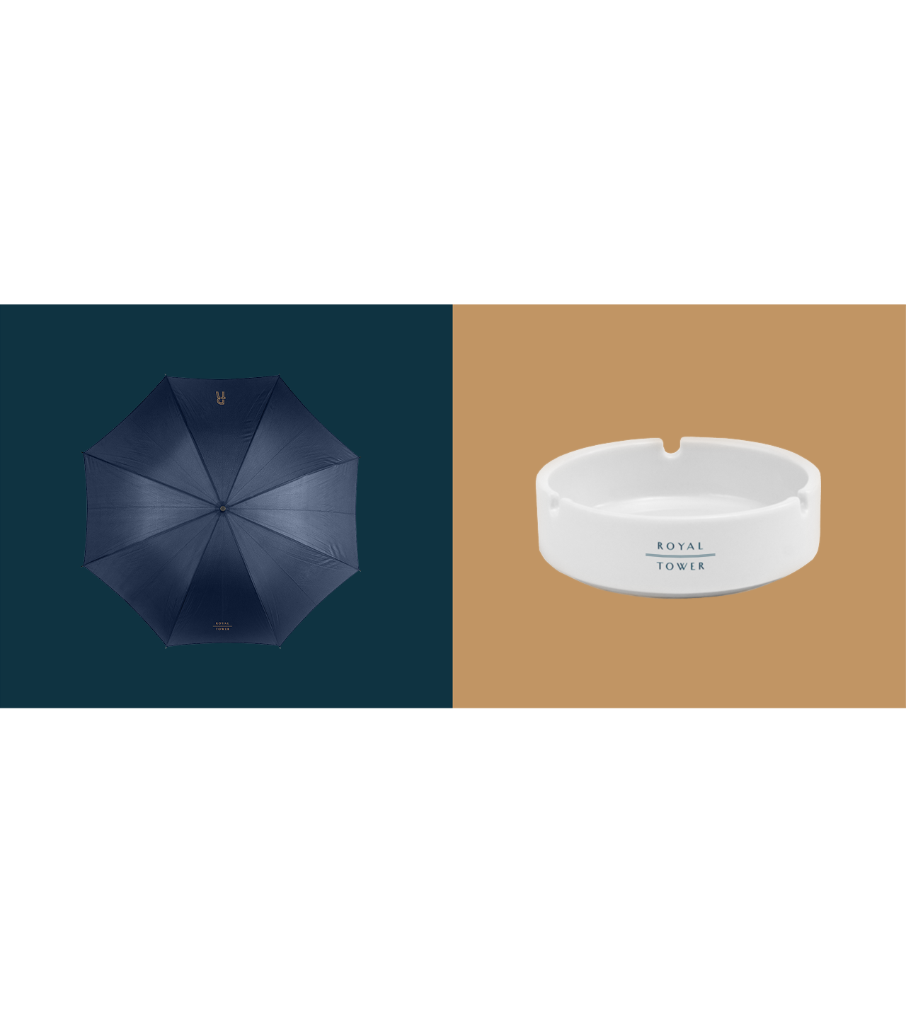
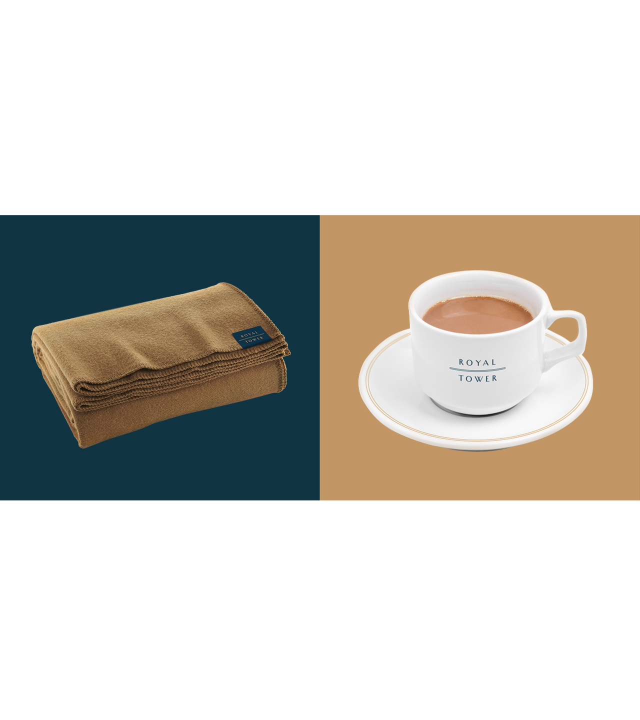
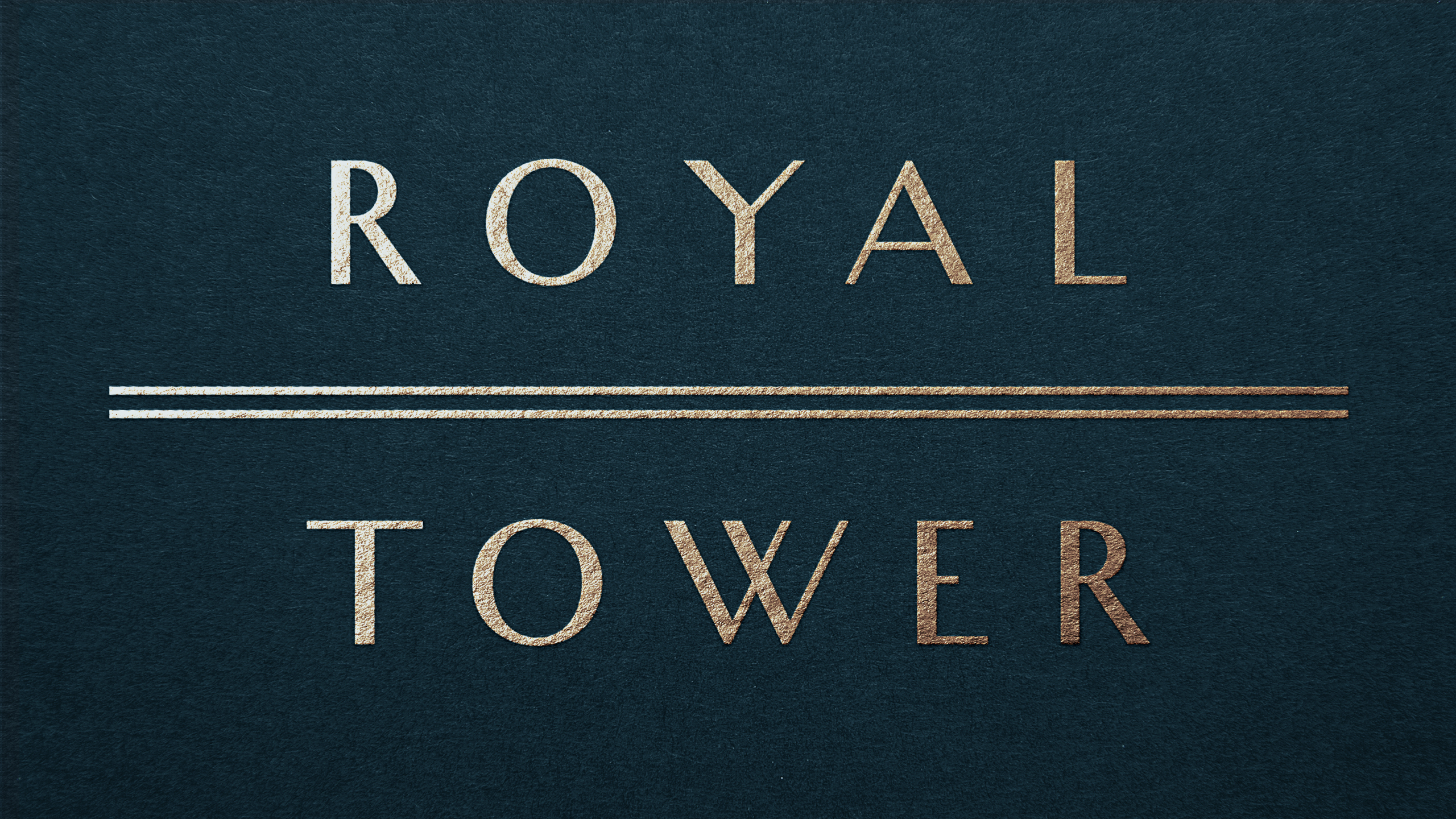
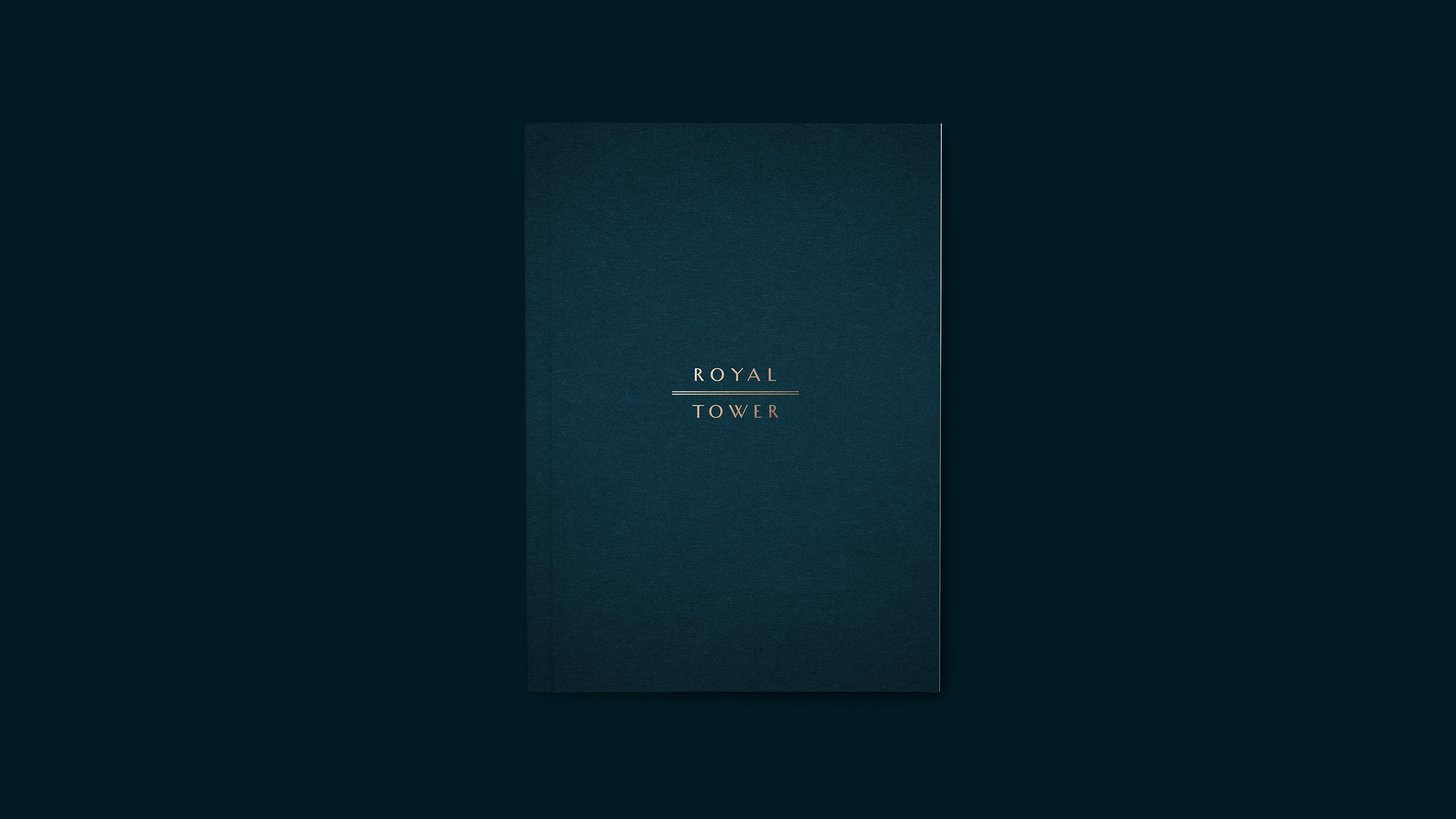
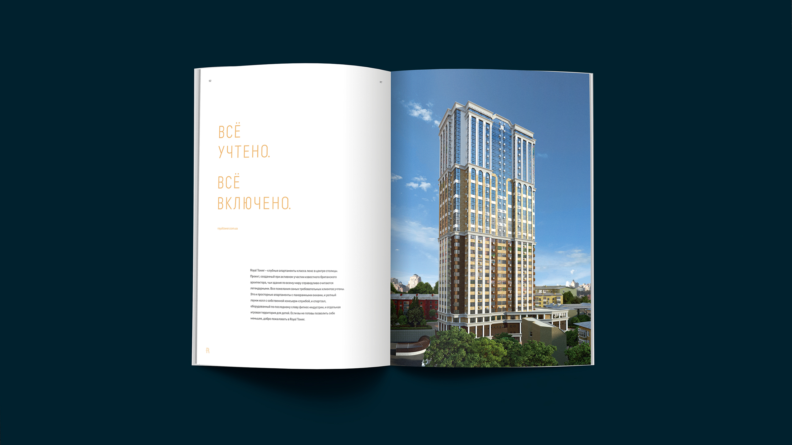
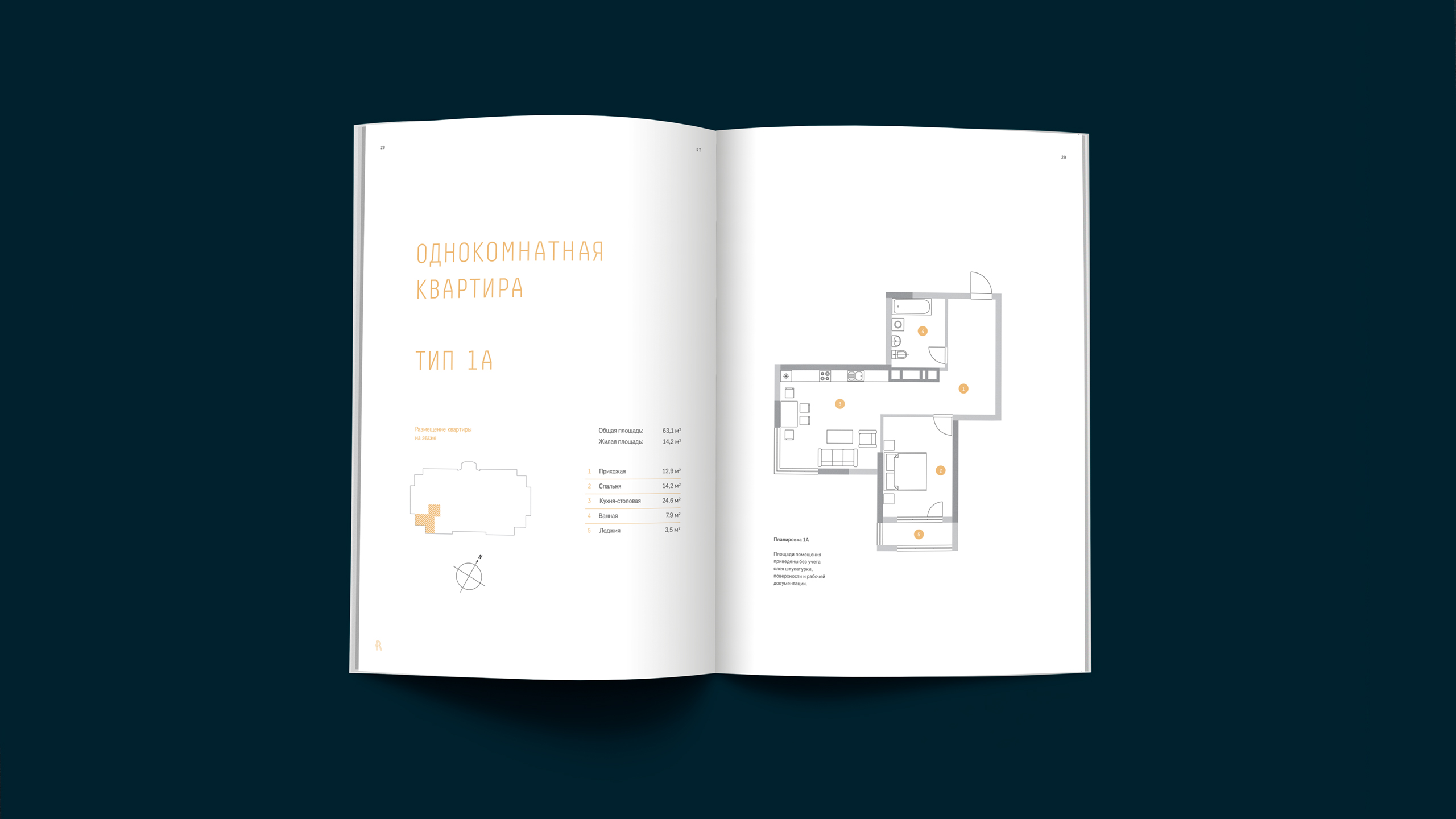
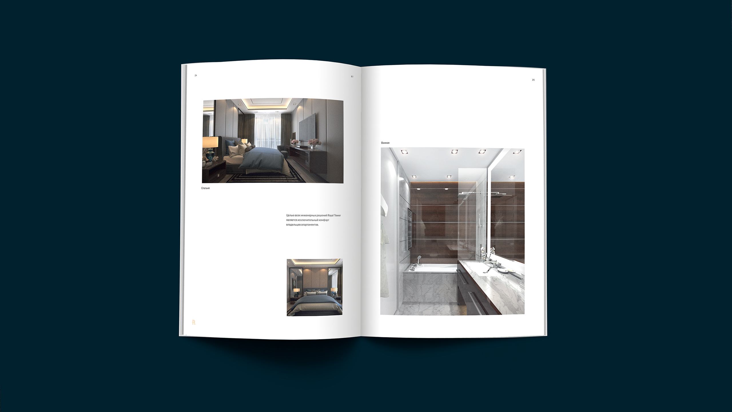
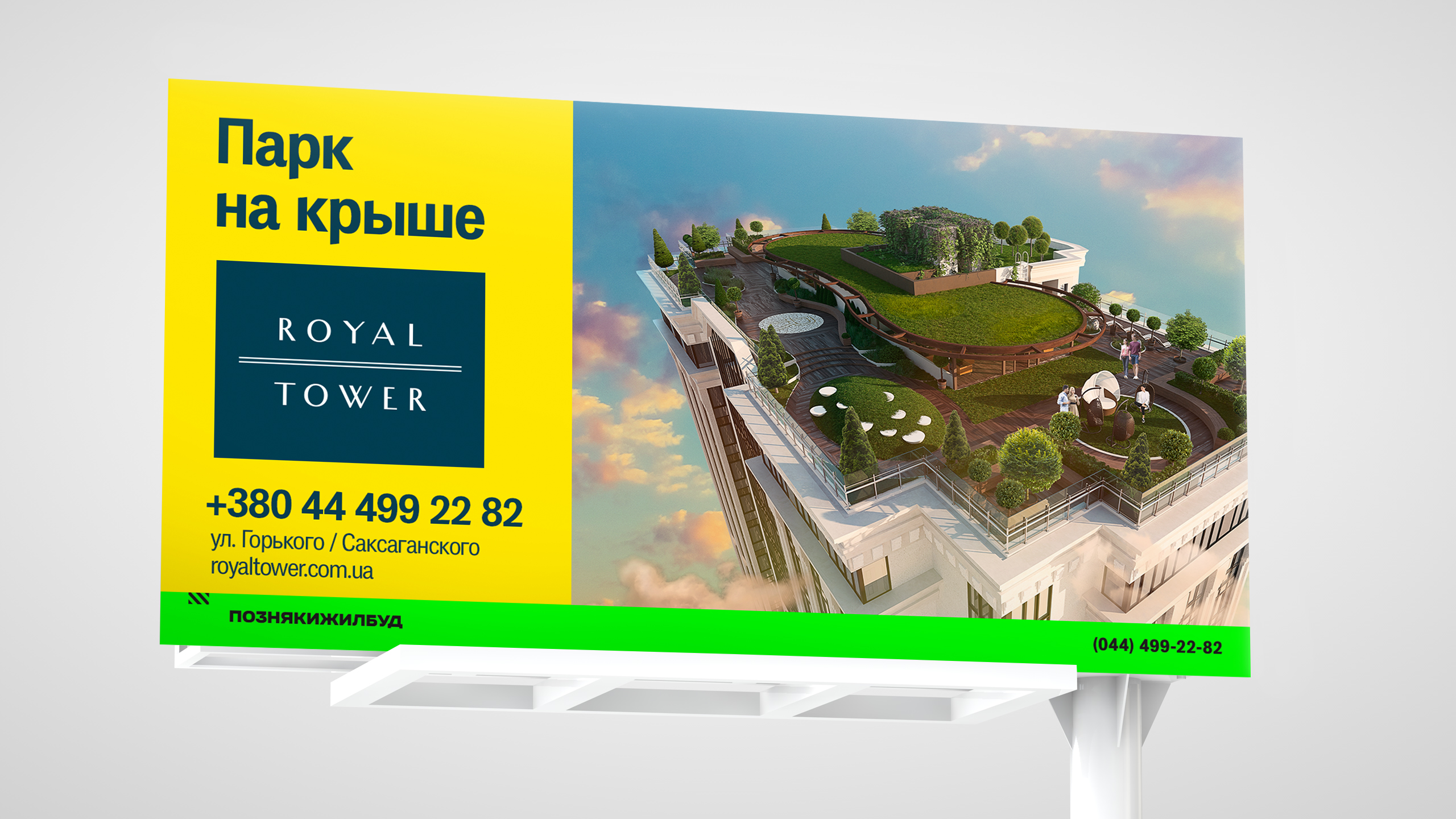
The real estate project was to satisfy the most demanding customers, so we came up with an idea to implement the ‘All factored in. All included’ strategy in our communication efforts. We developed a comprehensive identity system for Royal Tower as a cutting-edge and expensive residential compound. We came away from traditional pseudo-premium special effects and came up with a classic font scheme instead of gold and monogram simulation. What we offered was a unique hand-drawn Humanist Sans-serif conventionally used in premium brand’s identity. Capital R and T were adorned with an aristocratic monogram. A combination of deep blue and ochre beige colors (materialized into matt bronze) added impression to the overall color solution. Besides, we added a bright yellow color to serve as a perfect identifier for external communications.
