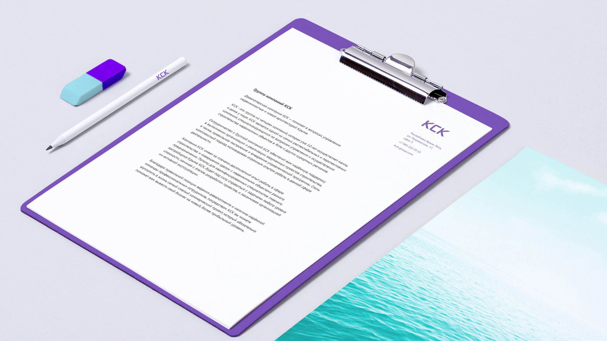
A seaside apartment is a dream. Sure, it is an expensive purchase. Yet, rationality pales beside a beautiful dream of living and vacationing near the sea. As part of strategy formulation, we expressed the essence of the KCK brand with one word only — carefreeness. Buying an apartment, document execution, transfers, repairs and even upkeep in the owner’s absence are cared. KCK takes these cares upon itself.
KCK
- Communication
- Design
- Strategy
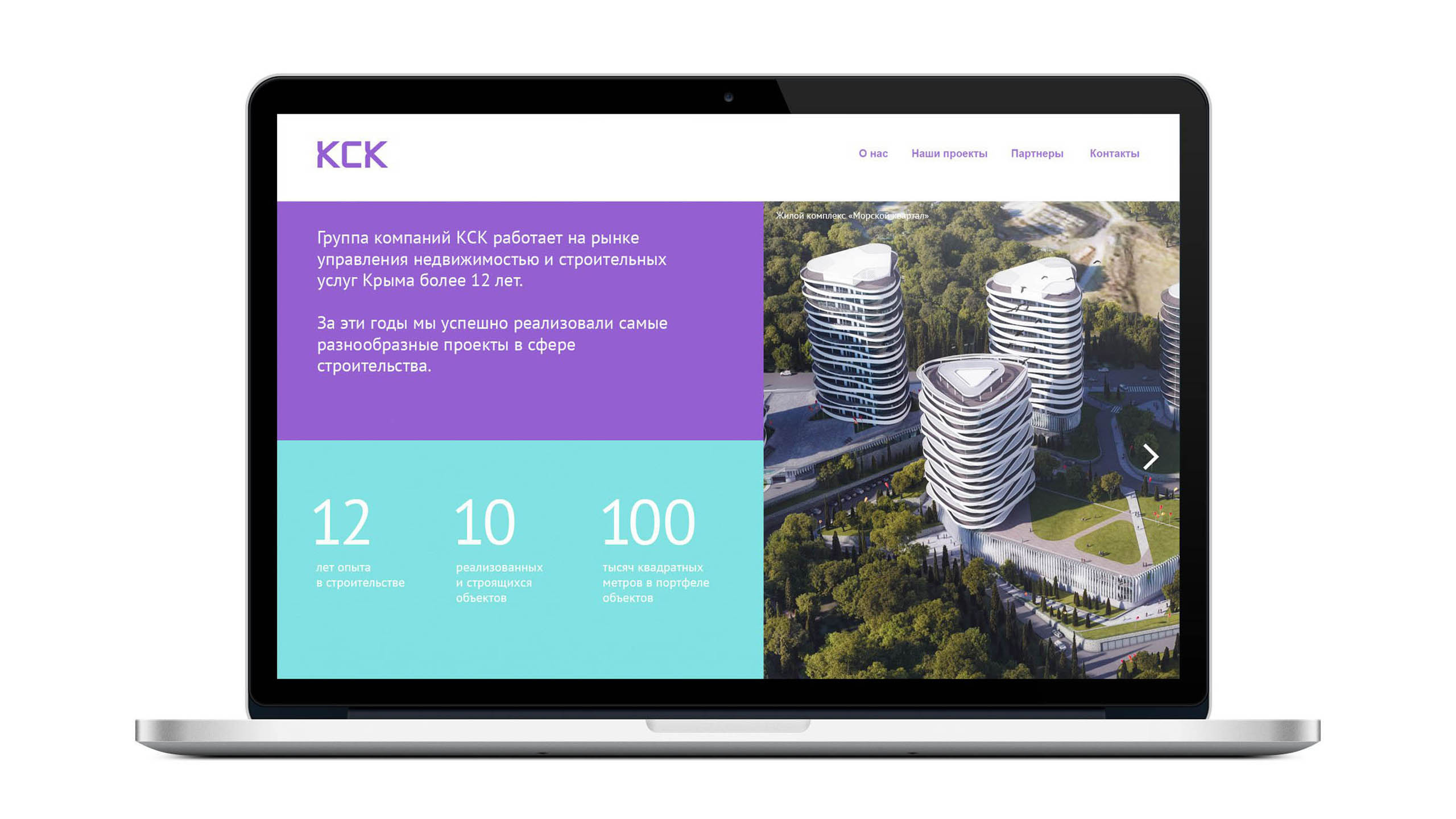
For ten years of strenuous efforts, the Construction Group KSK took the lead on the Crimean market. Its then-current visual style lagged behind its general performance, products and services. And a lack of clear positioning made the company vulnerable to competitors.
Before
After

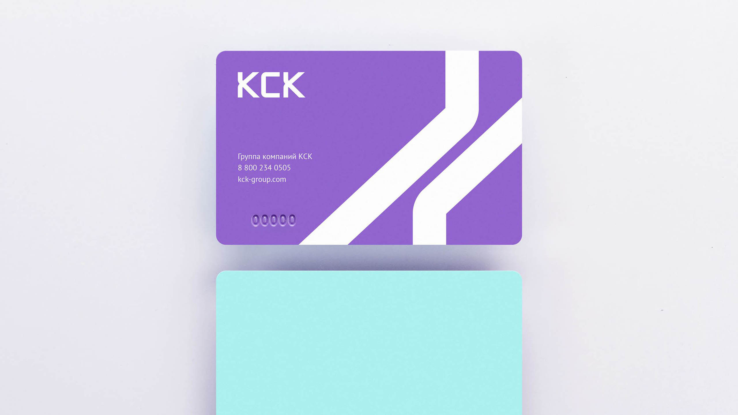
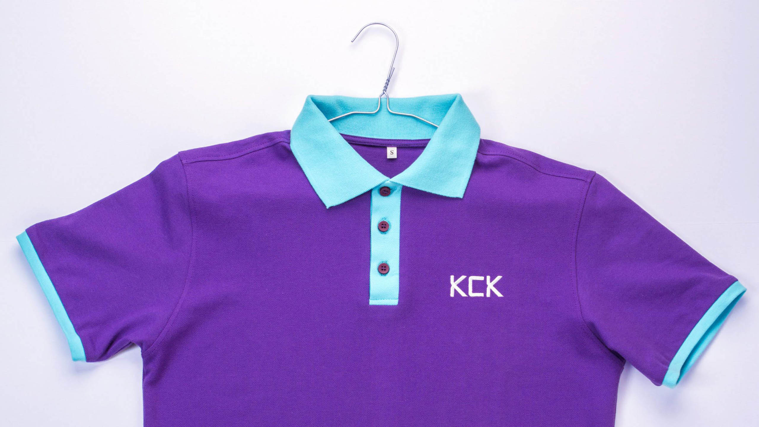
We offered them to invigorate their positioning with a visual solution that was trail-blazing for the branch. Every company out there uses traditional symbols — sea, waves, seagulls, sun, and blue, yellow and orange colors. The visual identity that we originated and a combination of violet and turquoise accentuate nonconformity of KCK and its focus on innovation. Besides, it also brings to mind the architectural solutions applied by KCK.