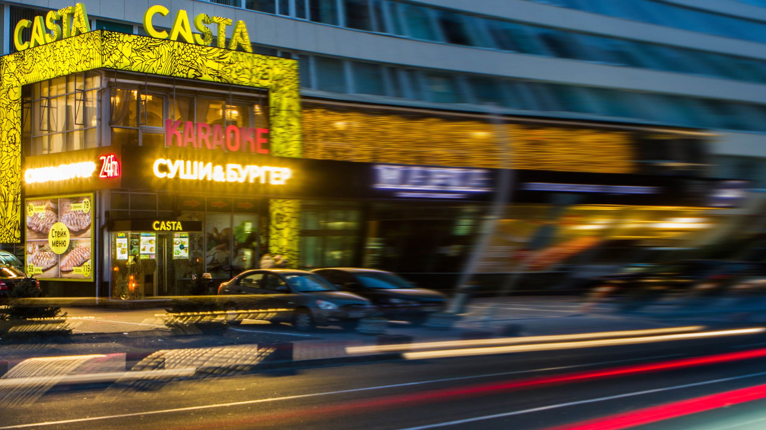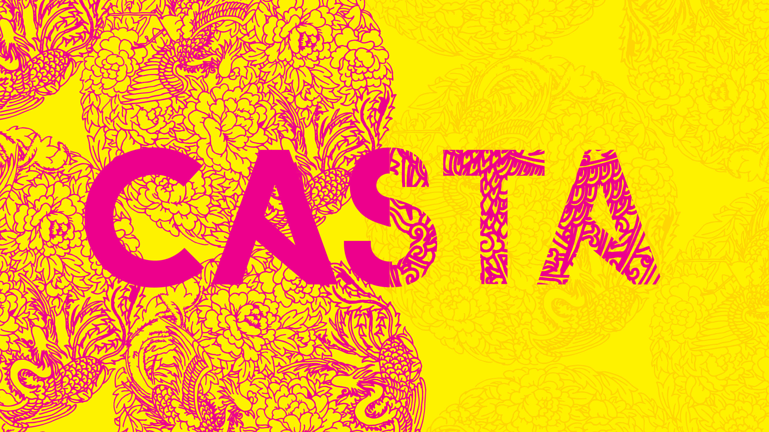
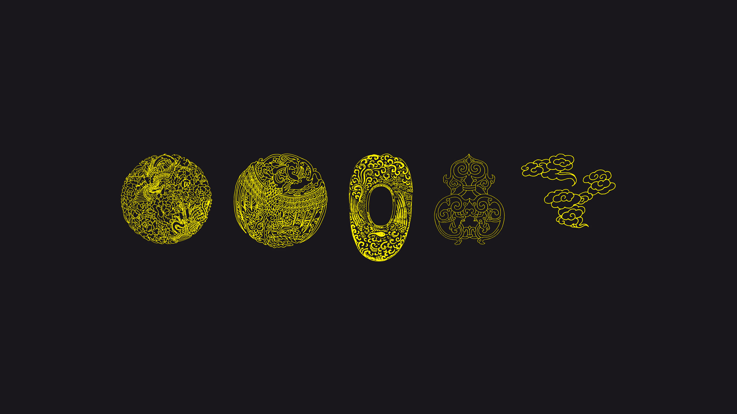
Solution
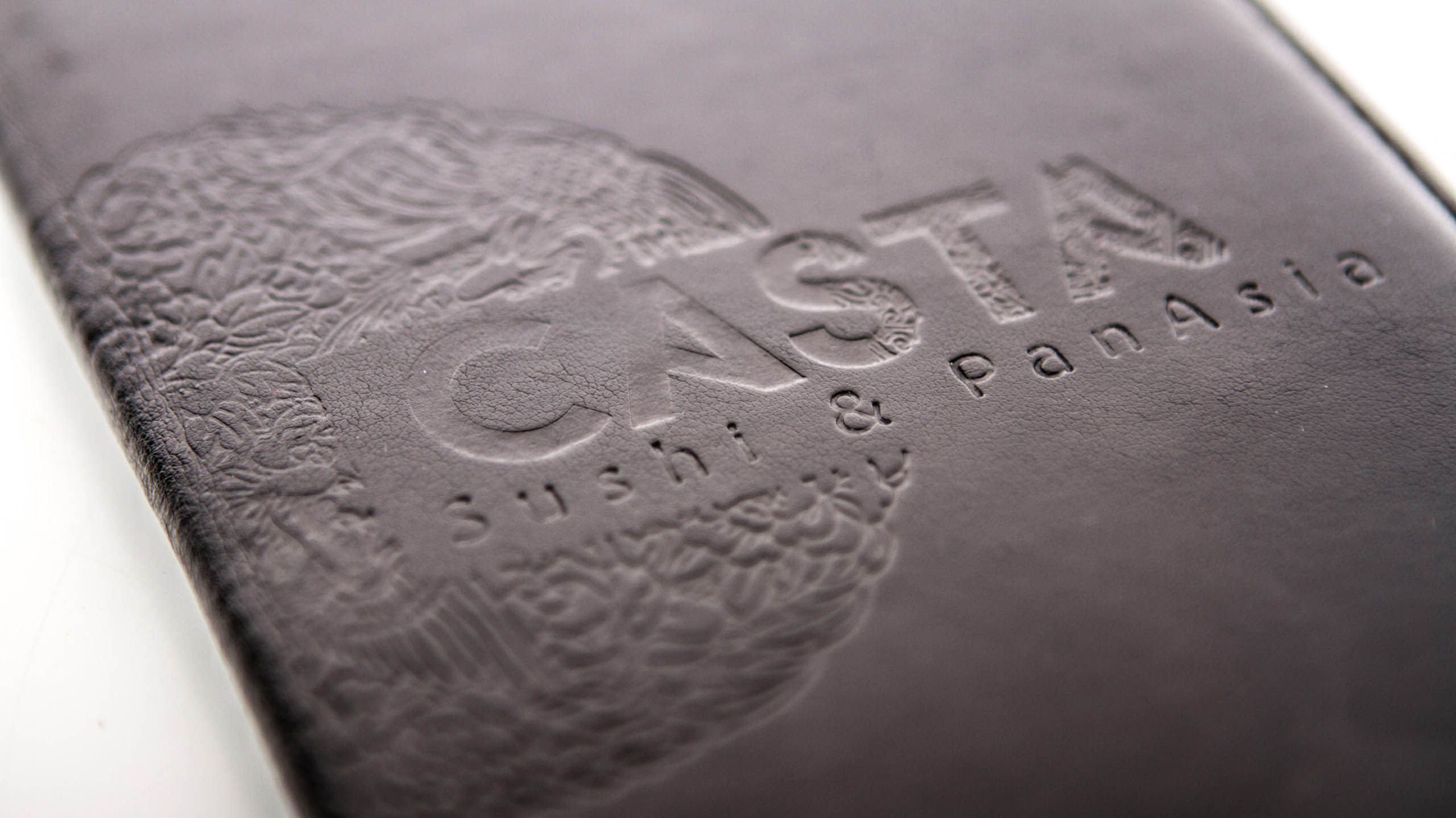
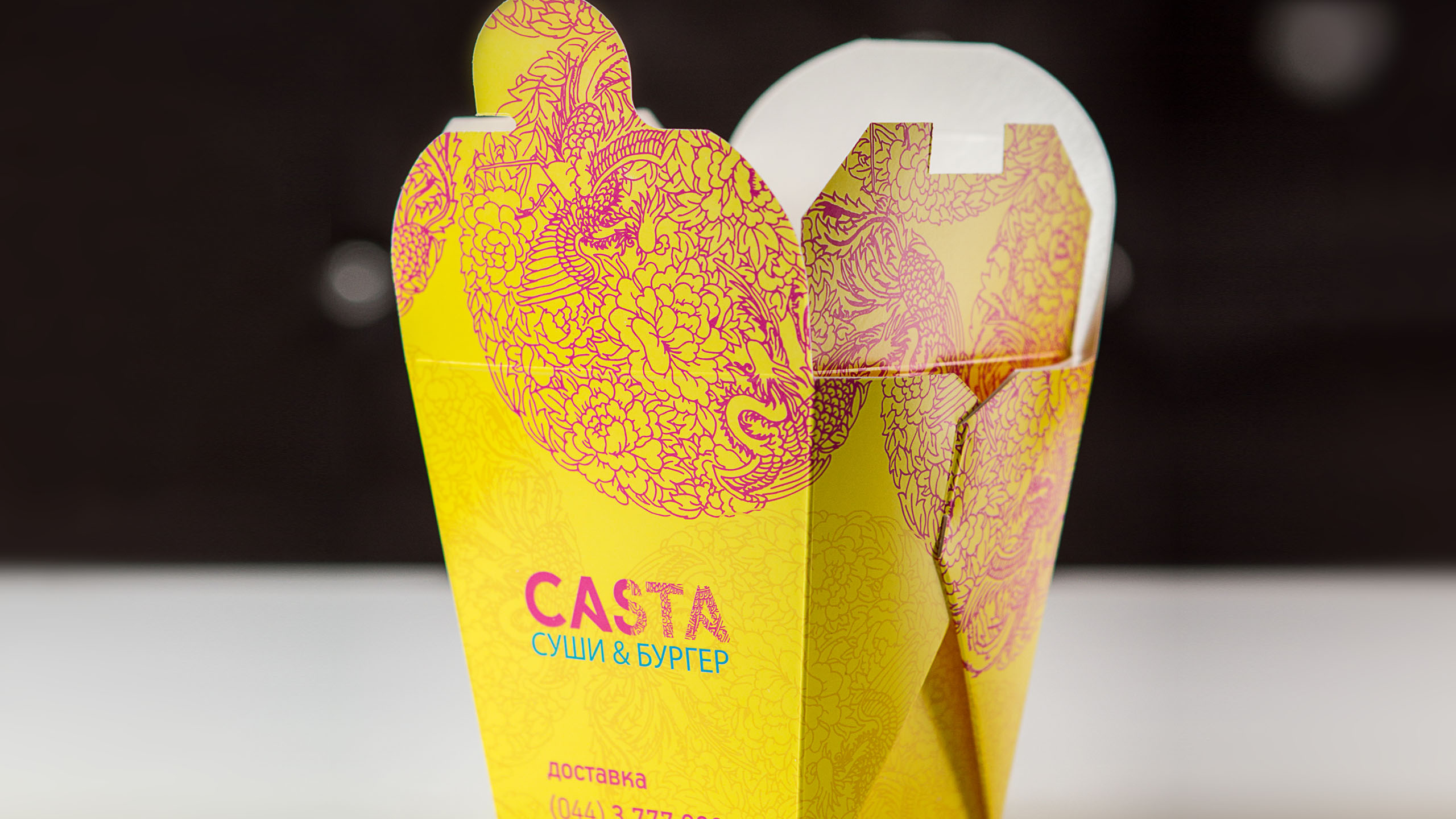
We worked out visual identity system based on a deep research of one of the most vibrant and influential world regions. We created a night atmosphere of Asian megalopolis, where life is in full swing 24/7. Besides, the visual identity of Casta is built on the idea of never-ending renewal and polar extremes interaction. Casta’s logo style fixed duality and polarity and embodied the principle of interaction between different reality aspects, like yin and yang. A contrast range of corporate identity colors underlines the opposition, meanwhile subtle Oriental ornaments soften that contrast and remind of interaction.